
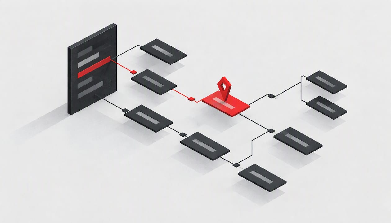
A UX navigation audit evaluates your menus, labels, and hierarchy to produce a prioritized, evidence-backed list of findability fixes. You gather proof from analytics, card sorting, tree testing, and first-click or new-starter tests, then rank what to repair first. Each fix is tied to a KPI, so you can measure the result and track it over time.
TL;DR:
- Use card sorting to generate or reorganize categories, then validate the proposed hierarchy with tree testing; one method cannot replace the other.
- When first clicks are correct but success is low, revise subcategory labels; scattered clicks and low success call for reorganizing the main hierarchy.
- Set a baseline for tree test success, failed internal searches, task completion, and key page exits before changes, then track those KPIs monthly.
- Test the live site on desktop, phone, and keyboard because rendered menus can wrap, rely on hover, or hide links that a sitemap misses.
Table of Contents
- What a UX navigation audit is and when to run one
- What to prepare before a navigation audit
- Research methods for navigation audits
- Step-by-step navigation audit workflow you can run on a live site
- How to interpret tree-testing and findability metrics
- Actionable fixes checklist for navigation problems
- Measuring audit impact and setting an ongoing cadence
- Integrating qualitative user feedback into navigation audit findings
- Case studies and examples of successful navigation audits
- Accessibility considerations in navigation design
- Tools and software for conducting UX navigation audits
- Speed versus thoroughness: where we land
- How we can help you run a navigation audit
- FAQ
- Sources
What a UX navigation audit is and when to run one
A UX navigation audit is a structured review of how people find things on your site: the menus, the wording of labels, the hierarchy behind them, and the paths that connect pages. It is narrower than a full UX audit. The question is simple: can a visitor with a goal locate the right page without guessing?
Teams usually run one when something has already started to hurt:
- Conversions on key pages are falling, and the cause is not obvious.
- Internal search shows rising zero-result queries, a sign that content is missing or labeled in words visitors do not use.
- New sections, features, and campaign pages have piled up, and the menu has turned into a dumping ground.
- Onboarding drop-off climbs because people cannot find the next step.
- A redesign or migration is coming, and you want evidence before you move anything.
Navigation degrades quietly. Every launch adds a page, a link, or a menu item, and nobody removes the old ones. Over time you get orphan pages that nothing links to, near-duplicate categories, and labels that made sense to the team that wrote them. A periodic audit stops that drift before it becomes a rebuild.
What to prepare before a navigation audit
An audit goes faster when you walk in with goals and data already collected. Spend a day on this checklist before you test anything:
- Set objectives tied to business KPIs. Write down what better navigation should change, such as trial signups, support deflection, or product page reach, and the number that will tell you it worked.
- Pull your analytics. Collect top landing pages, internal search queries (especially zero-result ones), behavior flows, and a sample of session replays from key journeys.
- Export a current sitemap or content inventory. A spreadsheet of every URL, its parent, and its last update date is enough. Flag pages nobody visits and pages that sit deep in the hierarchy.
- List the top user tasks. Choose the main things visitors come to do, such as compare plans, find pricing, or reach support, and mark the pages that serve them.
- Agree on scope. Name the flows and page types you will audit so the work does not sprawl.
Yale's usability team stresses that navigation should reflect users' mental models, not the internal structure of your organization. Keep that in mind while choosing tasks. A menu built around your departments will fail people who think in terms of their own problems.
Research methods for navigation audits
No single method answers every navigation question. The practical move is to match the method to the decision in front of you, then combine two or three.
Card sorting: how users group things
Card sorting is generative. You give participants a set of content items and ask them to group and name them, which surfaces their mental models. It belongs early, when you are reorganizing categories or inventing a structure. Yale's guidance notes that card sorting results show how users categorize content, which helps you choose between alphabetical, topical, task-oriented, audience-based, or hybrid structures that match what people expect.
Tree testing: does the hierarchy work?
Tree testing is evaluative. Participants get a text-only version of your hierarchy, with no visual design, and a task such as "find where to change your billing address." Nielsen Norman Group describes tree testing as the method for assessing whether users can navigate a proposed hierarchy without design cues, and it is the right tool for evaluating menu labels and categories. It also warns that card sorting is not a substitute: card sorting proposes structure, tree testing validates it. The output is a set of metrics (success rate, directness, first click, time) that the interpretation section below unpacks.
Analytics and search logs: what people actually do
Analytics show real entry points and real behavior. Internal search logs are especially revealing: a frequent query that returns nothing points to missing or mislabeled content, and a frequent query for something that is already in your menu points to a label nobody recognizes. Use these logs to choose which tasks to test, and to confirm afterward that fixes worked.
Quick diagnostics: new-starter and first-click tests
Two lightweight checks run on the live site and need almost no setup:
- New-starter test. Ask someone who has never used your site, or a new hire, to find common items while you watch. Where they hesitate is where the menu is failing.
- First-click test. Show a page or a task and record where people click first. A wrong first click is a strong predictor of a failed task.
NN/g's article on common information architecture mistakes makes the case for testing labels directly: vague or jargon-heavy labels cause first-click confusion when users cannot tell which category holds what they need.
Step-by-step navigation audit workflow you can run on a live site
Audit the live, rendered site rather than a spreadsheet or a design file. Real copy lengths wrap differently, mobile menus reflow, and hover-only items vanish on touch screens. None of that shows up in a sitemap.
- Pick the scope. Choose the high-impact flows (pricing, signup, onboarding, support) and a sample of page types. A focused audit of key paths beats a shallow scan of every URL.
- Review analytics and run heuristic checks. Study entry pages, search queries, and replays. Then walk the live site on desktop and a phone: do labels fit, do dropdowns work by touch, are any important links hidden behind hover?
- Run card sorting if you are reorganizing. Skip this step when the structure is basically sound and you only suspect labeling problems.
- Run tree tests to validate the hierarchy. Choose moderated sessions when you need to hear why people go wrong, and unmoderated when you need speed and larger numbers. A small, quick round is a reasonable way to start; our guide to small-scale beta tests covers recruiting a handful of users for exactly this kind of check.
- Analyze and synthesize. Read the tree-test metrics alongside analytics and replay findings. Where two sources agree, you have a confident finding.
- Produce a prioritized fix list and a plan. Rank each issue by how many people it affects, how badly it blocks a task, and how cheap it is to fix. Attach an owner and a re-test date.
UK government teams show how compact this can be. One government service blog describes using a 3-day design sprint to prototype and test navigation changes with recruited users, ending with testable prototypes and prioritized changes. You do not need a sprint, but the shape is useful: tight scope, real users, decisions at the end.
How to interpret tree-testing and findability metrics
Tree tests produce several metrics. Each one tells you something different, and the combination tells you what kind of fix you need.
- Success rate: the share of participants who ended on a correct answer. It is your headline findability score for a task.
- First click: where participants clicked first. A correct first click puts them on a path that can succeed.
- Directness: whether participants reached their answer without backtracking. Low directness means people got there, but only after wandering.
- Time on task: how long the task took. Treat it as a secondary signal, since slow can mean careful as well as lost.
NN/g describes success rate, directness, and first click as the metrics that are essential for IA decisions, and they are the ones to benchmark first.
Reading them together is where the value sits:
- When first clicks are mostly correct but success is low, the top-level categories are fine. The trouble is in the subcategories, so work on label clarity one level down.
- When first clicks scatter and success is low, people do not understand the top level at all. Consider reorganizing the hierarchy, not just renaming it.
- When success is high but directness is low, people find the content eventually. Look for competing labels or categories that overlap.
Statistic callout: NN/g's guidance rests on this claim: tree testing is the definitive method for checking whether users can navigate a proposed hierarchy without visual design cues, which is why its metrics carry more weight than opinions in a design review.
Numbers rarely explain themselves. When a task fails for a reason the data cannot show, such as two labels that mean the same thing to users, follow up with a short interview or a replay review before you change anything.
Actionable fixes checklist for navigation problems
Once the audit has ranked your problems, these are the repairs that come up most often:
- Labeling: replace internal jargon with the words users use, and make sibling labels clearly distinct so a first click is not a coin flip.
- Pruning and consolidation: remove low-value and duplicate pages that clutter menus. Update an existing page before creating a new one.
- Cross-listing: place an item in two locations only when tree tests show users expect it in both. Otherwise you add choices without adding findability.
- Breadcrumbs, sitemaps, and search: give people more than one route to content, and make zero-result searches useful by suggesting alternatives.
- Mobile menus: verify reflow, tap targets, and that nothing important depends on hover.
| Problem found | Typical fix | Evidence that justifies it |
|---|---|---|
| Wrong first clicks on a top-level category | Relabel or move the category | First-click distribution in tree test |
| Correct first click, failed task | Clarify subcategory labels | Success rate versus first-click result |
| Frequent zero-result searches | Add content or synonyms, improve search results | Internal search logs |
| Duplicate or orphan pages | Merge, redirect, or retire | Content inventory and traffic data |
| Users expect two locations | Add a cross-link | Tree-test paths showing split destinations |
The W3C's accessibility tutorial recommends providing multiple ways to find content, such as sitemaps, breadcrumbs, and search, and keeping them maintained so users can move through complex hierarchies. For a quick starting list, our post on three research-backed navigation fixes walks through changes you can ship within days. Commerce teams with large catalogs will find a useful parallel in this Shopify audit guide, which deals with cleaning up product-heavy site structures.
Measuring audit impact and setting an ongoing cadence
A fix you cannot measure is a guess. Pick a small set of KPIs before you change anything, record the baseline, and track the same numbers afterward:
- Findability or success rate from repeat tree tests on the same tasks.
- Internal search zero-results, as a count and as a share of searches.
- Task completion on your top user tasks.
- Bounce or exit rate on key pages where people should continue.
- Conversion on decision pages such as pricing and signup.
Combine these into a simple UX scorecard: one row per KPI, one column per month, and a note on what shipped. Trends matter more than any single reading, since a brief dip can be noise. Our write-up on running a UX scorecard and a re-audit cadence goes deeper on confidence and timing.
Government teams treat this as standard practice: a GOV.UK service assessment notes that teams draw on analytics, usability testing, and iterative user testing to improve navigation, and should define KPIs and performance benchmarks for it.
For cadence, re-audit after major releases and redesigns. Between those, run a short health check, such as a first-click test on your top five tasks, whenever content volume or features grow noticeably. Tying navigation problems to measurable business impact is easier when your events are already organized, as in our guide to turning GA4 events into a test backlog.
Integrating qualitative user feedback into navigation audit findings
Quantitative results say where people fail. Qualitative feedback says why. A tree test might show that some participants struggled to find the returns policy, but it takes a sentence from a participant, such as "I assumed that was under Support, not Orders," to know whether to rename a label or move a category.
Collect feedback in ways that fit the audit:
- Think-aloud comments during moderated tests, captured verbatim.
- Post-task questions such as "What did you expect to find under that label?"
- Support tickets and chat logs, which show the questions people ask when navigation lets them down.
- Session replays, where hesitation, rage clicks, and back-and-forth movement point at specific menu items.
Then tie each comment to a finding. A good report line reads: "Label X drew the wrong first click from most participants; participants said they read it as Y." That pairing of a number with a quote persuades stakeholders who would shrug off either one alone.
Treat qualitative input as a way to explain patterns, not to overturn them. One strong opinion from one participant is an anecdote. The same remark from several people, backed by a failing metric, is a finding you can act on.
Case studies and examples of successful navigation audits
Public examples are scarce, but government service teams have documented theirs openly. When the team behind the UK's Service Manual reviewed its own site, a blog post on discovery findings describes how discovery research, including user interviews and analytics, exposed findability problems, and how teams used discovery and sprint methods to redefine navigation by testing prototypes with users.
The later navigation improvement work follows the same pattern at smaller scale: a short sprint, recruited users, a testable prototype, and prioritized changes. The lesson is not the specific outcome. It is the process, which any team can copy: gather evidence first, prototype the structure, test it with real people, and only then build.

Yale's guidance gives a second, quieter example of the principle. It warns that menus built around internal departments cause findability failures, because visitors do not know or care how the organization is arranged. Many audits end with the same fix: rename and regroup around what users are trying to do.
Notice what these examples share. None of them started with a redesign. They started with observation, and the structure changed only after users showed where it broke.
Accessibility considerations in navigation design
Navigation that works for a mouse user can be unusable for someone on a keyboard or a screen reader, so an audit should check accessibility alongside findability. The two goals overlap more than they conflict, since clear structure helps everyone.
Check these on the live site:
- Keyboard access: every menu item and dropdown can be reached and opened without a mouse, and focus is always visible.
- Hover dependence: no important link appears only on hover, which excludes touch and keyboard users.
- Consistent order and labels: navigation appears in the same place with the same wording across pages.
- Multiple routes: visitors can find content through more than one path. The W3C tutorial on multiple ways to find content points to sitemaps, breadcrumbs, and search, and says these elements should be accessible and maintained.
- Screen reader clarity: menus are marked up so assistive technology can announce them as navigation, and link text makes sense out of context. "Learn more" repeated ten times tells a screen reader user nothing.
Test with a keyboard yourself first: unplug the mouse and try your top five tasks. That single exercise catches a surprising share of barriers. Then bring in users of assistive technology for the flows that matter most, because automated checkers cannot judge whether a menu is actually understandable.
Tools and software for conducting UX navigation audits
You do not need a big toolkit. Match the tool to the method:
- Tree testing: Optimal Workshop's Treejack and UXtweak both run text-only hierarchy tests and report success rate, directness, and first-click data.
- Card sorting: Optimal Workshop's OptimalSort and Maze support open and closed sorts with remote participants.
- Analytics and search logs: Google Analytics 4 covers behavior flows and landing pages, and your site search tool's own reports show zero-result queries.
- Session replay: Hotjar and Microsoft Clarity record sessions and heatmaps so you can watch hesitation on real visits.
- First-click tests: Lyssna (formerly UsabilityHub) and Maze make quick first-click studies easy to run.
- Content inventory: Screaming Frog crawls your live site and exports every URL, depth, and link count, which is the raw material for spotting orphans.
- Accessibility checks: WAVE and axe DevTools flag markup problems, and a screen reader such as NVDA or VoiceOver confirms the experience.
Tools collect evidence; they do not make decisions. Many teams get the most value from a modest stack, a tree-testing tool plus analytics plus replays, used consistently, rather than from a long list used once.
If you would rather skip the setup, an audit service can run several of these checks for you, which we cover below.
Speed versus thoroughness: where we land
Most navigation audits fail because they are too big to finish, not because they are too shallow. My bias is toward starting small. A new-starter test or a first-click check on your five most important tasks takes an afternoon and routinely exposes the problems that cost you the most. Do that first, fix what it shows, and measure again.
Save the heavier work for the moments that justify it: a large reorganization, a merger of two sites, a catalog restructure. There, quantitative tree testing with a benchmark and several candidate hierarchies earns its cost, because a wrong structural decision is expensive to reverse.
Whatever the size, audit the live site and concentrate on the paths where people make money-relevant decisions. A flawless footer is worth less than one clearer pricing label.
— William
How we can help you run a navigation audit
Our platform combines AI diagnostics with human beta tester reviews across several audit layers, including UX and navigation, and returns a ranked list of fixes with actionable prompts so you know what to repair first. You can start with a free scan on our home page to see where your pages lose people, then compare Free, Solo, and Founder plans when you want deeper, human-reviewed audits and repeated tracking over time.
FAQ
What are UX audits?
A UX audit is a structured review of a site or product that finds usability barriers and ranks them by impact. A navigation audit focuses on menus, labels, and hierarchy, and ends with a prioritized list of findability fixes backed by test and analytics evidence.
How do tree tests differ from card sorts?
Card sorting is generative: users group content and show you their mental models. Tree testing is evaluative: it checks whether people can find items in a proposed hierarchy, and NN/g notes that card sorting should not substitute for it. Use card sorting to propose a structure and tree testing to validate it.
What metrics should a navigation audit report?
Report success rate, first click, directness, and time on task from tree tests, plus internal search zero-results and task completion from analytics. Together they show whether people can find things, how directly they get there, and whether fixes move your KPIs.
How often should I audit my site's navigation?
Run a full audit after major releases or redesigns, and a short health check, such as a first-click test on your top tasks, whenever content or features grow. Between audits, watch search zero-results and key-page exits for early warning signs.
Sources
-
• Menus• WAI Web Accessibility Tutorials](https://www.w3.org/WAI/tutorials/menus/multiple-ways/)