
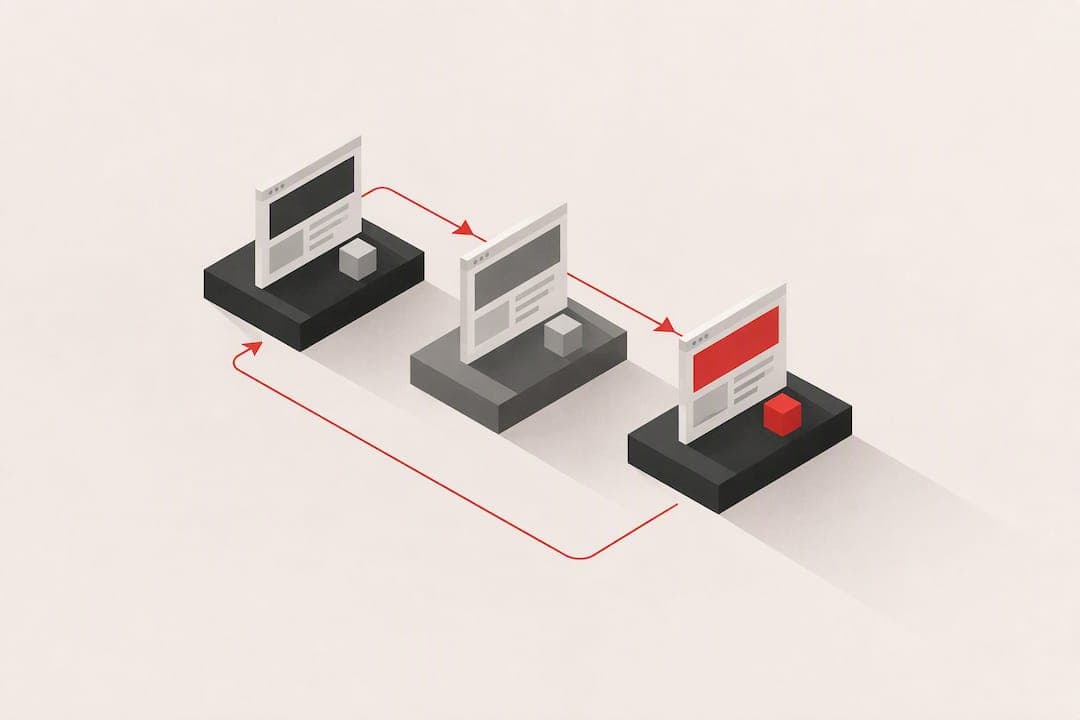
Conversion-focused website beta testing is a structured process of watching real people try to sign up, complete onboarding, or check out on your site, then fixing whatever stops them. Done well, it finds the handful of blockers, usually speed, confusing forms, or a murky onboarding flow, that quietly cap your signup and conversion rates.
TL;DR:
- Small user tests with three to five participants are sufficient to identify most critical usability issues before a larger scale effort.
- Prioritize fixes based on their estimated impact on key metrics like conversion rate and their effort to implement, focusing on speed and checkout flow.
- Use real session data alongside lab diagnostics to validate the effectiveness of fixes in realistic conditions and measure actual improvements.
- Re-test after fixes to confirm problems are resolved and prevent guessing on their success, feeding results back into your agile process.
- AI-powered diagnostics combined with human review streamline the prioritization of fixes, helping teams act quickly on the most impactful changes.
Table of Contents
- What conversion-focused website beta testing covers, and when to run it
- Plan the test: objectives, metrics, and who to recruit
- Running the sessions: scripts, data capture, and what to watch
- Turning findings into a ranked fix list
- Confirming the fix actually worked
- How combining AI diagnostics with human reviewers speeds up prioritization
- What actually matters in website beta testing
- Try a free scan before your next sprint
- FAQ
- Sources
What conversion-focused website beta testing covers, and when to run it
This guide focuses only on usability and conversion testing for live or near-live websites: finding the friction that stops a visitor from signing up, finishing onboarding, or completing a purchase. It does not cover pre-release software testing that recruits early adopters to hunt for bugs before a product ships. That is a different discipline with a different audience.
Run this kind of test at a few predictable moments:
- Before a public launch, to catch blockers while fixes are still cheap.
- After a redesign, since new layouts often introduce new friction even when they look better.
- When a conversion or signup metric drops without an obvious cause.
- Around major campaigns, so paid traffic lands on a page that actually converts.
The payoff is well documented. A 0.1-second improvement in mobile load time correlated with about 8% higher conversions on retail sites and 10% on travel sites, plus a 9.2% lift in average order value in some verticals. That is the scale of gain available from fixing problems most teams never measure.
Plan the test: objectives, metrics, and who to recruit
A test without a clear objective produces a pile of opinions instead of a fix list. Start narrow.
- Pick one or two objectives, such as "find out why mobile signup completion is low" or "diagnose checkout drop-off."
- Map each objective to a specific KPI: signup conversion rate, onboarding completion rate, or task success rate.
- Decide how you will quantify impact before launch, using conversion rate, completion rate, relative mobile conversion rate (Rel mCvR), revenue per visitor, or time-to-complete.
- Recruit participants who match your real user segments rather than a generic convenience sample.
- Run small rounds instead of one large study.
Testing with 3 to 5 users per round uncovers most usability problems, since each additional participant beyond that tends to repeat issues you already found. When your audience splits into distinct personas, such as new buyers versus returning account holders, recruit a small group for each rather than lumping them into one round.
Pro Tip: Run three to five users, fix what you find, then test again with a fresh small group instead of waiting for one big study.
Running the sessions: scripts, data capture, and what to watch
A session is only useful if it produces evidence you can act on, not a transcript of impressions. Write task-based scripts that mirror your actual funnel: "find the plan that fits your team," "complete signup," "finish your first onboarding step." Define success and failure criteria and track time-to-complete for each task.
While participants work, capture both qualitative and technical signals:
- Core Web Vitals during the session, including Largest Contentful Paint (LCP), Interaction to Next Paint (INP), and Cumulative Layout Shift (CLS).
- Time to First Byte (TTFB), plus the device and network conditions each tester used.
- Form behavior: number of fields, whether validation happens inline, how errors are worded, and whether a progress indicator exists.
- Think-aloud commentary and screen recordings, so you can see hesitation and confusion, not just the end result.
A landing page that cut Cumulative Layout Shift by about 92.7% and loaded roughly 0.4 seconds faster saw a 33.13% lift in conversion rate and a 53.37% increase in revenue per visitor in a controlled A/B test. That is the kind of result worth measuring for, not just the kind worth noticing.
Pair lab tools like Lighthouse with field data from real sessions. Lab scores tell you what should happen under ideal conditions; field data tells you what actually happens on a mid-range phone with a weak connection.

Turning findings into a ranked fix list

Raw notes from a testing round are not a plan. The next step is mapping every observed issue to its likely effect on a KPI, then ranking fixes by impact against effort.
Use research as a sanity check on your estimates rather than a substitute for your own data:
- Speed issues often carry outsized impact; even fractional load-time gains have moved conversion and order value in measured case studies.
- Checkout friction is a known high-impact area. Baymard's research suggests the average e-commerce site can improve conversions by roughly 35% through checkout usability fixes like form simplification and clearer microcopy.
- Onboarding copy and field-count reductions are usually low-effort, high-frequency wins.
Score each issue by expected impact (low, medium, high) against the effort to fix it, and prioritize high-impact, low-effort items first.
| Issue type | Typical impact | Typical effort |
|---|---|---|
| Page speed (LCP, TTFB) | High | Medium |
| Checkout form simplification | High | Low |
| Onboarding copy clarity | Medium | Low |
| Navigation restructuring | Medium | High |
Every ranked fix should include an owner, an effort estimate, a testable acceptance criterion ("signup form completion rate increases on re-test"), and a rollback plan in case the change backfires.
Confirming the fix actually worked
A fix that looks right in a demo is not proven until you measure it against real traffic. When you have enough volume, run an A/B test comparing the new version against the original and measure conversion rate and revenue per visitor directly.
- When traffic is too low for a reliable split test, use relative mobile conversion rate (Rel mCvR) to isolate the effect of a mobile-specific change from desktop performance, marketing shifts, or seasonal noise.
- Choose a test window that avoids major campaigns, holidays, or pricing changes that could distort the result.
- Re-run a small qualitative test with a fresh 3 to 5 person group after shipping, to confirm the original problem is gone and that the fix did not introduce a new one.
Pro Tip: Treat every fix as a hypothesis. Measure it, do not assume it worked just because it looked better in review.
Feed every validated result back into your agile backlog as a ranked, evidenced item rather than a one-off ticket, so the next sprint planning session already has the data it needs.
How combining AI diagnostics with human reviewers speeds up prioritization
Manually running the full cycle, planning, scripting, testing, analyzing, and ranking, takes real time, and most teams repeat it too rarely to build momentum. Our engine runs both AI-driven diagnostics and human beta tester reviews across several layers including technical SEO, performance, UX and navigation, conversion, accessibility, trust and security, and onboarding.
Instead of a stack of raw observations, we return a ranked fix list ordered by expected impact, so engineering time goes to the change most likely to move signups or onboarding completion first. Reviewers check the platform's approach directly if they want to see how the layered audit maps to a prioritized dashboard rather than a generic report.
What actually matters in website beta testing
Most advice on this topic treats every usability issue as equally urgent, which wastes engineering time on changes that barely move the needle. The teams that improve conversion fastest are the ones that measure impact before committing resources, not the ones that run the most tests.
Small, iterative sessions with three to five participants are underrated. Teams chase large-scale studies because they feel more rigorous, but a tight loop of test, fix, re-test catches more real problems per hour spent. Speed is also underrated as a conversion lever: it rarely gets the same attention as copy or layout, yet the measured gains from shaving load time are often larger.
The mistake to avoid is treating a single round of testing as finished work. A fix shipped without a re-test is a guess with better production values. Prioritize by impact and effort, measure what you ship, and keep the loop short. That discipline matters more than any single tool or technique.
— William
Try a free scan before your next sprint
The fastest way to see where your site loses signups is to run a scan rather than guess. Our free scan gives you a first look at where visitors stall, and our paid tiers add human tester reviews on top of the automated diagnostics for a fuller picture.
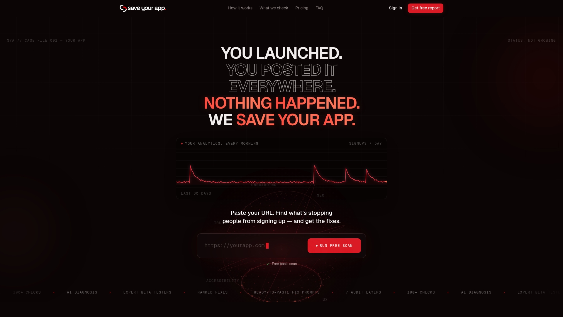
The Solo and Founder plans each offer subscription access with different feature sets; an Extra 3-day test is available as a paid add-on for fast additional reviews between regular cycles. For current pricing details, please refer to the pricing page on our website. Compare the plan details on our pricing page and start with whichever tier matches how often you plan to test.
FAQ
What is conversion-focused website beta testing?
It is structured usability and conversion testing on a live or near-live website, aimed at finding what stops visitors from signing up, finishing onboarding, or completing a purchase. It combines small user testing rounds with technical measurement rather than general software bug hunting.
How many users do I need for a usability test round?
Testing with 3 to 5 users per round typically surfaces most usability problems in that round. Running several small rounds with fixes in between tends to find more real issues than one large study.
How much can fixing checkout usability improve conversions?
Baymard's research suggests the average e-commerce site can improve conversions by roughly 35% through checkout usability fixes such as form simplification and clearer error messaging. The exact gain depends on how much friction currently exists in your flow.
What is Rel mCvR and when should I use it?
Relative mobile conversion rate (Rel mCvR) compares mobile conversion against desktop conversion to isolate the effect of a mobile-specific change from marketing or seasonal shifts. It is most useful when traffic volume is too low to run a reliable A/B test.
How does Save Your App help prioritize fixes after testing?
Our engine combines AI-driven diagnostics with human tester reviews across multiple audit layers, then returns a ranked fix list ordered by expected impact. Plans start with a free scan, and paid tiers on our pricing page add deeper human review.
Sources
- Web
- Reasons for cart abandonment – Baymard
- Why you only need to test with 5 users | Nielsen Norman Group