
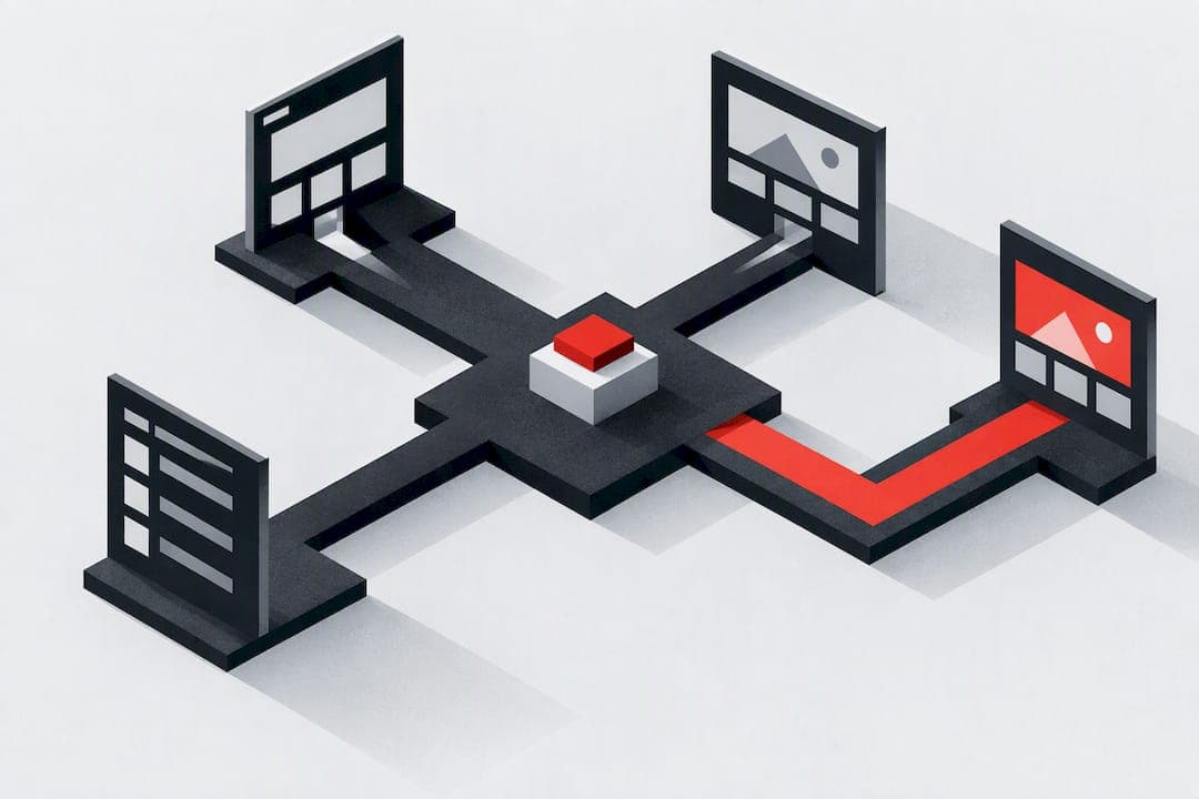
Three changes move the needle most: trim your top-level menu to items users actually recognize, align your information architecture to how people think using card sorting and tree testing, and make navigation visible and thumb-friendly on mobile. Baymard Institute benchmarks show most sites still perform poorly here, which means fixing these three areas tends to produce fast, measurable gains in findability and conversion.
TL;DR:
- Most sites still perform poorly in navigation design, especially on mobile, which hampers findability and conversion.
- Choosing the right pattern depends on site content and user needs, with vertical sidebars for content-heavy sites and mega menus for large catalogs.
- Effective labels, validated through card sorting and tree testing, ensure menus match user search behavior and reduce confusion.
- Mobile navigation should prioritize thumb-friendly actions, avoid deep nesting, and use persistent footer or bottom tabs for primary tasks.
- Quick fixes like trimming menu items, adding breadcrumbs, and increasing touch target size can significantly improve navigation within a day.
Table of Contents
- Which navigation pattern fits your site?
- How should you structure and label your menu?
- Designing navigation for mobile screens
- Accessibility and semantic navigation basics
- A conversion-minded checklist for menu design
- How to test navigation changes before you ship them
- Quick wins you can ship this week
- Why navigation deserves more attention than it gets
- Get a prioritized navigation audit instead of guessing
- Sources
- FAQ
Which navigation pattern fits your site?
Picking a pattern starts with asking how much content you have and how often users need to jump between sections. Horizontal top navigation works well for sites with five to seven main sections and suits most marketing sites and small business pages. Vertical sidebars fit content-heavy sites like documentation or dashboards, where users scan a long list of categories while staying on one page.
Mega menus solve a different problem: they expose deep catalogs without forcing users to click through multiple screens, which makes them common on large e-commerce sites. Footer navigation is a safety net. It rarely drives primary discovery, but it catches users looking for support links, legal pages, or company information after they've already explored the top nav.

Hamburger menus save space but cost discoverability. NN/g research found that hidden navigation produces lower task success and higher difficulty than visible navigation where screen space allows, so hamburger menus work best for secondary content, not primary destinations. Bottom tab bars solve this on mobile apps and app-like sites by keeping three to five key actions always visible.
Quick rules of thumb:
- Small sites and portfolios: a simple horizontal nav with five or fewer items.
- Content sites and blogs: horizontal nav plus a search bar, with categories in a dropdown.
- E-commerce catalogs: mega menus for categories, paired with filters and breadcrumbs.
- Web apps and dashboards: vertical sidebar nav, collapsible for focus mode.
Progressive disclosure, showing only what's relevant at each step, works across all four patterns when a full menu would overwhelm a first-time visitor.
How should you structure and label your menu?
Most broken navigation isn't a design problem. It's a research problem. Teams build menus around their org chart ("Solutions," "Platform," "Resources") instead of how customers actually search for things, and NN/g has documented this mismatch repeatedly.
Two methods fix this, run in sequence:
- Card sorting uncovers how users naturally group your content, before you've committed to a hierarchy.
- Tree testing validates a proposed hierarchy by asking users to find specific items within it, with no visual design to bias them.
NN/g explains that card sorting is a discovery tool while tree testing is a validation tool, and skipping one or the other leaves gaps. Card sorting alone tells you how people group things but not whether your actual labels work. Tree testing alone validates a structure you never confirmed matches user expectations in the first place.
A few labeling rules keep things grounded:
- Use words your customers use, not internal product names or department titles.
- Limit hierarchy depth to about three levels. Beyond that, users lose track of where they are.
- Cross-list an item in two categories only when user data shows people genuinely look for it in both places.
The practical process looks like this: draft a sitemap, run a card sort to see how users group the content, build a proposed tree from those results, validate it with a tree test, then iterate based on where people got lost.
Pro Tip: Run your tree test with a working prototype of the final visual design when you can. Plain-text tree tests tend to produce more conservative success rates than a finished page, which supplies extra information scent.
Designing navigation for mobile screens
Phone screens punish bad navigation decisions fast. What works on a widescreen monitor often buries critical links on mobile, where thumb reach and screen real estate are both limited.
- Put primary actions in a bottom tab bar or a persistent header. These sit in the easiest thumb zone and stay visible during scrolling.
- Reserve the hamburger icon for secondary links: account settings, legal pages, or rarely used sections. NN/g's research on hidden navigation applies even more strongly on mobile, where every tap costs attention.
- Keep touch targets at least 44 by 44 pixels with enough spacing between them that a thumb doesn't trigger the wrong link.
- Write full link text on mobile instead of truncating. "Shipping & Returns" beats "Shipping" when space allows, because mobile users can't hover to confirm a guess.
- Avoid nesting more than two levels deep in a mobile menu. Each additional tap to reach a destination increases the chance someone gives up.
The core mistake is treating mobile navigation as a smaller version of desktop navigation. It needs its own hierarchy decisions, built around what people actually do on a phone: quick checks, narrow tasks, less patience for exploration.
Accessibility and semantic navigation basics
Accessible navigation benefits every visitor, not just people using screen readers or keyboards. Semantic structure gives browsers and assistive technology a map of the page that visual design alone doesn't provide.
- Wrap navigation in a
<nav>element and main content in<main>, and label multiple navigation regions (for example, "Primary" and "Footer") so assistive technology can distinguish them. - Add a visible skip link as the first focusable element on the page, letting keyboard users bypass repeated navigation and jump straight to content.
- Keep a visible focus state on every interactive element and maintain a logical tab order that follows the visual layout.
- Use ARIA attributes only where semantic HTML can't do the job alone. Overusing ARIA often creates more confusion than it solves.
W3C's WAI guidance on landmarks recommends exactly this combination of semantic landmarks and skip links to make navigation programmatically discoverable, and it measurably speeds up navigation for keyboard and screen-reader users.
Baymard's 2025 benchmarking of over 16,000 UX performance scores found that 67% of mobile e-commerce sites and 58% of desktop sites perform at a mediocre-to-poor level for homepage and category navigation, which means the majority of sites are still losing visitors to avoidable navigation friction.
A conversion-minded checklist for menu design
Good menu design isn't about looking clean. It's about reducing the number of decisions and dead ends between a visitor and the thing they came for.
- Keep five to seven items in your top-level menu. Beyond that, users scan slower and recall less.
- Show navigation on larger screens rather than hiding it behind an icon. NN/g's menu-design checklist lists this as one of its core recommendations, alongside indicating the user's current location within the site.
- Make parent menu headers clickable, not just hover triggers, so touch and keyboard users aren't stuck.
- Use click-activated submenus instead of hover-only patterns, another point NN/g's checklist emphasizes directly.
- Apply a 300 to 500 millisecond hover delay on dropdown triggers. Baymard's product-finding research flags this small tweak as eliminating accidental submenu activations, a low-effort fix with outsized payoff.
- Place breadcrumbs just below the main navigation on any page more than one level deep, so users always know how to retreat.
- Keep your highest-priority call to action visually distinct from navigation links, usually with a button style rather than plain text.
- Avoid full-screen menu takeovers on desktop. They hide content and context that a dropdown or sidebar can preserve.
Order matters as much as the items themselves. Put your most-used or highest-converting sections first, left to right, since that's where scanning attention concentrates. This also has a secondary benefit: the pages linked earliest and most prominently in your navigation tend to accumulate more internal link equity, which affects how search engines weigh their importance.
Pro Tip: Check your analytics for which nav items get clicked least, then test removing or relabeling them before adding anything new. Simplifying by subtraction usually beats adding another menu item.
How to test navigation changes before you ship them
Testing navigation isn't optional if you want to know whether a redesign actually helps. The two foundational methods, run in order, are card sorting for discovery and tree testing for validation, each suited to a different stage of the process.
- Run a card sort early, with real users, before you've locked in a hierarchy.
- Build a tree from the results and validate it with a tree test, measuring success rate, directness (did they go straight to the answer or backtrack), and time on task.
- Pair qualitative testing with analytics: site search logs reveal what people couldn't find through navigation alone, and first-click testing shows whether your top-level labels send people the right direction on the very first try.
- Watch funnel drop-off points to prioritize which navigation fixes to test first, focusing on the steps losing the most visitors.
- Run an A/B test on the specific change, not the whole redesign at once, so you can attribute any shift in conversion to that one variable.
Tree testing isolates labels from visual design, which tends to produce more conservative success-rate numbers than the finished page will deliver once visual cues like icons and emphasis supply extra context.
| Method | Best for | Typical output |
|---|---|---|
| Card sorting | Discovering how users group content | Clustering patterns and suggested categories |
| Tree testing | Validating a proposed hierarchy | Success rate, directness, time on task |
| First-click testing | Checking if top-level labels point the right way | Pass or fail on the first click |
| A/B testing | Measuring the impact of a specific change live | Conversion or engagement delta |
One common pitfall in single-page applications: changing navigation structure without properly updating browser history can break the back button, frustrating users who expect it to work the way it does everywhere else on the web.
Quick wins you can ship this week
Some navigation fixes take an afternoon and still move metrics. Start here before planning a bigger overhaul.
- Cut your top-level menu down toward five to seven items by combining or removing rarely clicked ones.
- Make every parent menu header clickable instead of hover-only.
- Add breadcrumbs to any page sitting more than one level deep.
- Add a visible skip link as the first focusable element on the page.
- Increase mobile touch targets to at least 44 by 44 pixels with clear spacing.
- Add a 300 to 500 millisecond hover delay to dropdown triggers to stop accidental submenu flicker.
A simple impact-versus-effort view helps decide what to fix first:
| Fix | Effort | Expected impact |
|---|---|---|
| Add hover delay to dropdowns | Low | Fewer accidental clicks, smoother browsing |
| Make parent headers clickable | Low | Faster access for touch and keyboard users |
| Add breadcrumbs | Low | Clearer orientation on deep pages |
| Trim top-level menu items | Medium | Faster scanning, less decision fatigue |
| Restructure IA via card sort and tree test | High | Better long-term findability across the site |
A site that moved its five least-clicked top-level links into a footer menu typically sees the remaining items get scanned faster, since there's simply less to process. A site that added a visible skip link and fixed its tab order usually sees keyboard users complete tasks without getting stuck on repeated navigation blocks. Neither fix takes more than a day of development time.
Why navigation deserves more attention than it gets
Teams treat navigation as a solved problem once the site launches, then wonder why signups or conversions plateau months later. The real issue is rarely the offer or the design polish. It's that visitors can't find the page that would convince them, so they leave before they ever see your strongest argument.
The gap between what navigation promises (an intuitive site) and what it delivers is usually a testing gap, not a design gap. Teams pick a menu structure based on internal consensus, ship it, and never check whether real users navigate it the way the team assumed. A prioritized, research-backed diagnostic, the kind a tool like Save Your App is built to produce, can surface which navigation and onboarding issues cost the most conversions before a redesign goes live, saving weeks of guesswork.
Decisions about labels and hierarchy should come from watching people struggle, not from the loudest voice in a planning meeting.
— William
Get a prioritized navigation audit instead of guessing
Fixing navigation by instinct means testing one change at a time and waiting weeks to see if it worked. Save Your App shortens that cycle by running your page through its Prism Engine™ alongside human beta tester reviews, covering seven audit layers including UX & Navigation, and returning a ranked list of fixes by impact instead of a vague list of suggestions.
Each audit produces a scored PDF report plus a prioritized remediation list, so you know whether to fix your menu labels or your mobile tap targets first. A free scan is available for a first look, and paid plans unlock repeated audits and deeper human review. For readers running their own research first, a client discovery questionnaire can help structure stakeholder interviews before a redesign.
Check Save Your App's pricing for the Free, Solo, and Founder plans, or start with a free scan to see where your navigation stands today.
Sources
- Homepage & Category Navigation UX best practices – Baymard
- Hidden navigation methodology – Nielsen Norman Group
- H101: Providing landmarks – W3C WAI
FAQ
How to make a website easier to navigate?
Keep your top-level menu to five to seven labeled items that match how users describe your content, not your internal org chart. Validate the structure with a tree test, make navigation visible rather than hidden behind an icon on larger screens, and fix mobile touch targets and hover delays as quick, low-effort wins.
What makes a good website navigation?
Good navigation is visible on desktop, consistently labeled, and limited to around three levels deep so users always know where they are and where they can go. NN/g's menu-design checklist recommends showing the user's current location and avoiding hover-only submenus as two of its core guidelines.
Can I automate website navigation?
You can automate parts of navigation testing and diagnosis, such as running analytics-driven audits that flag broken links, unclear labels, or poor mobile tap targets, but the underlying structure still benefits from user research like card sorting and tree testing. Tools that combine automated diagnostics with human review, such as Save Your App, can speed up finding which navigation issues matter most.
How to keep navigation clear and consistent across a website?
Use the same menu structure, labels, and placement on every page so users build a reliable mental model of the site. Reinforce this with breadcrumbs on deep pages and a clear indication of the current section, both of which NN/g's research ties to lower navigation friction.