

An exit intent popup appears the instant a visitor's behavior signals they're about to leave, and it exists to recover an otherwise lost lead or sale before the tab closes. Marketers use the tactic to capture an email address, offer a discount, or stop cart abandonment in its tracks. When built well, these popups can lift conversions measurably, which we unpack with real metrics below.
TL;DR:
- Exit intent popups triggered by cursor movement on desktops are highly specific, but mobile triggers like scroll depth and inactivity are less precise.
- Full-screen overlays generate higher engagement but can harm user experience and search rankings if used improperly on mobile devices.
- The effectiveness of exit intent popups depends on targeting the right pages, timing, and offers, with mobile usage requiring separate testing and formats.
- Tracking metrics such as conversion uplift, email capture, and bounce rate changes help assess popup performance and long-term impact on retention.
- Ensuring technical setup and legal compliance, including consent and accessibility, is crucial before deploying exit intent popups.
Table of Contents
- How exit intent popups work: triggers and variants
- Do exit intent popups work? Evidence, metrics, and common failure modes
- Best practices and UX guidelines for popups that convert without annoying people
- High-performing examples and ready-to-use templates
- Mobile-specific triggers and softer alternatives that avoid false positives
- Implementation checklist and tools: what to configure before you launch
- How to design A/B tests and measure lift correctly
- Fix the page first: a diagnostic checklist before you invest in popups
- Quick decision heuristics for when a popup actually helps
- A different starting point: audit before you add another popup
- FAQ
- Sources
How exit intent popups work: triggers and variants
An exit intent popup fires based on a behavioral signal that software interprets as "this person is leaving." On desktop, that signal is usually cursor movement. A script tracks the mouse position continuously, and when the cursor crosses the top edge of the browser window toward the tab bar or address bar, the software flags it as an exit attempt and triggers the overlay. This works reasonably well because the gesture is specific: people rarely move their mouse to the very top of the screen unless they're reaching for a tab, a bookmark, or the back button.
Mobile devices don't have a cursor, so there's no equivalent gesture to track. Instead, mobile exit intent relies on proxies: a fast upward scroll, a tap on the browser's back button, or simple inactivity timers that assume a motionless visitor is about to bounce. These proxies are far less precise than desktop cursor tracking. A visitor scrolling up to reread a paragraph looks identical to one who's leaving, which is why mobile exit-intent needs separate testing rather than a straight copy of the desktop logic.
Once you've picked a trigger, you still need to choose a format. Each variant trades visibility for intrusiveness:
- Full-screen overlays command the most attention and work well for one-time, high-value offers like a discount code or lead magnet.
- Slide-ins appear in a corner and feel less disruptive, suiting ongoing newsletter or content prompts.
- Top or bottom banners stay subtle and are the safer choice on mobile, where full overlays risk penalizing your search visibility.
- Microsurveys ask a single question instead of pushing an offer, useful when you want to learn why someone is leaving rather than stop them.
Before building anything, decide on four things: which pages warrant a popup at all, which trigger fits the device, which variant matches the offer's weight, and how the exit event will be logged in your analytics so you can measure what happens next.
Do exit intent popups work? Evidence, metrics, and common failure modes
Exit intent popups can work, but "work" depends entirely on which metric you're watching and whether you've isolated it from noise elsewhere on the page. The honest answer is that they recover a slice of visitors who were already leaving, not a windfall of new demand, and treating them that way keeps expectations realistic.
Mobile traffic now makes up a large share of total website visits, according to Statista's mobile traffic data, which means a desktop-only exit strategy ignores a large part of your audience by design. Any popup program that doesn't separately address mobile is only solving part of the problem.
The metrics worth tracking fall into five groups:
- Conversion uplift on the specific page where the popup fires, measured against a holdout group that never sees it.
- Email capture rate as a share of unique visitors exposed to the trigger, not just impressions.
- Revenue per visitor on the exposed segment, which catches cases where a discount popup boosts signups but erodes margin.
- Bounce rate change immediately after launch, since a spike usually means the popup is firing too aggressively or too early.
- Downstream retention, because an email captured through a hard discount sometimes unsubscribes within weeks.
Several failure modes show up repeatedly. Poor targeting is the most common: firing the same popup to a first-time visitor and a returning customer wastes the gesture on someone who already trusts you. Mobile misuse comes next, when a desktop overlay gets ported over without adjusting for touch behavior, producing false triggers that frustrate rather than retain. A third failure mode is quieter but more damaging over time: repeated, aggressive popups condition visitors to distrust the brand, which shows up months later as lower repeat-visit rates. Finally, Google Search Central's guidance on intrusive interstitials warns that overlays obscuring main content can hurt both user experience and search ranking, so a popup that technically converts well can still cost you organic traffic.
A realistic ROI calculation weighs the incremental revenue from captured leads against the cost of any bounce rate increase and the long-term value of subscribers acquired through a discount versus those who opted in organically. A popup that lifts short-term conversions by double digits but drives unsubscribes within a month hasn't actually paid for itself.
Best practices and UX guidelines for popups that convert without annoying people
A popup earns its place on the page only when it respects the visitor's attention instead of ambushing it. The guidelines below cover copy, offers, timing, accessibility, and the legal boundaries that increasingly shape how these tools get built.
- Keep copy to one focus. A single headline, one value proposition, and one call to action outperform a popup trying to sell three things at once.
- Match the offer to the visitor's stage. A first-time visitor responds to a discount or free shipping threshold, while a returning visitor often responds better to a content upgrade or a chat offer than another coupon.
- Cap frequency per visitor. Showing the same popup on every page load trains people to close it reflexively; a reasonable rule is no more than one popup per visitor within a seven-day window.
- Respect session context. Don't trigger a popup within the first few seconds of a session, and don't refire it the moment someone dismisses it and keeps browsing.
- Build in keyboard accessibility. A popup needs a visible close control, a clear focus state when it opens, and a way to dismiss it using the Escape key or Tab navigation, not just a mouse click on a tiny X.
- Avoid obscuring the page on entry. Per Google's interstitial guidance, full-page takeovers that block content as soon as a page loads risk a search penalty; banners or smaller overlays triggered by genuine exit signals are safer.
Pro Tip: Test your close button on a phone before launch: a hit target under 44 pixels is hard to tap accurately and frustrates exactly the visitors you're trying to keep.
Offer selection deserves its own thought. E-commerce sites typically see the strongest response from a time-limited discount or a free shipping threshold nudge. SaaS products do better offering a trial extension or a demo booking rather than a price cut, since discounting a subscription undermines the pricing page you worked hard to build. Content sites get the most mileage from a content upgrade (a checklist, template, or extended guide) tied directly to the article the visitor was reading when they tried to leave.
Timing and frequency rules exist for a reason beyond politeness. A visitor who's already annoyed by a popup is statistically more likely to bounce entirely, which erases any upside the offer might have delivered. Session caps and revisit rules aren't just UX niceties, they're risk management for your bounce rate.
High-performing examples and ready-to-use templates
Specific copy beats generic copy, so here are templates organized by use case that you can adapt directly.
E-commerce:
- Cart abandonment discount: "Still thinking it over? Here's 10% off to complete your order, valid for the next hour."
- Free shipping threshold: "Add $12 more to your cart and shipping is on us."
- Low-stock urgency: "Only 3 left in your size. Complete your order before it's gone."
SaaS and product:
- Trial extension: "Not ready to decide? We'll add 7 more days to your trial, no card required."
- Demo request: "Questions before you commit? Book 15 minutes with our team."
- Feature checklist download: "Here's the feature comparison you were looking for, sent straight to your inbox."
Content and lead generation:
- Newsletter signup: "Get one sharp insight on [topic] every week. No spam, unsubscribe anytime."
- Content upgrade: "Grab the full checklist from this article as a free PDF."
- Webinar CTA: "Seats are filling up for Thursday's session. Save yours before you go."
Beyond straight copy, a handful of creative mechanics consistently outperform static text-and-button popups, though they come with higher production effort. A spin-to-win wheel that reveals a randomized discount tends to lift engagement because it feels like a game rather than a sales pitch, and a visible countdown timer attached to a limited offer creates urgency that a flat percentage-off claim doesn't. Both mechanics are worth testing on your highest-traffic pages first, since the lift has to justify the extra development time, and neither belongs on a page where the underlying offer isn't compelling enough to survive the gimmick being stripped away.
Mobile-specific triggers and softer alternatives that avoid false positives
Cursor-based exit intent simply doesn't exist on a touchscreen, so trying to force the desktop logic onto mobile produces a popup that fires at the wrong moment far more often than it helps. Smashing Magazine's guidance on mobile interstitials points out that mobile proxies for exit intent carry meaningfully higher false-positive rates than desktop tracking, which means a mobile popup triggered the same way as its desktop counterpart will likely annoy more visitors than it converts.
Safer mobile triggers include:
- Scroll depth, firing a popup only after a visitor has engaged with a meaningful portion of the page rather than guessing at their intent to leave.
- Intent-based timers, which wait for a period of inactivity long enough to suggest disengagement rather than normal reading pauses.
- Back-button intercepts, used cautiously since they can feel like the page is fighting the visitor's native navigation.
Rather than a full-screen overlay, mobile tends to respond better to softer formats: a sticky bottom bar with a single offer, an inline banner woven into the content itself, or a soft modal that covers only part of the screen and leaves an obvious path back to browsing. These formats respect the smaller screen and avoid the search penalty risk tied to full-page interstitials.
Treat mobile as its own experiment track rather than an afterthought bolted onto a desktop campaign. Measure bounce rate and back-button rate separately for mobile sessions exposed to a popup versus a holdout group, since a rising bounce rate on mobile specifically is the clearest signal that your trigger logic needs adjusting before you scale it further.
Implementation checklist and tools: what to configure before you launch
Most teams reach for one of three tool categories: a no-code popup builder for fast deployment, a CMS plugin when the platform already has a popup ecosystem built in, or Google Tag Manager paired with custom code when you need tighter control over triggers and data layer events. The right choice depends on how much customization your offer actually needs versus how quickly you need it live.
Before launch, work through this sequence:
- Select target pages based on traffic volume and existing exit rate, prioritizing pages where visitors already show high abandonment.
- Map user segments so a first-time visitor and a returning customer don't see identical messaging.
- Craft the offer to match the segment and page, using the templates above as a starting point rather than a final draft.
- Set triggers and frequency caps, choosing desktop cursor tracking and mobile-specific alternatives separately rather than one rule for both.
- Test across devices before going live, checking tap targets, load time, and whether the close button is reachable with one thumb on a phone.
Integration work matters as much as the popup itself. Confirm the popup pushes captured emails directly into your email provider and CRM, fires a distinct analytics event so you can separate popup-driven conversions from organic ones, and connects to any personalization logic you're running so a visitor who already converted doesn't see the same offer again. Reviewing your product page messaging before adding a popup is worth doing at this stage too, since a popup layered on top of unclear pricing or a confusing layout rarely fixes the underlying problem.
Watch for three common technical pitfalls: a popup script that loads synchronously and slows the page, layout shift caused by the popup rendering after the page has already settled (which hurts Core Web Vitals), and consent banners that conflict with the popup's own opt-in flow, creating a confusing double-ask that cannot satisfy the EDPB's requirement for clear, specific consent.
How to design A/B tests and measure lift correctly
Testing a popup without a structured experiment is how teams end up making decisions off noise. Start with a clear hypothesis and isolate one variable at a time.
- Test offer versus no offer first, since this tells you whether the popup adds value at all before you optimize anything else.
- Test copy variants once you've confirmed the offer works, changing headline or CTA wording while holding the offer constant.
- Test timing variants, comparing an earlier trigger against a later one to find the point where intent is clearest without feeling premature.
- Run desktop and mobile as separate experiments, since combining them hides which device is actually driving the result.
Segment your results by traffic source, new versus returning visitors, and cart value where relevant, since a popup that performs well for paid traffic can underperform for organic visitors who already trust the brand.
A holdout experiment lasting several weeks with a balanced traffic split on high-traffic pages can provide sufficient time to measure both immediate conversion lift and one-month retention, which matters because a popup can win on day one and quietly cost you subscribers by day thirty. Before declaring a winner, check that your sample size is large enough to distinguish a real effect from random variation, and weigh statistical significance against practical significance: a technically significant 0.3% lift may not be worth the added complexity.
Track downstream metrics alongside the headline conversion number: unsubscribe rate, churn among popup-acquired leads, and revenue per user over the following month. A follow-up sequence of automated emails to re-engage leads after capture can also reveal whether a popup-sourced lead behaves differently from one who signed up organically.
Fix the page first: a diagnostic checklist before you invest in popups
Before adding a popup, it's worth asking whether the page itself is the reason visitors are leaving. A short diagnostic checklist helps: is the core message clear within the first few seconds, is onboarding confusing once someone signs up, is the page slow to load, and is pricing presented transparently or buried behind vague language? Any one of these can explain an exit rate that no popup will meaningfully fix.

This is where a ranked, audit-first approach earns its keep. Rather than guessing which of these issues matters most, a structured audit that scores technical SEO, performance, UX, conversion, accessibility, trust, and onboarding against each other tells you which fix actually moves the needle first. Our Save Your App audit combines AI-driven diagnostics with human expert reviews across seven layers to surface exactly these barriers, then ranks them by impact so the highest-value fix is obvious instead of debated. A popup recovers visitors who were already leaving; a ranked fix list addresses why they wanted to leave in the first place.
Quick decision heuristics for when a popup actually helps
Deploy a popup when your page already converts reasonably well and you want to recover the remaining sliver of undecided visitors, not as a patch for a page that's fundamentally confusing. If your bounce rate is high and an obvious UX issue (slow load, unclear pricing, broken onboarding) is staring back at you, fix that first: a popup layered on a broken page just adds friction to friction. A popup makes the most sense as a short, well-measured experiment, four weeks, a clear holdout group, and a willingness to kill it if retention dips, rather than a permanent fixture you install once and forget.
— William
A different starting point: audit before you add another popup
Popup builders and CMS plugins solve one problem well: getting an offer in front of a leaving visitor. What they don't do is tell you whether that visitor was leaving because of something fixable on the page itself. That's the gap an audit-first approach closes.
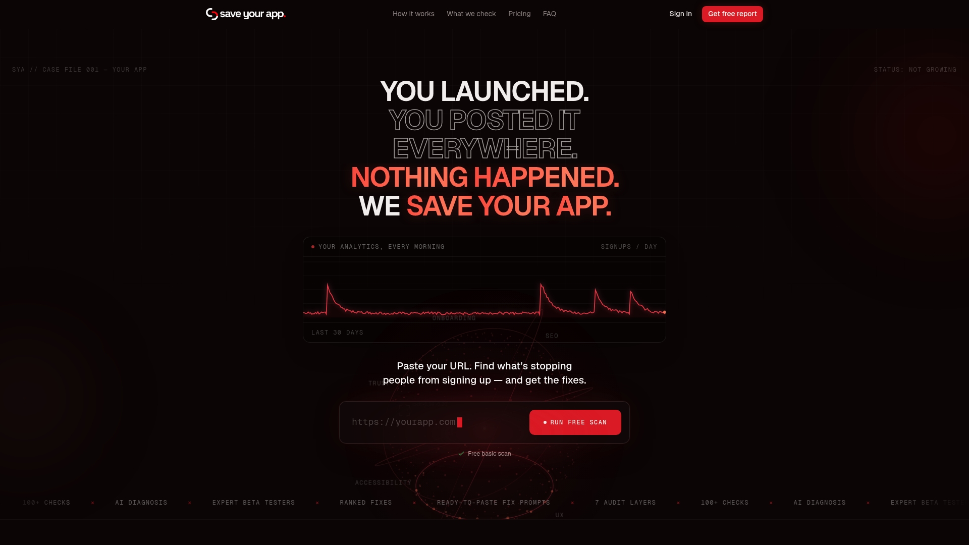
Our Prism Engine™ runs AI-driven diagnostics paired with human beta tester reviews across seven audit layers, from onboarding friction to pricing clarity, and returns a ranked list of fixes instead of a generic report. For teams weighing whether to spend on another popup tool or fix the underlying page, that ranking makes the decision concrete rather than a guess.
- Run a free scan to see which conversion barriers rank highest on your own pages.
- Compare the audit's findings against your current exit rate before committing to a new popup campaign.
- Upgrade to the Solo plan at $49 per month or the Founder plan at $129 per month for repeated audits and full human-reviewed feedback as your site changes.
If you're ready to see what's actually costing you signups, check your plan options and start with a scan.
FAQ
Are exit intent popups good for conversions?
Exit intent popups can be a useful, low-cost way to recover visitors who were already leaving, particularly for email capture and cart recovery offers. Their effectiveness depends heavily on targeting, timing, and offer quality, and a poorly targeted popup can raise bounce rates instead of lowering them.
How do exit intent popups work?
On desktop, exit intent popups track cursor movement and trigger when the mouse moves toward the browser's top edge, signaling an attempt to close the tab or navigate away. On mobile, there's no cursor to track, so the trigger relies on proxies like fast upward scrolling, back-button taps, or inactivity timers, which carry higher false-positive rates than desktop tracking.
How do you trigger exit intent on a webpage?
Exit intent is typically triggered with a script that monitors mouse position in real time and fires an action once the cursor crosses a threshold near the top of the viewport. Developers can set this up through a no-code popup builder, a CMS plugin, or custom code deployed via Google Tag Manager, depending on how much control the campaign needs.
How do you do an exit intent popup on mobile?
Since mobile devices lack a cursor, exit intent on mobile relies on proxy signals such as scroll depth, time-based inactivity, or a back-button press rather than true cursor tracking. Many teams choose softer mobile-specific formats instead, like a bottom bar or inline banner, since full overlays risk both false triggers and a search penalty for intrusive interstitials.
Do exit popups need GDPR consent?
Any popup collecting personal data, such as an email address, needs consent that is freely given, specific, and easy to withdraw, not inferred from passive behavior like scrolling. The EDPB's consent guidelines make clear that withdrawing consent must be as simple as giving it, so your popup's opt-out needs to be as accessible as its opt-in.