
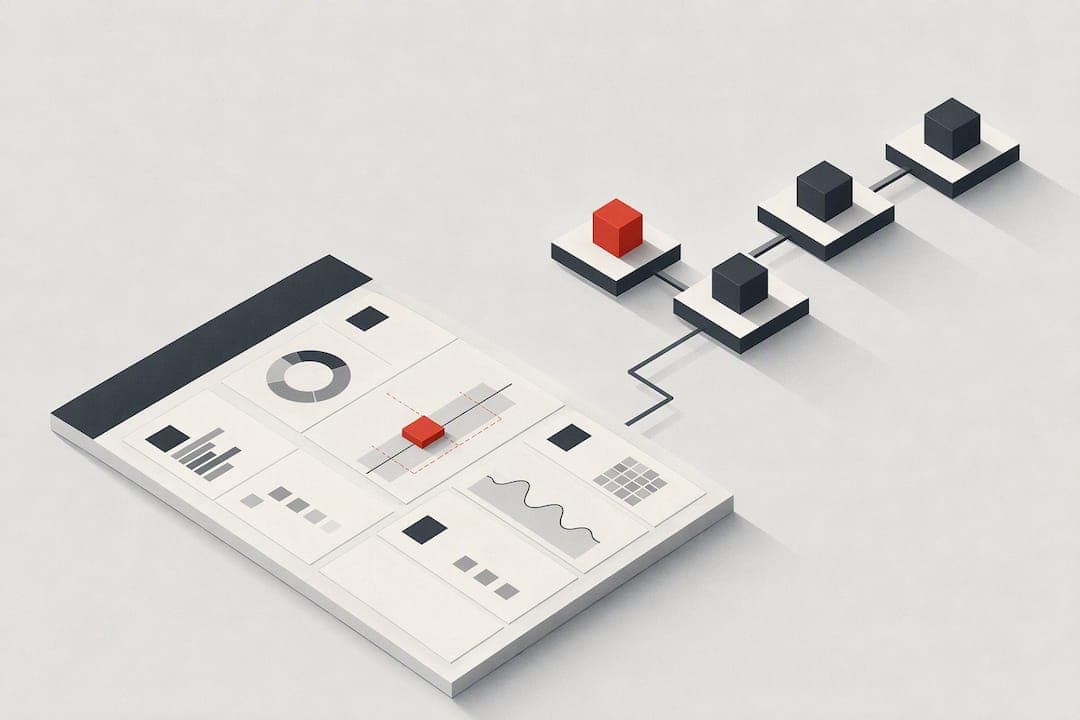
A UX scorecard is a structured, repeatable way to measure usability across defined tasks and turn the results into ranked fixes. Product teams use one when they need a baseline to track over time, not a one-off gut check. Run it before a major release, after a redesign, or on a set cadence to catch drift before it shows up in churn.
TL;DR:
- Running a scorecard every three to six months with the same set of tasks ensures meaningful trend tracking over time.
- Sample sizes below ten participants should be treated as directional evidence, with results reported alongside confidence intervals to account for uncertainty.
- Prioritizing fixes should focus on tasks scoring in the "needs work" or "poor" bands, especially when those tasks have high traffic or impact.
- Automated diagnostic tools combined with human review streamline baseline scans and speed up identifying critical usability issues.
- Context-specific weighting of metrics is essential, with failure-critical tasks in transaction flows receiving more emphasis than engagement-focused features.
Table of Contents
- What a UX scorecard measures and why teams use it
- Essential UX metrics and a simple grading rubric
- Step-by-step workflow to create and run a UX scorecard
- How to interpret scorecard numbers without overselling them
- Recommended cadence and how to benchmark over time
- A compact scorecard template and example fields to copy
- How automated audits and human review strengthen a scorecard
- How to present scores to stakeholders responsibly
- Integration of qualitative data with quantitative UX scorecard metrics
- How to tailor a UX scorecard to different product types or user segments
- Comparison of UX scorecards with other UX measurement methods
- Case studies or examples of UX scorecard impact on product decisions
- Mistakes worth avoiding and how to fix them
- How Save Your App fits into a scorecard workflow
- Sources
- FAQ
What a UX scorecard measures and why teams use it
A UX scorecard is a scenario-based snapshot: you pick real tasks, watch or track how people complete them, and score the results against a fixed rubric. It is not a survey and not a vague "how did that feel" debrief. The value comes from repeating the same scenarios over time so scores are comparable.
Teams reach for a scorecard in a few recurring situations:
- Benchmarking a product against its own past performance or a competitor category
- Prioritizing a backlog of usability fixes by measured impact rather than opinion
- Checking onboarding flows before and after a redesign
- Running a pre-release gate to catch regressions before shipping
ISO 9241-11 frames usability as an outcome of use, tied to specific users, tasks, and context, which is why a scorecard is only meaningful when tied to real scenarios rather than generic impressions. Gov recommends the same periodic approach: test representative tasks, log a baseline, and publish the metrics that show whether a service is getting better or worse.
Essential UX metrics and a simple grading rubric
A useful scorecard mixes behavioral and attitudinal metrics. Behavioral metrics tell you what happened; attitudinal metrics tell you how it felt, and the two often diverge.
- Task completion rate: the share of participants who finish a scenario without help
- Time on task: how long completion takes, useful for spotting friction even when people succeed
- Error rate: wrong clicks, dead ends, or backtracking during a task
- Funnel abandonment: where in a multi-step flow people drop off
- Satisfaction measures: the Single Ease Question (SEQ), a short CSAT prompt, or UMUX-lite for a quick usability read
NN/g's guidance on satisfaction versus performance notes the two correlate but tell different stories, so a scorecard should report both rather than picking one. Weighting should follow the product: a utility app or checkout flow should weight completion and error rate heavily, while a browsing or entertainment product can weight satisfaction closer to even, following NN/g's context-weighting guidance.
| Band | Completion rate | SEQ | Meaning |
|---|---|---|---|
| High quality | >= | >= | Task works for nearly everyone with low effort |
| Meets expectations | >= | >= | Usable but with friction worth fixing |
| Needs work | >= | >= | Noticeable barriers, fix before next release |
| Poor | Below 50% | < | Task is broken for most users |
Step-by-step workflow to create and run a UX scorecard
Building a scorecard is a sequence, not a single workshop. Skipping the first step is the most common reason scorecards end up unused.
- Define the decision the scorecard must inform: are you gating a release, comparing two designs, or tracking quarterly trend lines?
- Choose the tasks or scenarios that represent the actual job to be done, not every possible click path.
- Select metrics and rating scales that match the goal from step one, pulling from the core metric list above.
- Pick a method: a quick heuristic walkthrough, light moderated sessions with a handful of users, or a mixed approach combining both.
- Run the sessions, apply the rubric, compute scores per task, and rank the resulting fixes by a combination of severity and effort before presenting results.
Pro Tip: Score the same five or six tasks every round so trend lines mean something instead of comparing apples to a different fruit each quarter.
GitLab's UX handbook documents this exact structure in practice, offering either heuristic or formative evaluation depending on how much time a team has, paired with a grading rubric built on SEQ, satisfaction, and UMUX-lite scores.
How to interpret scorecard numbers without overselling them
A completion rate from a very small number of users is only a rough indication, not a precise fact. Small samples produce wide confidence intervals, so report such percentages with caution and include the range to show uncertainty.
- Report task success with a 95% confidence interval whenever the sample is small
- Treat single-digit sample sizes as directional evidence, described in words rather than a precise percentage
- Increase sample size specifically for numbers that will be published externally or used to gate a release
- Pair every reported score with a plain-language note on what it does and does not prove
A 50% observed success rate from 100 participants carries a 95% confidence interval of roughly 40% to 60%, meaning the true population rate could sit anywhere in that band. NN/g's explanation of confidence intervals makes the same point from the other direction: smaller samples widen that range further, which is why a five-user test should never be quoted as a fixed percentage in a stakeholder deck.
Recommended cadence and how to benchmark over time
Run a full scorecard every three to six months, or immediately after a major release, so scores stay comparable without becoming a weekly chore.
- Track the same set of tasks each round so movement reflects real change, not a different test design
- Publish a short KPI set (completion rate, satisfaction, time on task, defect trend) rather than every metric collected
- Note the confidence interval or sample size next to each published number
- Set explicit improvement targets tied to a business outcome, such as signup completion or support ticket volume
GOV.UK's benchmarking guidance recommends exactly this: periodic testing of the same representative tasks, with published metrics that make improvement visible over time rather than buried in a one-off report.
A compact scorecard template and example fields to copy
A spreadsheet with the right columns is enough to start. Keep it flat and simple rather than building a database on day one.
- Scenario ID and task description: what the user was asked to do
- User type: which segment or persona ran the task
- Success (1/0), time on task, SEQ score, satisfaction rating: the core measures per attempt
- Notes, recommended fix, priority score: the qualitative context and the action it produces
- Date, scorer, and a link to the recording or notes: for traceability when scores get questioned later
To calculate an overall task score, average completion across attempts, convert SEQ to a 1 to 100 scale, and weight the two according to the product context described earlier, utility flows leaning toward completion, delight-focused flows leaning toward SEQ.
How automated audits and human review strengthen a scorecard
Running a scorecard by hand every quarter is slow, and heuristic walkthroughs alone miss context that only a real user session reveals. Combining automated diagnostics with a short human validation pass speeds up baselining while keeping the contextual judgment a script cannot make.
- Automated diagnostics scan a page quickly and flag likely friction points before a single test session is scheduled
- Human review adds context-sensitive judgment about severity and which fix actually matters
- The platform uses advanced technology to analyze web pages and identify barriers to conversion, including poor onboarding and unclear pricing structures
- The platform combines AI-driven diagnostics with human expert reviews on its paid plans, so feedback reflects both machine speed and human judgment
- Ranked fixes based on impact let a team prioritize the same way a scorecard's priority score is meant to work
How to present scores to stakeholders responsibly
A scorecard number means nothing to a stakeholder without the context that produced it. The most common failure is handing over a completion rate or satisfaction score as if it were a final grade, when it is really a snapshot from a specific sample doing specific tasks.
Start every presentation with what was tested and who tested it: the scenario, the number of participants, and the method used to gather the data. Follow with the score itself, framed alongside its confidence interval or, for small samples, described as directional rather than precise. NN/g's guidance on trusting qualitative numbers makes this point directly: always tell the audience whether a number generalizes beyond the study sample, because a stakeholder who assumes it does will make a bigger bet on it than the data supports.
Avoid absolute language. A score that says a task "always fails" or is "proven broken" overstates what a handful of sessions can show. Say instead that the task failed for most participants tested, and that a larger sample would narrow the estimate.
Close with what the score should change: a specific fix, a re-test date, or a decision to hold a release. A number with no attached action is just a data point sitting in a slide deck. When two rounds of the same scorecard show movement, show the trend line rather than a single score, since one data point on its own tells a stakeholder nothing about direction.
Integration of qualitative data with quantitative UX scorecard metrics
Numbers tell you that a task failed. Notes from the session tell you why, and why is usually what gets a fix built. A scorecard that only records success or failure without a notes field loses the detail that turns a low score into a specific engineering ticket.
The practical approach is to record both in the same row of the same spreadsheet rather than keeping quantitative scores in one document and session notes in another. When a task scores in the "needs work" band, the notes field should capture the specific moment things broke: a confusing label, a hidden button, a form field with no error message. GOV.UK's guidance on measuring satisfaction recommends exactly this blend, combining ongoing quantitative tracking with qualitative signals to guide what actually gets fixed next.
This pairing also protects against a common misread: a task can score well on completion while participants describe frustration in their own words, or score poorly on time while participants report no complaints at all. Reading the qualitative notes next to the quantitative score is what catches that gap before it turns into a wrong prioritization call.
How to tailor a UX scorecard to different product types or user segments
A checkout flow and a content-browsing app should not share the same scorecard weighting. A utility product where failure has a direct cost, booking a flight, submitting a tax form, completing a purchase, should weight completion rate and error rate heavily, since a broken task there means lost revenue or a support ticket. NN/g's guidance on weighting by context backs this directly: prioritize success and efficiency for business-critical tasks, and shift toward satisfaction for products built around engagement or delight.
Segment matters as much as product type. A scorecard run only on tech-savvy early adopters will overstate how easy a product is for a less experienced segment. When a product serves distinct user types, such as new customers versus returning ones, or a specialized professional audience, run the same scenario set across each segment separately rather than blending the results into one average score. A specialized SaaS product built for a narrow professional buyer, for instance, benefits from scenario weighting that reflects that buyer's actual workflow rather than a generic template; guidance on building a clinical use case for SaaS is a useful reference for how specialized weighting decisions get made in a regulated or high-stakes vertical.
Onboarding-heavy products need a scorecard that captures first-run tasks specifically, since a returning user's ease with a flow says nothing about a brand-new signup's experience with the same screen.

Comparison of UX scorecards with other UX measurement methods
A scorecard is not a replacement for every other usability method, it sits alongside them. A single moderated usability test gives deep, unstructured insight into one session but does not repeat cleanly over time, since the tasks and facilitator questions often shift round to round. A scorecard forces the discipline of testing the same scenarios the same way, which is what makes a trend line possible.
Analytics dashboards show what happened at scale, funnel drop-off, page exits, click paths, but rarely explain why, since they carry no qualitative context. A scorecard fills that gap on a smaller sample by pairing the numeric score with session notes. Net Promoter Score and other relationship surveys measure overall sentiment toward a brand rather than a specific task, which makes them a poor substitute for a scorecard's task-level detail, though they can sit next to it as a broader temperature check.

The closest comparison outside UX is a metric like win rate in sales analytics: a single number tracked consistently over time against the same defined events, useful precisely because the definition never changes round to round. A UX scorecard works the same way. The completion rate only means something because the task, the participant criteria, and the scoring rubric stay fixed between rounds.
Case studies or examples of UX scorecard impact on product decisions
The clearest impact shows up in release gating. A team that runs the same five checkout scenarios before every release can catch a regression, a newly confusing error message, a broken autofill, before it ships to every customer rather than after support tickets start piling up. That gate only works because the scorecard's baseline was established in an earlier round.
Prioritization is the second common impact. A backlog full of proposed UX fixes, each argued for on instinct, becomes a ranked list once a scorecard attaches a completion rate, an error count, and a satisfaction score to each affected task. A fix that touches a task scoring in the "poor" band with high traffic outranks a fix to a rarely used feature scoring "meets expectations," even if the second fix seemed more urgent in a meeting.
Onboarding redesigns show the clearest before-and-after story, since a scorecard run before a redesign and again after gives a direct comparison on the same tasks. When the two rounds use the same scenario definitions and rubric, the resulting movement in completion rate and SEQ score becomes evidence a product team can bring into a roadmap discussion instead of a subjective claim that the new design "feels better."
Mistakes worth avoiding and how to fix them
Teams often let satisfaction scores stand in for task success, but a delighted participant can still fail the task. Weight metrics by context instead of defaulting to whichever number looks best. Report uncertainty whenever a sample is small, and rank fixes by combined impact and effort, never by a single metric in isolation.
— William
How Save Your App fits into a scorecard workflow
Building and re-running a scorecard by hand every quarter takes time most product teams do not have. Save Your App automates the baseline scan and adds a human expert review on every paid plan, so you get ranked, prioritized fixes without building the audit process from scratch.
Consider it when you need repeatable audits, ranked fixes tied to impact, and trend tracking across releases rather than a one-off report. Plans start with a free scan, and paid tiers, Solo at $49 per month and Founder at $129 per month, unlock full audits and repeated testing. Check current plans and pricing to see which tier fits your release cadence.
Sources
- Gov
- ISO 9241-11:2018 - Ergonomics of human-system interaction — Part 11: Usability: Definitions and concepts
FAQ
What does UX stand for?
UX stands for user experience, the overall experience a person has while interacting with a product or service. It covers usability, findability, and how satisfying a task feels to complete, not just visual design.
How do I create a scorecard?
Start by defining the decision it needs to inform, then pick representative tasks, choose metrics like completion rate and SEQ, gather data through testing or heuristic review, and score results against a fixed rubric. Repeat the same tasks each round so scores stay comparable over time, as outlined in GitLab's UX scorecard handbook.
What is UX KPIs?
UX KPIs are the small set of metrics a team tracks consistently to show whether usability is improving, typically completion rate, satisfaction, time on task, and error or defect trends. Publishing the same KPIs each round, alongside their uncertainty, is what makes a trend visible.
What does UX mean in statistics?
In a UX context, statistics describe how confidently a measured result, like a completion rate, reflects the true experience of the full user population rather than just the people tested. A 50% observed success rate from 100 participants carries a 95% confidence interval of roughly 40% to 60%, which is why small samples need that range reported alongside the raw number.