
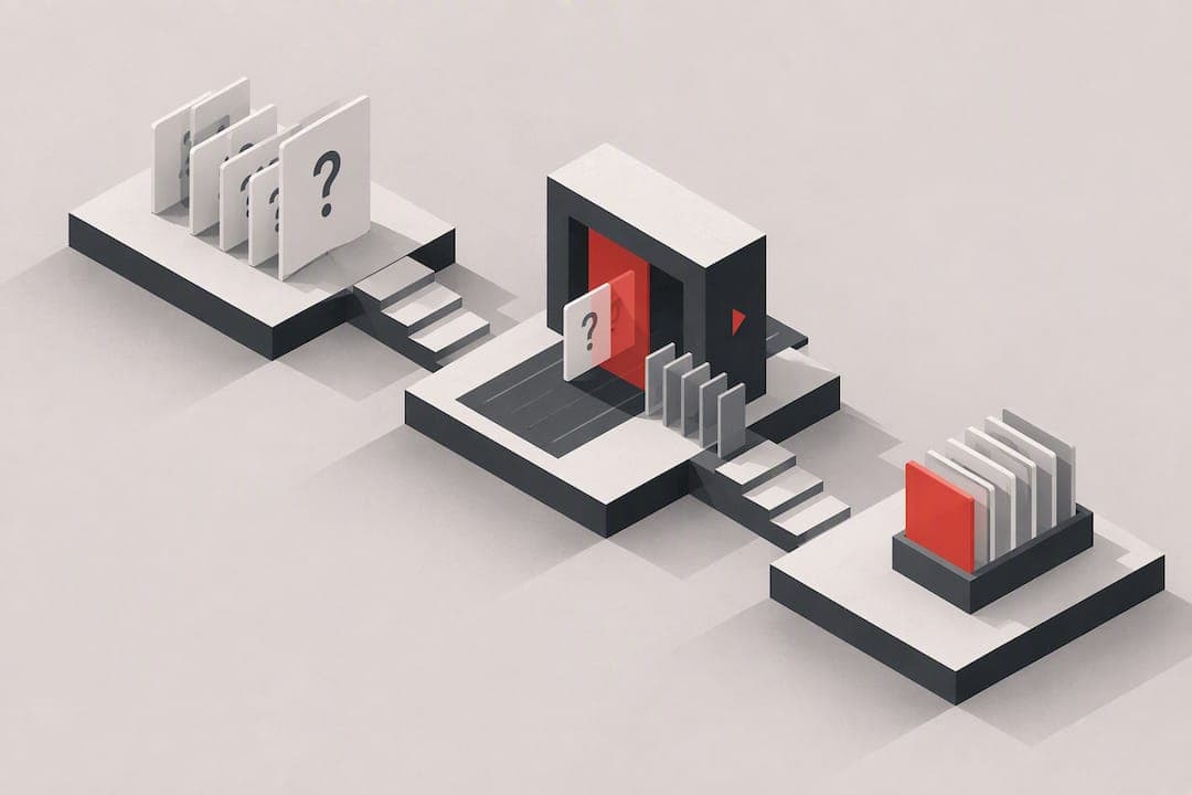
Good usability testing questions come from a clear research objective and a realistic task goal, never from interface labels or survey-style prompts. Before writing a single question, pick your objective and success criteria, write tasks around end goals instead of button names, and script neutral post-task probes to explain what you just watched. For qualitative rounds, Gov recommends recruiting 5 to 6 participants, which is usually enough to spot the patterns that matter.
TL;DR:
- Focus on end goals and success criteria when designing tasks to avoid priming participants with interface labels or prompts.
- Recruit 5 to 6 participants based on relevant behaviors rather than demographics to efficiently identify major usability issues.
- Write task scenarios in the second person and present tense, ensuring they are goal-oriented and free of UI labels, to reduce bias.
- Avoid common task-writing mistakes such as loaded language, multi-part tasks, or unclear success criteria, which can distort results.
- Prioritize clear, unbiased task wording and a six-item QA check over moderation tricks to improve overall usability testing quality.
Table of Contents
- What Types of Usability Testing Questions Do You Need?
- Screener Questions and Pre-Test Phrasing That Don't Prime Participants
- How Do You Write Task Scenarios That Don't Bias the Results?
- What Moderation Techniques Keep You From Biasing Behavior?
- What Post-Task Questions Reveal the Real Story?
- Which Task-Writing Mistakes Wreck Usability Test Results?
- Copyable Usability Test Script and Question Bank
- Turning Test Findings Into Prioritized Fixes
- Where to Go Deeper on Usability Testing Questions
- An Editorial Take on Scripts, Probes, and Prioritization
- Sources
- FAQ
What Types of Usability Testing Questions Do You Need?
A usability test script isn't one kind of question repeated eight times. It's five different tools, each doing a different job.
- Screener questions qualify or disqualify participants before you ever open a prototype. Purpose: keep the sample honest.
- Background questions warm up the session and establish context, like prior experience or current habits. Purpose: interpret behavior in light of who's sitting in front of you.
- Task prompts hand the participant a goal to pursue inside the product. Purpose: generate observable behavior, not opinions.
- Probes are the in-the-moment nudges you use while someone works through a task. Purpose: recover reasoning without leading it.
- Post-task questions ask what just happened, right after a task ends. Purpose: connect what you saw to what the participant thought.
Screeners and background questions tend to be closed ("Have you bought something online in the last month?") because you need fast, sortable answers. Probes and post-task questions work better open ("What did you expect to happen when you tapped that?") because you're after explanation, not a checkbox.
A quick placement example: a screener rules out anyone who hasn't used a similar app in six months; a background question asks how they currently track expenses; a task prompt asks them to add a new expense without saying "tap the plus icon"; a post-task probe asks what confused them along the way.
Screener Questions and Pre-Test Phrasing That Don't Prime Participants
Recruitment is where a lot of usability rounds quietly fail, because you get people who don't match your actual users. Behavioral qualifiers beat demographic ones almost every time. Asking "Have you used a budgeting app in the past six months?" tells you more than asking someone's age or income, and it's far less likely to feel intrusive.
Here's a workable sequence for a screener:
- Confirm recent, relevant behavior. "In the last six months, have you signed up for a subscription service online?" Anyone who says no gets thanked and released.
- Check role or context fit. If you're testing a B2B onboarding flow, ask whether the person has ever set up a new tool for a team, not just used one.
- Set a frequency threshold. "How often do you check your account settings?" filters out people who'll never realistically hit the flow you're testing.
- Watch for red flags. Participants who've worked in UX, design, or your own industry often over-explain or perform expertise instead of behaving naturally. Screen them out unless you specifically want expert users.
- Ask one open follow-up. "Tell me about the last time you did this." A vague, hesitant answer is often a sign the behavior isn't recent or real.
Pre-test background questions come next, once someone's qualified, and they should collect context without hinting at what the test is about. "What's your main goal when you open this kind of app?" works. "Do you find the checkout process confusing?" does not. That second version tells the participant exactly what you're hoping to hear, and now you'll hear it whether it's true or not.
How Do You Write Task Scenarios That Don't Bias the Results?
Task wording is where most usability rounds quietly break. NN/g's guidance is blunt on this point: describe the user's end goal, never the interface, because naming UI labels in a task primes participants and makes the flow look easier than it actually is.
Compare these pairs:
- Bad: "Click the settings gear and update your notification preferences." Better: "You've been getting too many emails from this app. Do something about it." The second version tells you whether people can even find settings.
- Bad: "Use the search bar to find running shoes under $50." Better: "You want a pair of running shoes and don't want to spend more than $50. Find something you'd actually buy." Removing "search bar" tests whether search is discoverable at all.
- Bad: "Tap the hamburger menu and go to your order history." Better: "You think you were charged twice last month. Figure out what happened." This version tests whether the path to order history is obvious under stress, which is closer to how people actually use the feature.
For discovery testing, a stepped structure works better than one flat instruction. Start broad ("You want to cancel your subscription"), then add a mild hint only if the participant stalls ("Somewhere in your account, there's a way to manage this"), and only go fully direct as a last resort so the session doesn't stall out completely. Each version should have a stated success criterion before you run it, such as "participant reaches the cancellation confirmation screen without asking for help" or "participant abandons and describes where they expected the option to be."
Pro Tip: Write every task in the second person, present tense, and read it aloud before the session. If it sounds like a set of instructions rather than a situation, rewrite it.
What Moderation Techniques Keep You From Biasing Behavior?
The instinct to jump in the moment a participant goes quiet is the single most common way moderators wreck their own data. GOV.UK's research team recommends waiting 15 to 20 seconds of silence before saying anything, then using a neutral line like "What are you thinking right now?" instead of "Do you need help?"

Think-aloud protocol itself carries a trade-off worth knowing about. Research comparing instruction styles found that explicit think-aloud instructions produce more verbal data but also raise the participant's mental workload, while neutral instructions feel more natural but yield thinner commentary. Pick one style and stay consistent across every session in the round, or your comparisons between participants won't mean much.
Three specific techniques from NN/g's research on talking with participants during a usability test are worth memorizing:
- Echo: repeat the participant's last few words back as a question. They say "this is weird," you say "weird?" and they usually keep talking.
- Boomerang: when a participant asks you a question, hand it back. "Should I click this?" becomes "What do you think?"
- Columbo: play deliberately confused to draw out an explanation. "Sorry, I'm a little lost, what were you expecting to see there?"
Note any moment where you had to step in and possibly nudged behavior. That single habit makes your write-up far more honest when you're deciding which findings to trust.
What Post-Task Questions Reveal the Real Story?
The gap between what someone did and what they say about it afterward is often where the most useful finding lives. Ask these right after a task ends, before moving to the next one:
- "What did you expect to happen when you did that?"
- "What made that part difficult, if anything?"
- "If you could change one thing about what just happened, what would it be?"
Wrap-up questions, asked once at the very end of the session, round out the picture:
- "What's your overall impression of what you just used?"
- "How confident do you feel that you completed that correctly?"
- "Would you come back and use this again? Why or why not?"
- "What was the single biggest obstacle across everything you just did?"
The real value shows up when you line stated opinions up against what you actually observed. A participant who says "that was easy" after fumbling for 40 seconds and hitting the wrong button twice is not lying. They're telling you the interface felt intuitive enough that the struggle didn't register as struggle, which is its own kind of finding worth flagging in your report.
Which Task-Writing Mistakes Wreck Usability Test Results?
Most bad usability data traces back to a handful of repeat offenders in the task-writing stage. Here are the ones worth checking for every time:
- Naming UI labels. "Click the Filter button" turns a findability test into a following-directions test. Rewrite around the goal instead.
- Telling users where to go. "Go to your account page and change your password" skips the exact step you're trying to measure.
- Loaded or emotional phrasing. "Fix this annoying error" tells the participant how to feel before they've felt anything.
- Multi-part tasks with no clear stopping point. Split any task with "and then" into two tasks with separate success criteria.
- Tasks that don't match real motivation. If nobody would ever actually do this in real life, the data won't transfer either.
- No stated success criterion. If you can't say in one sentence what "done correctly" looks like, you can't score the session.
- Yes/no task framing. "Can you find the pricing page?" invites a shrug. "Find out what the paid plan costs" invites behavior.
- Testing too many tasks in one sitting. Fatigue quietly wrecks your later tasks.
- Skipping a pilot run. Untested wording almost always has one confusing line you didn't catch.
- Mixing probes into the task itself. Save "why did you click that?" for after the task, not mid-task, or you'll change the behavior you're trying to measure.
Before any session, run a six-item pass on your script: does every task avoid UI labels, state a clear goal, have a defined success criterion, stay realistic, stay time-bounded, and separate the task cleanly from your probes?
Pro Tip: Time yourself walking through each task like a first-time user. If it takes you under 20 seconds, it's probably too easy to reveal anything.
Copyable Usability Test Script and Question Bank
A usability test script generally runs in five stages: intro and consent, warm-up background questions, a set of tasks each with a stated success criterion, in-task probes, and a wrap-up. Maze's script guidance caps a single session at around eight tasks, past which fatigue starts eating your data quality.
Eight ready-to-adapt task prompts:
- "Find a product you'd actually consider buying and add it to your cart." (search/discovery)
- "Complete a purchase using the payment details you'd normally use." (checkout)
- "You've just signed up. Get your account set up so it feels ready to use." (onboarding)
- "Turn off email notifications for one specific type of update." (settings)
- "Using your phone, find out how much shipping would cost to your address." (mobile flow)
- "You think you were charged the wrong amount. Find out what you were actually billed." (billing/trust)
- "Increase the text size on this page using whatever method feels natural to you." (accessibility)
- "Navigate this page using only your keyboard and tell me when you reach the main action." (accessibility)
For unmoderated tests, every prompt needs an explicit completion signal built in, since there's no moderator to catch confusion or answer a stuck participant's question. A moderated task can end on "let me know when you feel done," but an unmoderated one needs "click Submit once your order confirmation appears."
That 5 to 6 figure for moderated rounds isn't arbitrary. GOV.UK's research guidance treats it as the point where most usability problems have already surfaced at least once, and running more people usually means diminishing returns rather than new findings.
Turning Test Findings Into Prioritized Fixes
A usability test tells you that people struggle. It rarely tells you which struggle to fix first when you've got five candidates and one sprint. There are tools designed to close that gap by auditing multiple layers—such as UX & Navigation, Conversion, and Onboarding—and by returning a ranked list of issues rather than a flat report requiring manual prioritization.
Pair the two naturally: your test gives you the "what," like a participant quote about not finding the upgrade button, or a task that three out of six people failed. Run that same page or flow through Saveyourapp's Prism Engine, and its combination of AI diagnostics and human beta tester review can tell you where that specific failure ranks against everything else wrong with the page, so you're not guessing which fix to build first.
If you're running usability rounds regularly, it's worth trying the free scan and comparing what it flags against what your own sessions turned up. Full plan details, including the Solo and Founder tiers, are on the pricing page for teams that want repeated audits and deeper human review alongside their own testing.
Where to Go Deeper on Usability Testing Questions
GOV.UK's service manual and NN/g's task-writing guidance remain the two most reliable references for question and task wording. For a practical, fill-in-the-blank script, Maze's script guide is worth bookmarking. Anyone curious about the research behind think-aloud protocols should read the comparative study on think-aloud instruction styles.
An Editorial Take on Scripts, Probes, and Prioritization
The research on this topic supports a conclusion that's a little unglamorous: the biggest lever in usability testing isn't a clever probe or a slick moderation trick. It's writing the task right the first time. Most teams spend their energy polishing post-task questions when the real damage already happened three steps earlier, in a task that named a button and quietly told the participant where to click.
Where conventional advice falls short is in treating moderation technique as the hard part. Echo, boomerang, and Columbo are genuinely useful, but they're rescue tools. They recover a session that a bad task prompt already put at risk. A well-written task barely needs them.
If you're prioritizing where to spend your prep time, spend it on task wording and the six-item QA pass, not on rehearsing probe scripts. And once you've got real findings in hand, don't let them sit in a slide deck. Running the same flow through something like Saveyourapp's audit alongside your qualitative notes is a reasonable way to turn "three people struggled here" into an actual ranked fix list, instead of a debate in your next planning meeting about which problem feels more urgent.
— William
Sources
- Gov
- Task Scenarios for Usability Testing - NN/g
- Advice for better moderated usability testing - GOV.UK user research blog
- How to Write a Usability Testing Script (+ Examples) | Maze
FAQ
What Are the Five Types of Usability Testing?
The five common types are moderated, unmoderated, in-person, remote, and guerrilla (informal, quick-turnaround) testing. Each combines a delivery method (moderated or not, in-person or remote) with the level of formality in recruitment and setup, and teams often mix formats across a single research project.
What Is the 5-User Rule for Usability Testing?
The 5-user rule suggests that testing with around 5 to 6 participants surfaces most of the major usability problems in a qualitative round, a figure GOV.UK's research guidance also recommends. Beyond that number, additional sessions tend to repeat issues you've already found rather than reveal new ones.
What Is an Example of a Good Usability Testing Question?
A strong task prompt states a goal without naming interface elements, such as "You think you were overcharged last month. Find out what you were actually billed." A strong post-task question asks for reasoning after the fact, like "What made that part difficult, if anything?"
What Are Some Good Questions to Ask in User Research?
Effective questions split into screeners ("Have you used a similar app in the last six months?"), background questions ("What's your main goal when you open this kind of app?"), task prompts built around end goals, and post-task probes like "What did you expect to happen?" Each type collects a different kind of evidence, so a session usually needs all four.
How Many Tasks Should a Usability Test Include?
A single moderated session works best with 6 to 8 tasks, a limit Maze's script guidance also recommends to avoid participant fatigue. Unmoderated sessions should stay shorter, typically 4 to 6 tasks, since there's no moderator to keep a tired participant engaged.