

Start your A/B testing ideas with the hero headline and CTA, pricing messaging, signup forms, checkout cost visibility, onboarding, and email subject lines. Pick two quick wins and one bold bet, define one clear overall evaluation criterion, and size each test for statistical power before launch. A lift in conversion rate only counts when the sample can prove it. At Save Your App, we rank these fixes by impact so you test the right thing first.
TL;DR:
- Baymard's research links visible field count more strongly to checkout abandonment than page count; average checkouts show 11.3 fields, though most need only 8.
- Treat email open rate as an early signal, not the winner metric: curiosity driven subject lines can raise opens while reducing click to conversion.
- Set one overall business metric, add guardrails such as bounce or unsubscribe rate, and calculate sample size before launch; small effects require far more traffic.
- Using prior period data as a covariate reduced variance by roughly 45% to 52% in published results, potentially halving required traffic or test duration.
- Analyze mobile results separately because a variant that lifts desktop conversions but lowers mobile conversions can disappear in blended results.
Table of Contents
- 1. Quick wins: low-effort tests you can launch this week
- 2. Homepage and hero-area ideas worth testing first
- 3. Category pages and product listings: search, filters, and sorting
- 4. Product pages, cart, and checkout: pricing, shipping, and guest flows
- 5. Forms and signups: field-level tests that raise completion
- 6. Email, SMS, and notification tests that feed onsite conversions
- 7. Mobile and performance-driven tests
- 8. Designing valid experiments: hypothesis, OEC, power, and variance reduction
- 9. How to prioritize and sequence your tests
- 10. Common pitfalls that produce biased or inconclusive tests
- 11. Turning heatmaps, feedback, and session recordings into test ideas
- Why I treat A/B tests as a learning program
- Find your next test with a Save Your App audit
- FAQ
- Sources
1. Quick wins: low-effort tests you can launch this week
These tests need little design or engineering work, so you can start learning within days. Each one is a single-factor test: change one thing, keep everything else equal.
- Clickable social proof. Make testimonial quotes link to full stories, or add customer logos near the CTA. OEC: click-through to signup. Effort: low.
- Outcome-focused CTA labels. Swap "Submit" for "Get my free audit," then test color and placement separately. OEC: CTA click rate. Effort: low.
- Fewer visible form fields. Use one name field, hide Address Line 2, and tuck the coupon code behind a link. OEC: form completion rate. Effort: low.
- Earlier total price. Show the full order cost in the cart and make guest checkout the default. OEC: cart-to-purchase rate. Effort: medium.
- Sticky recap of the offer. Repeat the main benefit in a slim header bar on long pages. OEC: signup starts. Effort: low.
Write the hypothesis before you build the variant. "Showing total cost earlier will cut cart abandonment because surprise fees erode trust" is testable. "Make the cart better" is not. If you want a broader backlog to pull from, our 90-day prioritized conversion checklist groups ideas by effort and expected return.
2. Homepage and hero-area ideas worth testing first
Your hero section decides whether a visitor scrolls or leaves, so it deserves the most careful experiments. Treat each element as its own test rather than redesigning the whole fold at once.
- Headline framing. Compare a product-focused line ("Project tracking software"), an outcome-focused line ("Ship projects more efficiently"), and a question ("Still tracking projects in spreadsheets?"). Use click-through to the primary CTA or signup rate as your OEC.
- Hero media. Test a static image against a short product demo and against customer-in-context imagery. Try video when your product is hard to grasp from a screenshot, and skip it when page weight would slow the load.
- CTA structure. Compare one primary CTA against a primary plus a quieter secondary action. Add privacy microcopy such as "No credit card needed" beneath the button as its own variant.
- Trust badges. Place security, review, or press badges near the CTA and measure whether they help or merely add clutter.
- Navigation. Keep only the most relevant top-level menu items and watch funnel entry rates.
Pro Tip: Run the headline test first. It is cheap, and the winning message often tells you how to write your CTA, ads, and emails.
3. Category pages and product listings: search, filters, and sorting
Browsing visitors need help reaching a product detail page quickly. Your goal here is faster time-to-first-click and a higher add-to-cart rate.
- Default sort order. Compare relevance, best-sellers, and price low to high. Best-sellers often reassure new visitors, while relevance suits shoppers arriving from search. Track add-to-cart rate and revenue per visitor.
- Product card layout. Test larger images, quick-add buttons versus "view details," and how prominent the price appears.
- Urgency badges. Try truthful low-stock or shipping-status labels on a subset of products, and watch returns and complaints as a guardrail, since false urgency can backfire.
- Filter visibility. Compare a collapsed filter panel with an open one, and test preselecting a popular filter such as "In stock" for categories where nearly everyone wants it.
- Search placement. Move the search bar higher on mobile and measure how many sessions use it.
Keep one change per test. If you alter the sort order and the card layout together, you will not know which one moved the number.
4. Product pages, cart, and checkout: pricing, shipping, and guest flows
Checkout is where small friction costs real money, and UX research gives you strong starting hypotheses. Baymard's checkout research recommends surfacing total costs early, offering guest checkout, delaying account creation until after confirmation, and optimizing for browser autofill.
- Price display. Emphasize the monthly price versus the annual price, test anchor pricing beside a discounted plan, and vary how prominent the savings badge is. Naming also matters, and this guide on naming SaaS pricing tiers gives you variants to test.
- Cost transparency. Show shipping and tax estimates on the product page or first cart view. OEC: cart-to-checkout rate.
- Guest checkout. Make it the most visible option, with account creation offered after the order is placed.
- Field minimization. Use a single name field, hide Address Line 2, and default billing to match shipping. Expect the biggest uplift where your form is longest.
Baymard's research finds that the number of visible form fields predicts checkout abandonment more strongly than the number of pages, and the average checkout shows 11.3 fields when most sites need only 8. Cutting fields beats merging pages.
For a staged rollout of these changes, this 30/60/90 checkout plan shows how store owners can sequence them.
5. Forms and signups: field-level tests that raise completion
Forms are small, measurable, and easy to vary, which makes them ideal for testing. Every extra field is a reason to leave.
- Full name versus first and last. A single field is a clean, low-effort variant.
- Progressive disclosure. Hide optional or rarely used fields behind a "Add more details" link and compare completion rates.
- Inline validation. Test showing errors immediately as users type against showing them on submit. Immediate feedback usually helps with email and password fields, but test it, because premature errors can irritate people mid-typing.
- Autofill support. Add correct autocomplete attributes and measure time-to-complete.
- Button copy and step count. Compare a one-page form with a two-step flow that starts with a single easy question.
Measure completion rate as the OEC and time-to-complete as a secondary metric. Our write-up on form optimization that lifted leads walks through field-level changes in more detail.
Pro Tip: Check your form analytics for the field where people stall before you design variants. Test the fix for that field first.
6. Email, SMS, and notification tests that feed onsite conversions
Messaging experiments are fast because you control the audience and to send. Klaviyo's guide lists channel-specific ideas covering subject lines, CTA variations, and cadence.
- Subject lines and preview text. Use open rate as the early OEC, but judge winners on click-to-conversion, since a curiosity-bait subject can lift opens and hurt sales.
- Single versus multiple CTAs. One CTA concentrates clicks, while several spread them. Compare click distribution and downstream purchases.
- Send time and segmentation. Test morning versus evening, and compare new subscribers with repeat buyers.
- Cadence. Compare different sending cadences. Track unsubscribe rate and spam complaints as safety metrics alongside conversions.
- SMS length. Compare a short link-only text with one that adds a single benefit line.
Coordinate with your site tests. If a landing page changes mid-campaign, your email result becomes impossible to read.
7. Mobile and performance-driven tests
Mobile visitors tolerate less friction, and speed is a conversion lever you can test directly.
- CTA placement. Compare an inline button with a sticky bottom bar, and measure whether the sticky version covers content or boosts taps.
- Tap targets. Enlarge buttons and spacing, and simplify the menu to cut accidental taps and drop-off.
- Image formats. Serve WebP or AVIF to half your visitors and compare load time, bounce rate, and mobile conversion.
- Lazy loading. Load the hero image immediately but lazy-load below-the-fold assets, then confirm that scrolling still feels smooth.
- Layout stacking. Test placing the price and CTA above the product description on small screens.
Segment results by device. A change that wins on desktop and loses on mobile looks like a wash in blended data, which is why mobile deserves its own readout.
8. Designing valid experiments: hypothesis, OEC, power, and variance reduction
An idea only becomes evidence when the experiment is built correctly. Use this checklist before you launch anything.
- Hypothesis. State what you will change, who it affects, and why you expect a lift.
- OEC. Choose one overall evaluation criterion, such as conversion rate, revenue per visitor, or an activation metric. Add guardrail metrics like bounce rate or unsubscribes.
- Split and ramp. The Kohavi, Henne and Sommerfield guide to controlled experiments recommends 50/50 splits for efficient power and a small initial ramp-up to catch serious regressions early. Required sample size grows sharply as the effect you want to detect shrinks, so a tiny expected lift needs far more traffic.
- Variance reduction. Use pre-experiment data as a covariate, an approach known as CUPED.
- Guardrails against opinion. Ronny Kohavi warns that following the Highest Paid Person's Opinion instead of randomized tests is a common and costly mistake.
Using pre-experiment covariates, such as the same metric from a prior period, reduced variance by roughly 45 to 52 percent in published results, which can roughly halve the traffic or duration you need. Pick covariates and pre-period length carefully.
Document every assumption before the test starts, including your minimum detectable effect and planned run length, so nobody can quietly move the goalposts later. Controlled experiments also create a data trail you can mine for the next round, as the original guide notes.
9. How to prioritize and sequence your tests
Rank ideas by expected impact against effort, then let evidence break ties. Analytics, session recordings, and surveys all help you estimate impact more honestly than a gut feeling. Forrester also describes a structured approach to justifying UX investment that ties fixes to business impact and orders them by effort.
- Days 1 to 30: Verify your tracking and analytics, then run two quick wins such as CTA copy and form-field cuts.
- Days 31 to 60: Launch medium-effort tests like checkout cost transparency, segment-based messaging, and onboarding tweaks. Our SaaS onboarding checklist helps you spot activation tests.
- Days 61 to 90: Commit to one bold bet, such as a hero redesign or a new pricing page layout.
- Throughout: Run parallel tests only when they affect different pages or audiences, so they cannot interact.
If you start from analytics, turning GA4 events into a test backlog gives you a ranked list quickly.
Pro Tip: Keep a running backlog with impact, effort, and evidence scores. Retire ideas that stay unsupported for two review cycles.
10. Common pitfalls that produce biased or inconclusive tests
Most failed tests fail before launch, during idea generation. Watch for these traps.
- Opinion-driven selection. A senior leader's favorite idea jumps the queue without evidence. Require a hypothesis and supporting data for every test.
- Testing too many changes at once. A multi-change variant can win, but you will not learn why, so you cannot reuse the insight.
- Underpowered tests. Small traffic plus a small expected effect gives noise, not answers. Estimate sample size first, and if you cannot reach it, test a bolder change instead.
- Peeking and early stopping. Ending a test the moment it looks positive inflates false wins. Decide the run length in advance.
- Ignoring segments and seasonality. A holiday week or a campaign spike can distort results. Run tests across full weekly cycles.
- Chasing a vanity OEC. Click rate is easy to lift and may never reach revenue. Tie the primary metric to a business outcome.
- Skipping the loser. A flat or negative result still teaches you something. Record it.
When a test comes back inconclusive, resist the urge to declare a winner anyway. Treat it as a signal to sharpen the hypothesis or test a larger change.
11. Turning heatmaps, feedback, and session recordings into test ideas
Numbers tell you where people drop off. Qualitative research tells you why, and the best test ideas come from combining both.
Start with a quantitative flag, such as a page with high exit rate. Then open heatmaps and session recordings for that page. If visitors hover over a non-clickable image, that is a hypothesis: make it clickable or move the CTA near it. If recordings show people scrolling past the pricing table without pausing, test a more scannable layout.

Add direct voices to the mix. Short exit surveys ("What stopped you today?"), support tickets, and sales call notes reveal objections your analytics never will. Cluster the comments into themes, and each repeated theme becomes a candidate test.
Human reviewers add another layer, since they notice confusing copy and trust gaps that scripts miss. Structured beta rounds, like those in our website beta testing guide, turn those observations into a list of fixes. End-user testing, as covered in this practical guide, can also surface issues through recorded sessions.
Always translate an observation into a measurable hypothesis before testing. "People seem confused" becomes "Adding a three-line explainer under the price will raise plan selection."
Why I treat A/B tests as a learning program
I would rather run fewer tests and learn from every one than ship a steady stream of random tweaks. Document each decision, record what lost as carefully as what won, and fold winning variants into the product roadmap so gains compound. Use small iterative tests when you have a working funnel and a clear friction point. Reserve bold overhauls for cases where the whole premise looks wrong.
— William
Find your next test with a Save Your App audit
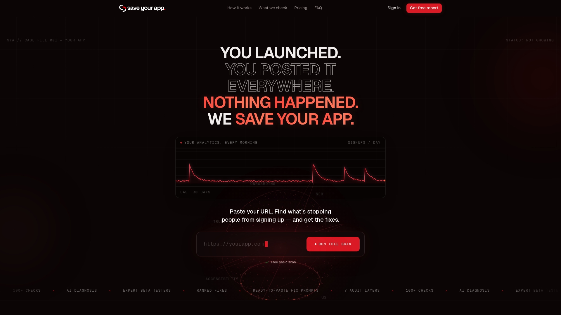
Most teams do not lack ideas. They lack a ranked list of what actually blocks conversions. We built Save Your App to supply it. Our Prism Engine™ combines AI-driven diagnostics with human reviews across audit areas including Technical SEO, Performance, UX & Navigation, Conversion, Accessibility, Trust & Security, and Onboarding. You get a ranked list of issues with actionable fix prompts, so your test backlog starts with the changes most likely to matter.
Our Free plan lets you run a basic scan first. Paid plans start with Solo at $49 per month, and Founder is $129 per month. Extra 3-day tests are $199 per test. You can see everything on our pricing page, or start your free scan at Saveyourapp and turn the results into your first two quick wins.

FAQ
What are some examples of A/B testing?
Common examples include testing two headlines, two CTA labels, a short versus long signup form, or two email subject lines. Each compares one change against a control. For ready-made channel ideas, see Klaviyo's A/B testing guide.
What is an A/B testing strategy?
An A/B testing strategy is a repeatable plan for choosing, running, and learning from experiments. It defines your goal metric, ranks ideas by impact and effort, and sets rules for sample size and run length. The aim is steady, documented learning rather than isolated tweaks.
What is an example of a hypothesis for an A/B test?
"Replacing separate first and last name fields with one full-name field will raise form completion because it removes effort." It names the change, the metric, and the reason. Baymard's research on visible form fields supports this kind of idea.
How do you A/B test on social media?
Run two versions of one ad or post that differ in a single element, such as the image, headline, or CTA, and split the audience evenly. Judge the result by a downstream metric like signups, not only likes or clicks.
Sources
- Practical Guide to Controlled Experiments on the Web:
- Ai
- Improving the Sensitivity of Online Controlled Experiments by Utilizing Pre-Experiment Data