

Form optimization is the practice of adjusting fields, layout, validation, and surrounding context to increase completion rates without sacrificing lead quality or downstream activation. The evidence is clear on one point marketers keep getting wrong: cutting fields is not the highest-leverage move. Layout clarity, error recovery, and perceived value of what's on the other side of "Submit" move completion more reliably than field count alone.
TL;DR:
- Layout clarity, error recovery, and perceived value significantly influence form completion and activation, beyond simply reducing field count.
- Testing should focus on lead quality and downstream metrics, not just submit clicks, to avoid optimizing for quantity over quality.
- Mobile forms require touch targets of at least 48 pixels, correct input types, and real-device testing to improve usability and reduce abandonment.
- Error messages must be clear, precise, and linked to fields, with validation delayed until after user finishes typing to build trust.
- Using diagnostic tools like AI scans and human feedback helps identify specific friction points, enabling prioritized fixes that improve both conversion and lead quality.
Table of Contents
- What Does Form Optimization Actually Improve?
- Core Best Practices for Layout, Labels, and Input Types
- How Should Error Messages Guide Users to Fix Mistakes?
- What Mobile and Accessibility Fixes Matter Most?
- How Do You Test Form Changes Without Fooling Yourself?
- How Do You Prioritize Which Form Fixes to Ship First?
- How Save Your App Turns Diagnosis Into a Ranked Fix List
- The Gap Between Form Advice and Form Reality
- Run a Free Scan Before You Rebuild Anything
- Sources
- FAQ
What Does Form Optimization Actually Improve?
Completion rate and activation quality are not the same metric, and treating them as interchangeable is where most form projects go wrong. A form can post a higher completion rate while quietly feeding your sales team worse leads, because the fields you removed were the ones that filtered out bad fits.
The MarketingExperiments case study on complex web forms is the clearest example on record. A treatment that removed navigation and rebuilt the surrounding page to communicate value more clearly produced a large lift in leads, even though the form itself kept more fields. Field count wasn't the barrier. Unclear value was.
That finding lines up with what the Nielsen Norman Group has documented across years of usability testing: forms that follow basic structural conventions outperform forms that don't, independent of length. The practical takeaways:
- Test field count changes alongside context changes, not in isolation.
- Track lead quality or activation rate, not just submit clicks.
- Treat "shorter is always better" as a hypothesis, not a rule.
Core Best Practices for Layout, Labels, and Input Types
Most form problems trace back to four fixable decisions: column structure, label placement, input type, and copy. Get these right and you fix the majority of friction before you touch anything else.
- Use a single-column layout. Multi-column forms force the eye to jump around and slow scanning, which is why NN/g's form design research recommends a single vertical flow with related questions grouped together.
- Keep labels visible and above the field. Placeholder text that disappears once someone starts typing removes the label from view exactly when people need it most, and it fails several WCAG success criteria that require a programmatically associated label, not just placeholder text.
- Match the label's
forattribute to the input'sid. This single line of markup lets screen readers announce the right label and lets sighted users click the label to focus the field. - Set correct input types and autocomplete tokens. Using
type="email",type="tel", and tokens likeautocomplete="postal-code"lets browsers autofill fields correctly, which Web shows meaningfully cuts typing time. Skip this and you're asking every visitor to type what their browser already knows. - Write CTA copy around the value, not the mechanics. "Get My Free Audit" beats "Submit" because it restates the payoff at the exact moment of hesitation. For sensitive fields (income, phone number, company size), add a one-line explanation of why you're asking.
Pro Tip: Run your form through a screen reader once, manually, before you ship it. You'll catch missing label associations and confusing tab order faster than any automated audit will flag them.
If your traffic comes from paid campaigns, the form also needs to match the promise made in the ad. A mismatch between what a landing page's CTA promises and what the form asks for is one of the more common, and most fixable, sources of drop-off in acquisition funnels.
How Should Error Messages Guide Users to Fix Mistakes?
Good validation doesn't just catch mistakes. It tells people exactly what to do next without punishing them for typing.
Errors should appear next to the field they belong to, describe the problem in plain language, and never wipe out what the user already entered. "Invalid input" tells someone nothing; "Enter a phone number with area code, like 555-123-4567" tells them exactly what to fix. Web recommends focusing the first actionable error automatically so users aren't left hunting through a form for the one field with a red outline.
A few rules that consistently reduce abandonment:
- Don't validate on every keystroke. Validating before someone finishes typing an email address flags "correct" as "wrong" and erodes trust in the form itself.
- Preserve all field values on a failed submit. Losing a completed form because one field failed is one of the fastest ways to lose a conversion for good.
- Use
aria-describedbyto link error text to its field programmatically, so screen reader users hear the error immediately when the field gets focus.
The CHI paper on usable web form design tested 20 such guidelines under controlled eye-tracking conditions and found forms following them produced faster completion times, fewer failed submission attempts, and higher satisfaction scores. Validation UX isn't a nice-to-have layered on top of conversion work. It's part of conversion work.
What Mobile and Accessibility Fixes Matter Most?
Mobile forms fail in ways desktop forms never reveal, because a form that looks fine in a browser preview can be nearly unusable with a thumb and a five-inch screen.
The fixes that move completion rates on mobile are mostly mechanical, not aesthetic:
- Touch targets need roughly 48 pixels of tappable space, with enough spacing between fields that a thumb doesn't hit the wrong one.
- Set input types that trigger the right keyboard automatically. A numeric keypad for phone numbers, an email keyboard with the "@" key exposed for email fields.
- Test on real devices, not just a browser's responsive mode. Web.dev's sign-in form testing guidance specifically calls out autofill and password manager behavior as things that only surface on an actual phone with an actual keyboard app installed.
- Use semantic HTML elements (
<button>,<select>, native form controls) instead of custom-built equivalents, since assistive technology already knows how to interpret them.
These aren't separate workstreams from conversion optimization. The same eye-tracking research behind the guideline-based form redesign found that accessibility and usability improvements together cut submission attempts and raised satisfaction scores, which means the "compliance" fix and the "conversion" fix are frequently the same fix.
How Do You Test Form Changes Without Fooling Yourself?
Most form A/B tests measure the wrong thing: they optimize for submit clicks while ignoring whether the leads that come through are worth having.
Build the instrumentation first, before you test anything. Track five points: session start, first field interaction, per-field time and abandonment, submit attempt, and confirmed success. That field-level breakdown tells you which specific field is bleeding people, instead of a single aggregate completion number that hides the actual problem.
- Set a primary metric and at least one guardrail metric. Completion rate is the primary number; a downstream quality signal (qualified lead rate, activation rate, support ticket volume) is the guardrail that stops you from shipping a "win" that quietly wrecks pipeline quality.
- Change one thing per test. Combining a field removal with a copy change with a layout shift means you'll never know which change actually did the work.
- Keep a running change log. When a test wins or loses, you need to know exactly what shipped, when, and to which segment.
- Follow up quantitative wins with qualitative checks. A short user interview or session recording review often explains why a change worked, which tells you whether it will generalize to your next form.
Pro Tip: If a form test shows a completion lift with no matching lift (or a drop) in your guardrail metric, don't ship it yet. Dig into what changed about who is now getting through.
How Do You Prioritize Which Form Fixes to Ship First?
Score every candidate fix on three axes: how much drop-off it's tied to, how much business value sits behind that drop-off point, and how much effort the fix takes to ship. A high-drop-off field on your highest-value conversion path with a one-line fix beats a medium-impact redesign that takes three sprints, every time.
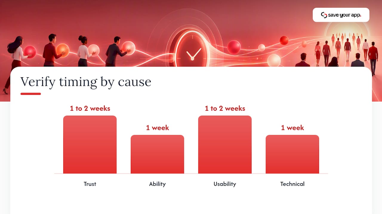
Root-cause matters more than symptom when you're deciding what "fix" even means. A field with high abandonment might be a trust problem (why are you asking for this?), an ability problem (people don't know the format you want), a usability problem (the label vanished when they started typing), or a technical problem (autofill isn't working on mobile Safari). Each root cause has a different minimum fix, and misdiagnosing it wastes a sprint on the wrong solution.
- Always include a guardrail metric in your prioritization score, not just conversion lift.
- Ship the smallest fix that addresses the actual root cause before considering a full redesign.
- Re-check both completion and the guardrail metric one to two weeks after release, not just on day one.
| Root cause | Minimum viable fix | Verify within |
|---|---|---|
| Trust | Add a one-line reason for the ask | 1 to 2 weeks |
| Ability | Add format examples near the field | 1 week |
| Usability | Move labels above fields, fix tab order | 1 to 2 weeks |
| Technical | Fix autocomplete tokens and input types | 1 week |
How Save Your App Turns Diagnosis Into a Ranked Fix List
Running this playbook manually across every field, label, and validation rule on a site takes real time, which is exactly the gap Saveyourapp's Prism Engine was built to close. It scans a page and flags the specific friction points, from unclear labels to broken autofill paths, instead of leaving teams to guess where drop-off starts.
- AI-driven diagnostics catch structural and technical issues fast, across layout, validation, and accessibility.
- Human beta tester reviews catch what automated scans miss: confusing copy, an ask that feels invasive, a CTA that undersells the value on the other side.
- Fixes come back ranked by impact, so a team with limited sprint capacity can ship the highest-leverage change first instead of the easiest one.
That combination matters because forms fail for reasons that are both measurable (a missing autocomplete token) and subjective (copy that makes someone hesitate), and no single diagnostic method catches both reliably.
The Gap Between Form Advice and Form Reality
Most form advice online still repeats the same tired instruction: remove fields, shorten the funnel, done. The MarketingExperiments data should have killed that advice years ago. It's a reminder that people fill out longer forms all the time when the payoff is obvious and the page around the form doesn't feel like a maze.
Where I think teams genuinely go wrong is treating form optimization as a design exercise instead of a measurement exercise. Moving a label or fixing a broken autocomplete token is trivial. Knowing whether that change actually improved the leads coming through, not just the raw completion number, is the part almost nobody instruments properly. A form that converts better but sends garbage leads to sales didn't get optimized. It got gamed.
If you take one thing from this: build the field-level funnel and the guardrail metric before you touch a single field. Everything downstream, layout, validation, mobile fixes, gets easier to prioritize once you can see exactly where and why people stall, instead of guessing from a single aggregate completion rate.
— William
Run a Free Scan Before You Rebuild Anything
Before committing engineering time to a form rebuild, it's worth finding out which specific fields, labels, or validation steps are actually costing you conversions. Saveyourapp's free scan applies this exact playbook automatically: it checks layout, accessibility, validation UX, and mobile behavior, then hands back a ranked list of fixes instead of a generic report.
A typical pilot looks like this: run the free scan to get the AI-driven diagnostic, review the ranked fix list, ship the top two or three, and measure both completion and a downstream quality metric before touching anything else. Teams that want faster validation can add an Extra 3-day test, which brings in human beta testers to catch the friction automated scans miss.
None of this replaces good measurement discipline. It shortens the distance between "we think our form has a problem" and "here's exactly what to fix first." Full plan details, including the Solo and Founder tiers, are on the Saveyourapp pricing page.
Sources
- Optimizing Web Forms: How one company generated 226% more leads from a complex web form (without significantly reducing fields) - MarketingExperiments
- Web form design (NN/g)
- Web
FAQ
What Does Form Optimization Mean?
Form optimization means adjusting a form's fields, layout, labels, validation, and surrounding copy to raise completion rates while protecting the quality of the data or leads collected. It covers technical work (input types, autocomplete tokens) and content work (CTA copy, field explanations) together, since both affect whether someone finishes the form.
Is a Shorter Form Always a Better-Converting Form?
No. The MarketingExperiments case study found a treatment with more fields produced up to a 226% lift in leads once the surrounding page communicated value more clearly. Field count matters less than perceived value and layout clarity.
How Do I Reduce Form Abandonment on Mobile?
Use touch targets around 48 pixels, set input types that trigger the correct mobile keyboard, and test on real devices rather than a desktop browser's responsive preview, per web.dev's sign-in form guidance. Real-device testing catches autofill and password manager failures that never show up in a simulator.
What's the Best Way to Test a Form Change?
Instrument field-level drop-off and time-in-field before you test anything, then run one change at a time against a primary conversion metric plus a downstream quality guardrail. This prevents shipping a "win" that raises completion but lowers lead quality.
Can Saveyourapp Help Fix an Underperforming Signup Form?
Yes. Saveyourapp's Prism Engine scans a page for form and onboarding friction and combines that with human tester feedback, then returns fixes ranked by impact. Current pricing, including the available plans, is listed on the Saveyourapp pricing page.