

Use a prioritized, funnel-structured conversion optimization checklist that starts with tag verification and technical fixes, then moves to clarity and call-to-action visibility, to raise conversion rates reliably. It's built for marketers, ecommerce managers, and business owners who need to know what to fix first, not just what's broken. Expect measurable movement in conversion rate and signup or sales volume within one full audit cycle.
TL;DR:
- Fix technical issues like slow load times and broken tags first, as they can significantly hinder tracking accuracy and user experience.
- Ensure above-the-fold elements, including headlines and CTAs, are clear, compelling, and quickly communicate the offer within five seconds.
- Match landing page messaging precisely to ad promises, maintaining consistency in headlines, visuals, and offer details to improve conversion rates.
- Simplify forms and checkout processes by removing unnecessary fields and supporting guest checkout to reduce abandonment and friction.
- Use real, specific proof and trust signals at critical decision points to reinforce credibility and persuade hesitant visitors.
Table of Contents
- How to Use This Conversion Optimization Checklist
- Is Your Site Fast Enough to Convert?
- What Makes the Top of a Page Convert?
- Does Your Landing Page Match the Ad That Sent Traffic?
- Why Are Visitors Abandoning Your Forms and Checkout?
- Where Should Trust Signals Go on Your Page?
- How Do You Run A/B Tests That Actually Mean Something?
- Which Fixes Should You Prioritize First?
- How Does a Prioritized Audit Actually Get Built?
- Your 90-Day Conversion Action Plan
- What Happens After Someone Converts?
- Should Every Visitor See the Same Page?
- What Do Heatmaps Actually Tell You?
- How Do You Get Shoppers Back After They Abandon Cart?
- Do Urgency and Scarcity Tactics Actually Work?
- A Note on Getting This Wrong
- Get a Ranked Fix List Instead of Guessing
- Primary Sources and Implementation Tools
- Sources
- FAQ
How to Use This Conversion Optimization Checklist
A checklist only works if you treat it like a scoring system, not a to-do list you skim and forget. Before touching a single headline or button color, pick one page and one goal. A homepage trying to sell a demo, collect newsletter signups, and push a discount code at the same time converts worse than a page with a single, obvious job. Split the goals across separate pages or separate CTAs, and measure each one on its own.
Score every checklist item Pass, Partial, or Fail (or 2/1/0 if you want a numeric rollup). A Fail on a technical item — broken tag, missing SSL, layout shift on load — outranks every Partial on messaging, because a technical failure corrupts the data you'd use to judge everything else. This priority-first approach, where technical fixes come before copy and design tweaks, consistently produces faster and more reliable gains than tackling issues in random order.
Work through the checklist in this order:
- Tracking and technical foundation (tags, speed, stability)
- Above-the-fold clarity and CTA visibility
- Landing page message match
- Forms and checkout friction
- Trust signals and social proof
- A/B testing and measurement refinement
Set a remediation cadence so the checklist doesn't gather dust:
- Week 1: fix tagging and technical blockers
- Month 1: ship 2 to 3 headline, subhead, or CTA tests
- Quarter 1: complete a full audit pass and roll fixes into your product or marketing backlog
Is Your Site Fast Enough to Convert?
Nothing on this checklist matters if your tracking is broken or your page takes six seconds to load. Technical issues aren't glamorous, but they're the layer everything else sits on, and they're usually the fastest fixes to make once you know where to look.
Speed and stability targets:
- Mobile page load under roughly 2.5 seconds
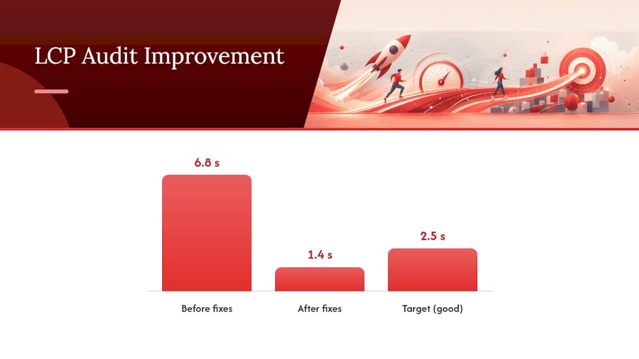
- Largest Contentful Paint (LCP) under 2.5 seconds
- Cumulative Layout Shift (CLS) under 0.1
- Interaction to Next Paint (INP) in the "good" range Google's PageSpeed Insights reports
Quick technical fixes that move the needle fast:
- Compress images and serve modern formats (WebP or AVIF) instead of raw JPEGs
- Defer or async nonessential JavaScript so it doesn't block rendering
- Preload key assets like hero images and fonts
- Reduce server response time, especially on ecommerce platforms running heavy plugin stacks
- Fix console errors that silently break forms or scripts on certain browsers
One audit case documented LCP dropping from 6.8 seconds to 1.4 seconds after a round of technical fixes, paired with a 23% lift in conversion rate and a 31% drop in bounce rate on the same website audit. That's the kind of return a purely cosmetic redesign rarely delivers.
Tagging deserves its own line item, because it determines whether any of your other work is even measurable. Install a site-wide Google tag rather than scattering one-off snippets across pages, then verify it with Tag Assistant, which flags missing or duplicate tags. Link Google Analytics to Google Ads so conversion data flows both directions, and know that status changes can take up to 48 hours to fully propagate. If you're testing cross-domain checkout flows, set up Conversion Linker through Google Tag Manager and confirm your cross-domain linker settings preserve the GCLID parameter through redirects, since losing it breaks attribution entirely, a gap Google Ads partly fills with modeled conversions when cookies are restricted.
Round out the technical pass with basics: valid SSL certificate, zero broken links on primary conversion paths, and a scan for accessibility failures like missing form labels or unreadable contrast ratios, since these block real users just as effectively as a slow server.
What Makes the Top of a Page Convert?
You have about five seconds before a visitor decides whether to keep reading or bounce. Run the five-second test yourself: show the page to someone unfamiliar with your business and ask them to explain, in one sentence, what you do and what they're supposed to do next. If they hesitate, your headline isn't doing its job.
A working headline formula names what you do, who it's for, and the core benefit, in that order, without forcing the reader to infer any of the three. The subhead should answer the objection the headline creates, usually "how" or "how fast."
CTA visibility checklist:
- Button size large enough to tap comfortably on mobile, sitting inside the natural thumb zone on a phone screen
- Color contrast high enough to stand out from surrounding content, not just brand-matching
- Primary CTA repeated at least once more further down the page, not just above the fold
- Copy that states the action and the payoff ("Get Your Free Scan," not "Submit")
Above-the-fold real estate is also where your first proof point belongs. A single strong logo strip, review count, or customer number placed near the headline reduces hesitation before a visitor even scrolls. On dedicated landing pages, consider stripping the main site navigation entirely. Every extra link is an exit ramp away from the one action you want taken.
Pro Tip: Track bounce rate and first-click destination separately before and after any above-the-fold change. If bounce rate drops but first clicks scatter across five different links, your CTA still isn't clear enough.
Does Your Landing Page Match the Ad That Sent Traffic?
Message match is the single most overlooked reason ad spend gets wasted. If your ad promises "20% off your first order" and the landing page headline says "Welcome to Our Store," you've broken the promise that got the click, and conversion rate suffers immediately.
Ad-to-page alignment checklist:
- Headline mirrors the specific offer language and specificity used in the ad, not a generic paraphrase
- Same numbers, same discount, same product name the visitor expects to see
- Visual style (colors, product imagery) carries over from ad creative to landing page
Every landing page should serve exactly one objective. If the ad drives to a demo signup, don't also offer a newsletter signup, a "learn more" link, and a pricing page link on the same screen. Multiple competing actions dilute conversion rate across all of them instead of maximizing one.
Structure the page as hero, then proof, then CTA. Lead with the offer and headline, follow immediately with the strongest supporting evidence (a stat, a testimonial, a before/after), and close each scroll section with a repeated call to action rather than making visitors hunt for the button.
Technical behaviors that quietly sabotage landing pages:
- Broken or mismatched link targets that send ad traffic to the wrong URL variant
- Forms that trigger a "success" event even when submission fails, corrupting your conversion count
- Redirects that strip the GCLID parameter, breaking attribution back to the original ad click
- Missing UTM parameters on internal links that route traffic away from the landing page before conversion
A landing page that nails message match but leaks GCLID on a redirect still shows up as an underperformer in your ad platform, even though the actual page is converting fine. Check both.
Why Are Visitors Abandoning Your Forms and Checkout?
Every field you add to a form is a small tax on completion. Audit each field and ask whether you truly need it now, or whether it can wait until after signup. Name and email might be all you need at the top of the funnel; company size, job title, and phone number can often move to a later step or an onboarding flow.
Form friction checklist:
- Remove or defer any field not strictly required for the immediate goal
- Use inline validation so errors show field-by-field, not in a single error banner at the top
- Write error messages that state exactly what's wrong ("Enter a valid email") instead of generic "Error" text
- For multi-step forms, show a progress indicator and let users save and return without losing data
Checkout-specific items:
- Offer guest checkout as the default path, not just an option buried below account creation
- Support multiple payment methods, including at least one digital wallet option
- State shipping cost and estimated tax before the final payment screen, not as a surprise at checkout
- Use a visible progress bar across checkout steps so shoppers know how much is left
- Trigger an automated cart abandonment email within an hour of a dropped session
Trust cues to place near the payment field specifically:
- SSL indicator or padlock messaging near the card entry field
- Recognizable security badges from your payment processor
- A one-line refund or return policy statement, linked to the full policy
- Visible customer support contact, even if it's just a chat bubble
Pro Tip: Watch session recordings of your checkout flow before you touch a single field. You'll usually find one specific step, often shipping cost disclosure, where hesitation spikes, and that's worth fixing before any broader redesign.
Where Should Trust Signals Go on Your Page?
Generic trust badges scattered randomly across a page barely move conversion rate. Quantified, specific proof placed at the moment of hesitation does. "Trusted by thousands" says nothing; "4,200 orders shipped last month" or a named client logo with a specific result says something concrete a visitor can evaluate.
Proof placement checklist:
- Position your strongest proof point directly above or beside the primary CTA, not buried in a footer
- Repeat a lighter version of proof (a star rating, a review count) at each checkout step
- Keep testimonials short, specific, and tied to the exact outcome your offer promises
- Avoid stacking five testimonials in a row; one sharp quote outperforms a wall of praise
Not all proof works the same way for every audience. An expert quote might carry more weight for a B2B software buyer weighing a big purchase, while a peer testimonial with a visible result tends to land better with consumer shoppers comparing similar products. Test both formats against each other rather than assuming one wins universally, and measure the result against a micro-conversion, like add-to-cart rate or form starts, before waiting on full purchase data to confirm which version performs better.
How Do You Run A/B Tests That Actually Mean Something?
Don't guess at what to test. Pull session recordings and heatmaps first, and let the actual behavior tell you where people hesitate, misclick, or abandon. Hypotheses built from real behavior data outperform hypotheses built from opinion, because you're fixing an observed problem instead of a guessed one.
A/B testing rules that keep results trustworthy:
- Change one variable per test. A new headline and a new CTA color tested together tells you nothing about which one moved the number.
- Calculate a minimum sample size before launching, not after. Stopping early because a test "looks like it's winning" produces false positives more often than people expect.
- Run the test for at least one full business cycle, typically one to two weeks, to average out day-of-week effects.
- Treat a result that hasn't reached statistical significance as inconclusive, not as a soft win.
Configure your conversion actions correctly before any test launches. Mark your true business goal (a purchase, a signup) as Primary and softer engagement events (newsletter clicks, video views) as Secondary, because Smart Bidding relies on primary conversion signals to optimize spend, and a misconfigured hierarchy can quietly steer budget toward the wrong outcome.
After any technical fix, from a caching change to a new tag, re-run your tests. A site update mid-test can invalidate the data without triggering any obvious error, leaving you optimizing off numbers that never reflected the real page.
Which Fixes Should You Prioritize First?
Not every checklist item deserves equal urgency. Rank each fix on impact and effort, and start with anything that's high impact and low effort, since a compact, priority-ordered list of high-impact items typically outperforms an exhaustive one simply because it gets implemented instead of stalling in a backlog.
Quick wins that usually score high impact, low effort:
- Compressing hero images and deferring nonessential scripts
- Rewriting a vague headline into a specific, benefit-led one
- Making the primary CTA bigger and repeating it further down the page
- Fixing a broken or missing conversion tag
| Timeframe | Focus | Example actions |
|---|---|---|
| Week 1 | Unblock measurement | Verify tags, fix broken links, resolve console errors |
| Month 1 | Clarity and friction | Run 2 to 3 headline/CTA tests, cut form fields |
| Quarter 1 | Full remediation | Complete audit, ship all high-impact fixes, revisit testing plan |
Turn every Fail and Partial score from your audit into a backlog ticket, tagged with its impact/effort rating, so the roadmap survives past the initial burst of motivation.
How Does a Prioritized Audit Actually Get Built?
Most checklists tell you what to check. Few tell you what to fix first when five things fail at once. That's the gap Saveyourapp's Prism Engine™ was built to close: it scans a page across seven layers, technical SEO, performance, UX and navigation, conversion, accessibility, trust and security, and onboarding, then ranks the resulting issues by likely impact instead of dumping a flat list.
A ranked list only works if the ranking reflects what would actually move a conversion number, not just what's easiest to flag automatically. Layering human beta tester review on top of the AI diagnostics catches friction that automated scans miss entirely, like a confusing onboarding step or unclear pricing language a script can't judge.
To emulate this manually, don't just list problems. Score each one for impact and effort, then sort by impact first. That single habit, ranking before fixing, is what separates a checklist that produces results from one that produces a long, unread document.
Pro Tip: When you can't decide which of two issues to fix first, ask which one is closer to the money. A pricing page confusion usually outranks a footer typo, even if the typo is easier to spot.
Your 90-Day Conversion Action Plan
Start narrow. In Week 1, verify every tag fires correctly, pick one page and one goal, and fix the top technical blockers slowing that page down. In the first month, run two or three tests on headline, subhead, or CTA copy, and implement your highest-priority form fixes. By the end of the quarter, complete a full audit across the funnel and roll out every high-impact fix your priority matrix flagged. Measure conversion rate at each milestone, not just at the end, so you know which specific change produced the lift.
What Happens After Someone Converts?
A signup or a purchase isn't the finish line. It's the start of whether that customer sticks around, refers someone, or churns after one order. Post-conversion follow-up closes that gap, and most sites treat it as an afterthought.
Send a confirmation immediately, but don't stop there. A short onboarding sequence, three to five emails spaced over the first two weeks, that shows a new customer how to get value fast tends to reduce early churn far more than a single "thanks for buying" message. For ecommerce, a delivery-status email followed by a review request seven to ten days after delivery captures feedback while the purchase is still fresh.
Segment your follow-up by what the customer actually did. Someone who bought your entry-level plan needs a different nurture sequence than someone who bought the premium tier, and a first-time buyer needs different messaging than a repeat customer. Blasting the same generic newsletter to everyone wastes the one channel where you have a warm, engaged audience.
Track a second conversion metric here: activation rate for SaaS, or repeat purchase rate for ecommerce. A high initial conversion rate paired with a low activation or repeat rate usually means the acquisition funnel works but the follow-up doesn't, and that's a different problem than anything upstream on this checklist can fix.
Should Every Visitor See the Same Page?
Treating every visitor identically wastes the data you already have about them. A first-time visitor from a cold search query and a returning visitor who abandoned checkout yesterday are in completely different decision stages, and showing them the same generic homepage ignores that.
Practical segmentation starting points:
- New vs. returning visitors, with returning visitors seeing a lighter, faster path back to their last viewed product or plan
- Traffic source (paid search vs. organic vs. email), matching page messaging to the intent that source implies
- Geographic location, when shipping cost, currency, or availability actually differs
- Device type, since a mobile visitor mid-commute has different tolerance for a long form than a desktop visitor at work
Personalization doesn't require a complex engine on day one. Something as simple as swapping headline copy based on the ad campaign a visitor clicked from, or showing a "welcome back" banner with their last viewed item, captures most of the available lift. Save the heavier machine-learning-driven personalization for after you've validated that basic segmentation moves the number, since a complex system built on unproven assumptions just adds another layer of things that can break.
What Do Heatmaps Actually Tell You?
A heatmap shows you where people click, scroll, and hover, but the real value comes from what it reveals that you didn't expect. Session recordings, the frame-by-frame companion to heatmaps, show individual visitors hesitating, rage-clicking a nonfunctional element, or abandoning a form on a specific field.

Tools like Microsoft Clarity or Hotjar are the common entry points here, and both are worth running before you write a single test hypothesis. If a scroll map shows 80% of visitors never reaching your pricing section, that's not a testing question, it's a page-length or content-order problem you can fix immediately.
What to look for specifically:
- Rage clicks on elements that look clickable but aren't (a common sign of a design or dev mismatch)
- Scroll depth drop-off points, especially right before your primary CTA
- Mouse movement that circles a form field repeatedly without submitting, often signaling confusing labels
- Attention clustering on an element you didn't intend to be the focal point, like a decorative image outcompeting your CTA
Behavior data earns its keep because it replaces opinion with observation. A designer might argue the CTA color is fine; a heatmap showing zero clicks in that zone settles the argument. Run this analysis before every major test, and revisit it after any significant redesign, since new layouts create new behavior patterns worth checking again.
How Do You Get Shoppers Back After They Abandon Cart?
Cart abandonment happens for reasons that are usually fixable once you know which one applies to your store. Unexpected shipping costs, a forced account creation step, and a checkout that feels longer than expected are the three most common culprits, and each has a distinct fix.
Reduction tactics that address the root causes:
- Show total cost, including shipping and tax, as early as the cart page, not the final checkout screen
- Offer guest checkout by default, since forced account creation is one of the most common single reasons for abandonment
- Send a recovery email within one hour of abandonment, then a second one at 24 hours, often with a gentle incentive on the second touch
- Add a persistent mini-cart or saved-cart feature so returning visitors don't have to rebuild their order from scratch
Recovery emails work best when they show the actual abandoned items, not a generic "you left something behind" message. A product image and price reminder does more to trigger completion than copy alone. If you're running paid retargeting alongside email recovery, make sure the two don't compete for the same discount codes, since stacking incentives from two channels erodes margin without adding incremental conversions.
Measure abandonment rate at each checkout step separately, not just as one aggregate number. A spike specifically at the shipping-cost reveal step points to a pricing transparency fix; a spike at account creation points to a guest checkout fix. Treating abandonment as one problem instead of several distinct step failures is why so many "cart recovery" efforts underperform.
Do Urgency and Scarcity Tactics Actually Work?
Urgency and scarcity work when they're true, and backfire when they're not. A countdown timer that resets every time a visitor reloads the page, or a "only 3 left" message that never actually runs out, trains returning visitors to ignore your urgency signals entirely, and that skepticism spreads to messaging that would otherwise be accurate.
Tactics worth using, when the underlying claim is real:
- Genuine limited-time offers tied to an actual expiration, communicated with a specific date rather than a vague "ending soon"
- Real inventory counts pulled from live stock data, not a static hardcoded number
- Seasonal or event-based urgency (a shipping cutoff before a holiday) that's grounded in an operational reality the customer can verify
Test urgency messaging the same way you'd test any other CTA element, and watch conversion rate alongside a secondary metric like return rate or support ticket volume. A tactic that spikes short-term conversions but also spikes returns or complaints is borrowing from future revenue, not creating new demand. Scarcity messaging tends to perform best on genuinely limited inventory, like seasonal products or limited drops, and worst on evergreen products where the claim is transparently manufactured.
A Note on Getting This Wrong
The single most common mistake isn't a bad headline or a weak CTA. It's running a test on a page with broken tracking or an unresolved technical failure, then trusting the result. If your tagging isn't verified, every conversion number downstream is suspect, no matter how convincing the lift looks.
Document every test, win or lose, including the hypothesis and the behavior data that led to it. A losing test that gets written down saves someone else from re-running it in six months. Share findings across teams, not just wins. The failed tests usually teach more about your actual audience than the ones that worked.
— William
Get a Ranked Fix List Instead of Guessing
You now have the full checklist. What you don't have yet is a ranked answer for your specific page, and that's the part manual audits take days to produce by hand. A diagnostic tool runs checks across multiple audit layers including technical SEO, performance, UX, conversion, accessibility, trust, and onboarding, and may add human beta tester reviews on paid plans so the fixes aren't just algorithm output.
Start with a free scan to see where your page stands today. If you want repeated audits and full human-reviewed depth, the Solo plan runs $49 per month, and the Founder plan, at $129 per month, adds the deepest layer of review for teams running frequent changes. Need a fast turnaround on a specific page before a launch? The Extra 3-day test delivers a focused review for a one-off fee of $199. Whatever tier fits, expect a ranked issue list with actionable fix prompts, not just a score. Visit the Saveyourapp home page to see how the audit works, then pick a plan on the pricing page that matches how often you plan to test.
Primary Sources and Implementation Tools
Bookmark these for hands-on setup: Google Ads conversion setup, Google tag verification, and Google's PageSpeed Insights for Core Web Vitals checks.
Sources
- Use the Google tag for Google Ads conversion tracking - Google Ads Help
- The Conversion Rate Optimization Checklist That Moves the Needle
FAQ
What Is a Conversion Optimization Checklist?
It's a prioritized list of technical, design, and copy checks, ordered by impact, that guides you through fixing what blocks conversions before testing smaller improvements.
What Should I Fix First on My Website?
Fix conversion tracking and technical performance first, since tagging errors and slow load times corrupt every other measurement and block visitors before they ever see your offer.
How Long Should an A/B Test Run?
Run a test for at least one full business cycle, typically one to two weeks, and wait for statistical significance rather than stopping early because results look promising.
Does Saveyourapp Replace a Manual CRO Audit?
Saveyourapp's Prism Engine™ automates the diagnostic scan across seven audit layers and adds human beta tester review, which speeds up the process compared to a fully manual audit while still surfacing ranked, actionable fixes.
How Much Does Saveyourapp Cost?
Saveyourapp offers a Free plan, a Solo plan at $49 per month, and a Founder plan at $129 per month, with an optional one-off Extra 3-day test for $199, all listed on the pricing page.