
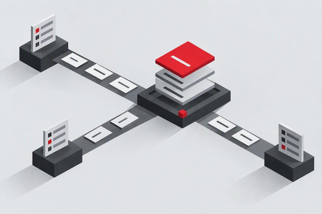
A heuristic evaluation checklist walks a small group of evaluators through an interface against a fixed set of usability principles, such as Nielsen's 10, so teams can find friction before users do. Your next move: pick one screen or flow, recruit three evaluators, and timebox each inspection to one or two hours.
TL;DR:
- Limit the review to one screen or flow, brief evaluators on the user, task, and device, and give everyone the same worksheet fields.
- Use three to five independent evaluators for one to two hours each, and keep worksheets private until everyone finishes to prevent groupthink.
- Use Nielsen’s 10 as the practical default, or ISO 9241-110 for a more structured review; log each violation, problem, location, and suggested fix.
- Consolidate duplicate findings before severity ratings, have evaluators independently score each issue from 0 to 4, and discuss wide differences between scores.
- Prioritize fixes by severity and business impact, not frequency; include acceptance criteria, screenshots, and heuristic references in tickets, then choose a recheck or user testing.
Table of Contents
- Set the Scope and Prepare Your Evaluators
- Choose the Checklist: Nielsen's 10 or ISO 9241-110
- Run Independent Inspections Without Groupthink
- Consolidate Findings and Rate Severity After the Fact
- Turn the List Into Prioritized Fixes
- A Copy-Ready Checklist for Your Workbook
- Where This Checklist Comes From
- What the Checklist Gets Wrong When Teams Skip the Boring Parts
- Get Ranked Fixes Without Building the Spreadsheet Yourself
- FAQ
- Sources
Set the Scope and Prepare Your Evaluators
Narrow the review before anyone opens the product. A full site audit invites shallow notes; a single screen, onboarding flow, or checkout path gets deep, usable findings.
Write a short brief so every evaluator starts from the same page. It should cover:
- The target user profile (new signup, returning admin, mobile shopper)
- Success criteria for the task (complete checkout, finish onboarding, find a setting)
- Device and browser constraints (mobile SEO best practices include specific considerations for mobile Safari, desktop Chrome, and various breakpoints)
- Any known context, like a recent redesign or a feature still in beta
Decide on a documentation format before the session starts. A shared workbook, a spreadsheet with one row per finding, or a Miro board with pinned screenshots all work, as long as every evaluator uses the same fields. Consistency here saves hours during consolidation.
Choose the Checklist: Nielsen's 10 or ISO 9241-110
Nielsen's 10 usability heuristics are the practical default for most teams: they are compact, well known, and easy to map to real screens. A few examples worth copying straight into a worksheet:
- Visibility of system status: does the page show a loading spinner during a slow save, or does it look frozen?
- Error prevention: can a user accidentally submit a payment form twice by double-clicking?
- Recognition rather than recall: does a multi-step form show previously entered data, or force the user to remember it?
For teams that want a more structured, principle-based framing, ISO 9241-110 offers seven interaction principles, including learnability, controllability, and use-error robustness, with its own annex checklist. Add domain-specific heuristics, such as accessibility criteria, payment-flow standards, or guidance for evaluating AI-generated outputs, once the core pass is done.
Run Independent Inspections Without Groupthink
Independence is the point of the method. When evaluators compare notes mid-session, they converge on the same handful of issues and miss the rest. A single evaluator typically catches only a third to just over 40% of major problems, which is why aggregating findings from several evaluators matters so much.
A workable session flow:
- First pass: move through the flow naturally, as a user would, without taking notes.
- Second pass: go screen by screen, checking each element against the chosen heuristics.
- Log every violation before moving to the next screen.
Each finding should capture four things: the violated heuristic, a short neutral problem statement, the location (a screenshot or URL), and a suggested fix. Budget roughly one to two hours per evaluator and three to five evaluators total for a review that balances coverage against cost.
Pro Tip: Keep worksheets private until everyone finishes. Comparing notes early quietly erases the diversity that makes multiple evaluators worth the time.
Consolidate Findings and Rate Severity After the Fact
Once every evaluator submits a worksheet, cluster duplicate findings using affinity grouping: pull similar issues into one neutral problem statement that captures the pattern without blaming a specific evaluator's phrasing. A findings table with columns for heuristic, description, and screenshot reference works well here.
Severity ratings come next, not during discovery. Rating while still searching for problems biases evaluators toward whatever they just found. Instead, run a post-session rating pass of about 30 minutes, where evaluators score the consolidated list using synthesized descriptions and screenshots.
- Use a 0 to 4 scale: 0 (not a problem) through 4 (usability catastrophe).
- Have each evaluator rate independently, then average the scores.
- Flag any issue with a wide spread between raters for a quick discussion.
A mean severity score from at least three evaluators gives a far more reliable priority signal than any single rater's gut call, since individual ratings vary but averages stabilize quickly.
Turn the List Into Prioritized Fixes
Rank by severity and business impact, not by how many evaluators happened to flag the same issue. A rarely noticed but catastrophic checkout bug outranks five cosmetic complaints about button color.
Split the backlog into quick wins and larger redesign work:
- Quick wins: copy changes, missing error messages, inconsistent labels.
- Redesign candidates: navigation restructuring, multi-step flow rethinks, new onboarding logic.
Write each ticket with clear acceptance criteria, the relevant screenshot, and the specific heuristic it addresses so engineers and designers understand the "why," not just the "what." For navigation-related findings, patterns like the ones in navigation fixes translate well into tickets. For form issues, see form optimization fixes. Once fixes ship, decide whether a quick heuristic re-check is enough or whether the issue is significant enough to warrant moderated user testing.
A Copy-Ready Checklist for Your Workbook
Paste this sequence into a spreadsheet, Notion doc, or Miro board:
- Scope brief: target screen, user profile, success criteria, device constraints.
- Evaluator prep: assign heuristics, confirm access, set the timebox.
- Per-evaluator worksheet: heuristic violated, problem statement, screenshot or URL, suggested fix.
- Consolidation: cluster duplicates, write neutral synthesized statements.
- Severity questionnaire: 0 to 4 rating per issue, per evaluator, averaged.
- Ticket creation: title, screenshot, heuristic reference, acceptance criteria, priority.
A sample entry might read: "Checkout button label changes without warning after address entry (Heuristic: Consistency and standards). Screenshot: checkout-step-3.png. Suggested fix: keep button label static until form validation completes."
Export the consolidated list as a PDF or shared spreadsheet so stakeholders outside the review can follow along without opening the raw worksheets.
Where This Checklist Comes From
- Independent inspection followed by synthesis, rather than group discussion during discovery, is the method's core design and the reason heuristic evaluations surface more issues than a single reviewer would catch alone.
- Rating severity after the fact, using synthesized descriptions, produces steadier scores than rating on the fly.
- Three to five evaluators is the range most consistently recommended for balancing thoroughness against the time cost of each session.
Aggregated findings from several independent evaluators expose usability problems that any one reviewer, working alone, would likely miss.
Teams that want to carry this workflow further without building every spreadsheet by hand can see how ranked, severity-weighted fixes look in practice using an AI-plus-human review approach, which mirrors the consolidation and prioritization steps above at the page level.
What the Checklist Gets Wrong When Teams Skip the Boring Parts
The checklist itself is not the hard part. Most teams that struggle with heuristic evaluation skip the unglamorous mechanics: they let evaluators chat during the session, they rate severity while still hunting for problems, or they settle for one reviewer because scheduling three felt like too much effort.

The conventional advice oversells the heuristics list and undersells the discipline around it. Nielsen's 10 are a shared vocabulary, not a magic diagnostic. The actual value comes from keeping evaluators independent until synthesis and from resisting the urge to rate severity in the moment.
If you only have bandwidth to do one thing well, protect evaluator independence. A rushed severity scale with three independent evaluators beats a beautifully designed rating system run by one person who already knows what they're going to find. Fix the process before you fix the checklist.
— William
Get Ranked Fixes Without Building the Spreadsheet Yourself
Running a full heuristic evaluation by hand takes real coordination: scheduling evaluators, building worksheets, and consolidating findings into something a product team can act on. We built our audit around the same core idea, independent diagnosis followed by synthesis, but automate the heavy lifting with AI-driven checks across seven layers, including UX and navigation, then add human beta tester review for the judgment calls software misses.
Every paid audit returns a ranked list of fixes by impact, exportable as a PDF, so you skip the manual consolidation step entirely. Run a free scan or start a Solo plan at $49 per month to see your first prioritized fix list.
FAQ
What are the steps in heuristic evaluation?
The core steps are: define scope and users, choose heuristics, brief evaluators, run independent inspections, document each violation, consolidate duplicates into neutral statements, rate severity, and assign fixes before a follow-up review. Teams typically use a few evaluators working one to two hours each.
What are the 10 heuristic principles?
Jakob Nielsen's 10 usability heuristics include visibility of system status, consistency and standards, error prevention, recognition rather than recall, and flexibility of use, among others. They were refined through factor analysis to give evaluators a shared, compact vocabulary rather than an exhaustive specification.
What is a checklist in evaluation?
In this context, a checklist is a structured list of usability principles, such as Nielsen's 10 or ISO 9241-110's interaction principles, that evaluators use to inspect an interface systematically. It standardizes what each reviewer looks for so findings can be compared and consolidated afterward.
What is heuristic evaluation?
Heuristic evaluation is an expert inspection method where evaluators independently review an interface against a fixed set of usability principles and log violations.
How is heuristic evaluation different from user testing?
Heuristic evaluation relies on evaluators applying known usability principles without real users present, while user testing observes actual people attempting real tasks. The two methods complement each other well: a heuristic pass catches known patterns quickly, and moderated or unmoderated user testing validates fixes with real behavior afterward.
Sources
- ISO 9241-110 reference and usability principles - course notes
- Heuristics explained - Princeton course handout