
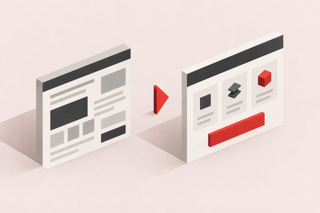
Well-targeted microcopy reduces friction at the exact moments users hesitate, and it can meaningfully lift conversions when you fix the right spots first. Start with three areas: CTA labels, form validation and error messages, and helper text near high-friction fields. These three show up repeatedly in Nielsen Norman Group's microcopy frameworks and in Baymard's error-message research, and they're the fixes an audit tool like Save Your App typically ranks highest.
TL;DR:
- Before testing a rewrite, state the expected mechanism and choose one primary metric, then segment new and returning visitors rather than blending them.
- Keep failed form entries intact, make each error name the problem and next step, and place the message prominently beside the affected field.
- A first time visitor needs trial commitment details; returning visitors can use brief labels, while developers need exact technical errors, not friendly generalities.
- Run each test through a full weekly cycle, track retention and support volume, and watch for pricing changes or seasonal shifts that may distort results.
Table of Contents
- What Microcopy Is and Where It Matters
- Why Microcopy Moves Conversion: Psychology and Evidence
- Practical Principles and Frameworks: 3 C's, 3 I's, and Fluency Rules
- High-Impact Patterns and Annotated Examples
- Quick Writer's Checklist and Reusable Templates
- How to Test Microcopy and Measure Real Impact
- Applied Example: How a Conversion Audit Surfaces Microcopy Fixes
- Strategies for Tailoring Microcopy to Different User Personas and Contexts
- Common Mistakes in Microcopy That Reduce Conversion
- Integration of Microcopy With Overall UX Design and Visual Hierarchy
- Examples of Microcopy Adaptations for Mobile Versus Desktop Interfaces
- Author Perspective: Treat Microcopy as a Conversion Experiment
- Save Your App: Quick Audit and Prioritized Fixes
- FAQ
- Sources
What Microcopy Is and Where It Matters
Microcopy is the short text embedded in an interface: button labels, placeholders, confirmations, tooltips. NN/g defines it as typically under three sentences, written for a reader who is scanning, not reading. That size constraint matters because every extra word competes with the user's attention at a decision point.
You'll find microcopy doing real work in these spots:
- Call-to-action buttons and links
- Form field placeholders and labels
- Inline validation and error messages
- Helper text next to complex or sensitive fields
- Confirmation and success messages
- Modal dialogs and tooltips
A generic CTA like "Submit" tells a user nothing about what happens next. "Get My Free Quote" tells them exactly what they'll receive. The same logic applies to errors: "Invalid input" forces a guess, while "Missing @ in email" points directly at the fix. Neither rewrite requires new design work, just sharper words in the same slot.
Why Microcopy Moves Conversion: Psychology and Evidence
Microcopy works on the brain's shortcuts. Cognitive fluency, the ease with which a sentence is processed, lowers the mental cost of a decision. Simple, familiar words read faster and feel more trustworthy than jargon or vague phrasing, which is why "Cancel anytime" consistently outperforms "No long-term commitment required."
Loss framing and autonomy cues work alongside fluency. Telling someone what they'll lose by not acting ("Only 2 left") can prompt faster decisions, but it backfires when it feels manipulative or when the stakes are low. Preserving a sense of choice, sometimes called the "but you are free" effect, tends to soften pushy copy without weakening its pull. A practitioner analysis of microcopy psychology notes that changes targeting fluency, loss framing, and autonomy together often produce effects larger than any single mechanism alone.
Most websites fail to provide specific, adaptive validation error messages, according to Baymard's research on adaptive error messages. Replacing a generic "Invalid entry" with something like "Missing @ in email" shortens recovery time and cuts abandonment, because it removes the guesswork that fluency theory predicts will stall a user mid-form.
Practical Principles and Frameworks: 3 C's, 3 I's, and Fluency Rules
Two frameworks give writers a quick way to check any piece of microcopy before it ships.
NN/g's 3 C's rank clarity, concision, and character in that order. Clarity comes first: if a shorter version of a sentence risks confusion, keep the longer version. Concision matters, but never at the cost of a user understanding what to do next. Character, the brand voice layer, comes last and should never override the first two.
NN/g's 3 I's sort microcopy by goal: inform, influence, or interact. Before writing a snippet, decide which job it's doing. A field label informs. A CTA influences. A loading message supports interaction. Mixing goals, like injecting marketing language into a functional error, usually confuses more than it persuades.
A few working rules follow from both frameworks:
- Use the vocabulary your users already have, not internal jargon.
- Replace vague urgency ("Act now") with specific, honest loss framing ("Your cart expires in 10 minutes").
- Preserve user agency in error states and opt-outs; never trap someone into a choice that feels forced.
Pro Tip: Before editing any microcopy, label it with one of the 3 I's. If you can't decide whether it's informing, influencing, or interacting, the copy is probably trying to do too much.
High-Impact Patterns and Annotated Examples
A few swaps consistently move the needle because they match copy to how users already think about the task.
- CTA labels: Swap "Submit" for "Start My Free Trial" when the action starts something, or "Get My Quote" when it delivers a result. Test hypothesis: specific, outcome-based labels increase fluency and reduce hesitation at the click point.
- Error messages: Follow a what, why, how structure. Before: "Invalid input." After: "That phone number is missing an area code. Add three digits and try again." The rewrite preserves the user's original entry and names the fix, consistent with Smashing Magazine's error-message guidance.
- Helper and reassurance text: Near a payment or signup CTA, a one-line reassurance like "No credit card required" or "Cancel anytime" reduces perceived risk without adding visual weight.
- Opt-out language in modals: Instead of a guilt-trip dismiss link ("No thanks, I don't want to save money"), use neutral phrasing like "Not now." It preserves autonomy and avoids the backlash that manipulative "confirmshaming" produces.
Each of these is small enough to test in isolation, which matters more than it sounds: isolating one variable is the only way to know which word actually moved the number.
Quick Writer's Checklist and Reusable Templates
Run this in about ten minutes before shipping any microcopy change.
- Identify every CTA on the page and check whether it names the outcome.
- Check all form error messages for specific, actionable language.
- Confirm user input is preserved after a failed submission.
- Look for helper text near any field that asks for sensitive or unfamiliar information.
- Scan confirmation messages for clarity about what happens next.
- Check opt-out and dismiss links for guilt-based or manipulative phrasing.
- Verify tone consistency across all microcopy on the page.
A few templates worth keeping in a shared doc:
- CTA: "[Verb] My [Specific Outcome]" (example: "Get My Free Quote")
- Field error: "[Field name] needs [specific requirement]."
- Validation error: "That [field] doesn't match the format we need. Try [example]."
- Server error: "Something went wrong on our end. Your information is saved, try again in a moment."
- Opt-out: "Not now" or "Maybe later" instead of guilt-framed dismissals.
When you log a microcopy test in a ticket or experiment brief, name the exact strings being changed, the psychological mechanism you expect to move (fluency, loss framing, or autonomy), and the single metric you'll check first.
How to Test Microcopy and Measure Real Impact
A microcopy test is only useful if the hypothesis names a mechanism, not just a guess. Write it like this: "Changing the CTA from 'Submit' to 'Get My Free Quote' will increase click-through because it raises outcome clarity and cognitive fluency."
Before launching, run through this checklist:
- Segment traffic so new and returning visitors aren't blended into one result.
- Pre-register the primary metric (click rate, form completion, checkout conversion) before you see any data.
- Set a minimum exposure window that covers a full weekly cycle, not just a few hours.
- Check secondary quality signals, like support tickets or error-retry counts, to confirm the win isn't hiding a hidden cost.
Watch for confounders like a concurrent pricing change or seasonal traffic shift, and always track downstream metrics (retention, support volume) alongside the immediate conversion number, since a microcopy win that increases churn later isn't really a win.
Applied Example: How a Conversion Audit Surfaces Microcopy Fixes
In practice, we find microcopy issues the same way most audits do: by combining automated scanning with human judgment. Our Prism Engine™ flags patterns like generic CTAs, vague error text, and missing helper copy near sensitive fields, then our human reviewers confirm which flags actually affect real user behavior rather than just looking imperfect.
A typical ranked output from this process includes:
- Swapping a generic "Submit" button for an outcome-specific label on a signup form.
- Replacing a catch-all validation message with field-specific guidance on a payment form.
Each fix comes with an expected behavior change, like fewer abandoned forms or faster task completion, so teams know what to watch after shipping. For teams who want to see this kind of prioritization applied to analytics data, our post on turning GA4 events into a test backlog walks through the process, and our form optimization guide covers field-level microcopy in more depth.
Strategies for Tailoring Microcopy to Different User Personas and Contexts
The same CTA rarely works equally well for a first-time visitor and a returning power user. A new visitor needs more context: "Start Your Free 14-Day Trial" tells them what they're committing to. A returning user already knows the product, so "Resume Your Project" respects their familiarity and skips the reintroduction.
Context matters as much as persona. A B2B buyer filling out a demo request form expects formal, specific language ("Schedule a Call With Our Team"), while a consumer checkout flow benefits from warmer, more casual phrasing ("You're almost there!"). Technical audiences, like developers reading an API error, want precision over friendliness: "Rate limit exceeded: 100 requests per minute" beats "Oops, slow down!"
Age and familiarity with technology shift the calculus too. Older or less tech-fluent users benefit from more explicit instructions and fewer idioms, while younger or more technical users tolerate shorthand and move faster through minimal copy. The safest approach is to map your primary personas before writing, decide which vocabulary they already use, and write toward that vocabulary rather than toward what sounds clever internally.

Common Mistakes in Microcopy That Reduce Conversion
The most frequent mistake is vagueness disguised as brevity. "Submit," "Click here," and "Learn more" all save space but tell the user nothing about the outcome, which increases hesitation rather than reducing it.
A second common error is clearing user input after a failed submission. Forcing someone to retype a long form because of one typo is a reliable way to lose them entirely, and it directly contradicts the input-preservation guidance in Smashing Magazine's error-message research.
Overusing urgency is another trap. Constant "Only 1 left!" messaging stops producing the intended effect once users notice it never changes, and it damages trust faster than it drives action.
Finally, many teams write microcopy in isolation from the rest of the interface, resulting in a mismatch between the button's visual weight and its text's importance, or a tone that clashes with the surrounding content. Treating microcopy as an afterthought, written after the design is finalized, is often the root cause of all of the above.
Integration of Microcopy With Overall UX Design and Visual Hierarchy
Microcopy doesn't work in isolation from layout. A perfectly worded CTA buried below the fold or in low-contrast gray text will underperform a mediocre label placed where the eye naturally lands. Visual hierarchy and wording need to reinforce each other, not compete.
The size, color, and placement of a text element signal its importance before a user reads a single word. If a reassurance line like "No credit card required" is meant to reduce anxiety near a signup button, it needs to sit close enough to that button to be read in the same glance, not tucked into a footer. Similarly, error messages need visual prominence (color, icon, position near the field) that matches their urgency, since a quiet gray error easily gets missed entirely.
Good microcopy and good layout get designed together, ideally with writers involved before wireframes are finalized rather than brought in to fill empty boxes afterward, a process detailed in A faster website: what to measure and what to fix. When a writer understands the hierarchy a designer intends, they can write copy that matches the emphasis the layout is trying to create, rather than fighting it.

Examples of Microcopy Adaptations for Mobile Versus Desktop Interfaces
Screen size changes how much microcopy a user will actually read. On desktop, a helper line under a form field has room to be a full sentence: "We'll only use this email to send your receipt." On mobile, the same message often needs to shrink to fit without wrapping awkwardly: "Used only for your receipt."
CTA buttons face a similar constraint. A desktop button can hold "Add to Cart and Continue Shopping," but the same label on a mobile screen risks wrapping to two lines or crowding the touch target. The mobile version, "Add to Cart," trades some specificity for scannability and thumb-friendly tap area.
Error messages also shift placement on mobile, where inline text below a field is easier to notice than a modal that covers the keyboard. Tooltips, which work well on desktop with a hover state, often need to become tap-to-reveal text on mobile since there's no hover equivalent. Writing for both means drafting a full version and a compressed version of every critical microcopy string, then testing that the shorter version still carries the same meaning.
Author Perspective: Treat Microcopy as a Conversion Experiment
Microcopy is a testable variable, not a finishing touch. Pair a writer with a product analyst on every meaningful rewrite, and let the data settle the argument.
— William
Save Your App: Quick Audit and Prioritized Fixes
Instead of guessing which CTA or error message to rewrite first, we run a full audit across seven layers, including conversion and onboarding, and hand back a ranked list of fixes. Our Free plan covers a basic scan, while Solo runs 49 USD per month and Founder runs 129 USD per month for ongoing human-reviewed analysis. For a deeper look, add an Extra 3-day test at 199 USD one-off.
See what your own page is losing at Saveyourapp.
FAQ
How do I write effective microcopy?
Start by naming the goal of the snippet, whether it informs, influences, or interacts, using the 3 I's framework. Then write for clarity first, trimming words only if meaning stays intact, following the 3 C's approach.
What is a micro conversion?
A micro conversion is a smaller process milestone, like starting a form or adding an item to a cart, that predicts whether a visitor will complete the larger goal. Tracking micro-conversions helps teams spot friction before it causes a lost sale.
What is the definition of microcopy?
Microcopy is the short interface text, usually fewer than three sentences, found in buttons, labels, placeholders, and error messages. It guides users through small decisions rather than explaining a product in depth.
How do I convert a vague message into specific microcopy?
Replace generic phrasing with language that names the exact issue and the exact fix, such as changing "Invalid input" to "Missing @ in email." Baymard's research found that most sites still skip this step, which is why specific messages stand out.
What's the fastest way to check my site's microcopy?
Run a quick audit that flags vague CTAs, generic errors, and missing helper text across your key pages, then prioritize fixes by expected impact. A tool like Save Your App's free scan returns this kind of ranked list without manual review of every page.
Sources
- The 3 I’s of Microcopy — Nielsen Norman Group
- Adaptive validation error messages — Baymard Institute