
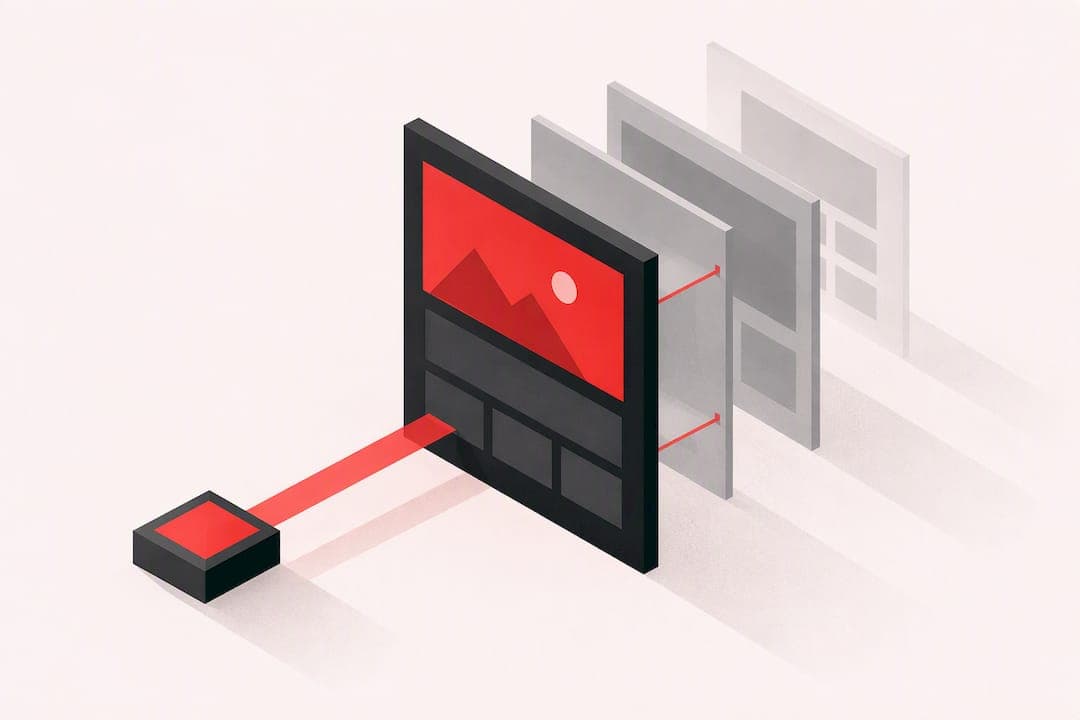
Above the fold content is whatever appears in the visible viewport before a visitor scrolls, and the single most important move is to put your clearest value statement and one primary action inside that space. The exact height changes by device and screen, so the goal is never a fixed pixel count. It's a balance between instant clarity and fast loading.
TL;DR:
- NN/g eyetracking found that about 57% of viewing time occurs above the fold and 74% within the first two screenfuls, but these are not universal targets.
- Measure Largest Contentful Paint separately on mobile and desktop, aiming for 2.5 seconds or less at the 75th percentile; optimize the largest visible element first.
- Test the CTA on viewport sizes your main traffic uses, keep it visible on narrow screens, and make tappable targets at least 44 by 44 pixels.
- Track Cumulative Layout Shift after ad changes; reserved space and lower placements help keep headlines and calls to action from jumping.
Table of Contents
- What above the fold means today and why it still matters
- What research and metrics show about user attention and scrolling
- Practical best practices for above-the-fold content
- Technical steps to speed up the initial viewport
- Mobile and responsive considerations for above-the-fold design
- Ads, dynamic content, and layout shift risks near the fold
- Above-the-fold layout patterns worth testing
- A prioritized checklist and the blind spots audits catch most often
- Why the fold still gets misunderstood
- Turning this checklist into ranked fixes with Save Your App
- FAQ
- Sources
What above the fold means today and why it still matters
The term comes from newspapers, where editors put the most important headline above the physical crease so it would catch a reader's eye on a newsstand. On the web, there's no crease, just a browser window that changes size with every device, so "the fold" is really a moving line defined by whatever screen someone happens to be using.
That's why treating it as a single pixel target misses the point. The fold works better as a prioritization boundary: a reminder that whatever occupies the top of your page should carry your strongest message, because that's where attention concentrates before a visitor decides whether to keep going.
Visitors scroll past that boundary constantly, but only when the top of the page gives them a reason to. Jakob Nielsen's information-foraging research describes this as information scent: people follow a trail of cues that suggest more value lies ahead. A strong headline and a visible next step create that scent. A vague one kills it before the visitor ever reaches your second screen.
What research and metrics show about user attention and scrolling
Eyetracking research from NN/g found that about 57% of page viewing time happens above the fold, with 74% concentrated in the first two screenfuls. Attention drops sharply once visitors scroll past that point, and the 100 pixels just above the fold receive roughly twice the viewing time of the 100 pixels just below it.

Around 57% of page viewing time happens above the fold, according to NN/g eyetracking, which means the content you place there carries a disproportionate share of your page's persuasive weight.
That figure describes general browsing behavior, not a universal rule for every layout or audience, so don't treat it as a target to hit on every page. What matters more is watching how your own visitors behave on the devices they actually use. A handful of metrics make that concrete: Largest Contentful Paint at the 75th percentile, scroll depth, bounce or exit rate on your landing pages, and time to first meaningful paint. Together they tell you whether your initial viewport is both fast enough and compelling enough to earn a scroll.
Practical best practices for above-the-fold content
A strong initial viewport does a few things at once: it states what the page is for, gives the visitor one clear action, and avoids clutter that competes for attention. Shopify's guide to above-the-fold design recommends concise headlines, responsive layouts, fast loading, and visual cues that invite scrolling, all aimed at the same outcome: getting the visitor to understand the offer in seconds.
- Write a unique, descriptive heading that states the page's purpose and the benefit to the visitor, not a generic tagline.
- Feature one primary call to action with a clear label, and add a secondary action only if it doesn't compete for attention.
- Keep supporting copy short and scannable, with a visual hierarchy that makes the most important line impossible to miss.
- Use meaningful, optimized visuals that reinforce the message instead of decorative images that just fill space.
- Add a visual signpost, like a partial element or a subtle arrow, that signals more content sits below the fold.
- Avoid stacking navigation bars, promotional banners, and large ads into the same space; each one competes with your actual message.
Pro Tip: If a visitor can't tell what your page does or what to click quickly, the problem is often above the fold, not somewhere deeper in the layout.
A false floor, where the design makes it look like the page ends right at the fold, is one of the most common ways to lose a visitor who would have kept reading if they'd realized there was more.
Technical steps to speed up the initial viewport
A beautiful hero section means nothing if it takes too long to appear. Web recommends measuring Largest Contentful Paint separately for mobile and desktop, targeting 2.5 seconds or less at the 75th percentile. The LCP element is usually your largest visible image, text block, or video, which makes it the single most useful thing to optimize first.
- Measure LCP per device type rather than relying on a single average, since mobile and desktop often behave very differently.
- Inline only the CSS required for the initial viewport, keeping critical CSS compact.
- Preload the LCP image and key fonts using
rel="preload"so the browser fetches them earlier in the loading sequence. - Optimize hero images with modern formats and correctly sized assets, and lazy-load anything below the fold.
- Defer or load noncritical JavaScript asynchronously so it doesn't block the browser from rendering your main content.
Westcode's breakdown of how site speed affects revenue covers similar ground from a business impact angle, useful if you need to make the case for prioritizing this work internally.
Mobile and responsive considerations for above-the-fold design
Desktop and mobile visitors see completely different folds, so testing a layout only on a large monitor tells you very little about what most of your traffic actually sees. Start by identifying the handful of viewport sizes that make up most of your real traffic and test your above-the-fold layout against those specific heights.
Touch targets matter just as much as visual hierarchy on small screens. Zyff's guidance on mobile popup design points to 44 by 44 pixels as a practical minimum for tappable elements, a standard worth applying to your primary CTA as well as any popups or widgets layered on top of it.
Short copy does more work on mobile, where vertical space is scarce and every extra line pushes your call to action further down. A visual signpost, like a partially visible card or a scroll cue, helps communicate that there's more to see without forcing the visitor to guess. Progressive disclosure, where the top of the page stays simple and promising while detail unfolds as the visitor scrolls, tends to outperform cramming everything into the first screen.
Ads, dynamic content, and layout shift risks near the fold
Dynamic elements, like ads, cookie banners, or late-loading widgets, can quietly wreck an otherwise solid above-the-fold design by shifting your headline or CTA after the page has already rendered. Google's publisher guidance on minimizing layout shift recommends reserving dimensions for ad slots in advance and keeping high ad slots far enough from the top of the viewport to reduce disruptive layout shifts.
- Reserve fixed dimensions for every ad slot before it loads, rather than letting content jump once the ad arrives.
- Push large ad units below the fold when possible, since high slots are the most likely to displace your core message.
- Use CSS aspect-ratio boxes or placeholders for any late-loading element so the layout doesn't move once it appears.
- Track Cumulative Layout Shift and real-user metrics after any ad or banner change to confirm it didn't hurt the experience.
Above-the-fold layout patterns worth testing
Different page goals call for different above-the-fold structures, and picking the right one matters more than fine-tuning any single pattern.
- Hero with a concise headline and a single CTA works best for conversion-focused landing pages where one action, like a signup or a demo request, is the entire goal.
- Product preview with price and an add-to-cart button suits commerce landing pages, where visitors expect to see the item and the cost before anything else.
- Signup teaser with a short benefit line and a start button fits SaaS acquisition pages, where clarity about the core benefit matters more than a long pitch.
- Teaser with cut-off content or a scroll arrow works for long-form pages where scrolling is already expected, like articles or editorial content.
Whichever pattern you pick, validate it with A/B testing and a handful of qualitative beta sessions rather than assuming it will transfer cleanly from another site. Mobile-first landing page design for paid acquisition traffic often needs its own variation of these patterns, since ad-driven visitors arrive with less context than organic ones.
A prioritized checklist and the blind spots audits catch most often
Start with the basics: a clear headline, an obvious CTA, a measured LCP score, reserved space for any ads, and a visual signpost that invites scrolling. Those five items fix the majority of above-the-fold problems we see in audits.
- Check whether your CTA disappears or gets pushed off-screen on narrow mobile viewports, a mistake that's easy to miss on desktop.
- Look for oversized, unoptimized hero images that quietly tank your LCP score without anyone noticing.
- Watch for false floors where the design makes the page look finished right at the fold.
Pro Tip: Pair a handful of quick user sessions with your metrics dashboard. Watching someone hesitate at your CTA can reveal issues that analytics alone may miss.
Why the fold still gets misunderstood
Most advice about above-the-fold design treats it as a layout problem, something to solve with the right hero image or button color. The eyetracking evidence tells a different story: attention concentrates at the top because visitors are scanning for a reason to keep going, not because the top of the page is sacred real estate on its own.
That reframes the priority. A fast, clear, single-purpose top section beats a polished one that loads slowly or buries the CTA under a carousel. Teams spend too much time debating hero image choices and too little time measuring LCP or checking whether their CTA remains visible on narrow screens.

The conventional advice also treats the 57% viewing-time figure as a reason to cram everything above the fold. It's the opposite case: visitors reward pages that promise value briefly and let them scroll for the rest. A page that tries to say everything at once usually says nothing clearly.
If you take one thing from this, prioritize clarity and speed above the fold before touching anything else. Everything downstream, including scroll depth and conversion rate, depends on getting those two right first.
— William
Turning this checklist into ranked fixes with Save Your App
Running through this checklist manually takes time, and it's easy to miss issues that only show up under real testing. We built our audit to catch exactly that: seven layers covering technical SEO, performance, UX, conversion, accessibility, trust, and onboarding, combined with human beta tester reviews.
- Get a ranked issue list that tells you which above-the-fold problems to fix first, based on impact.
- See suggested fixes alongside AI diagnostics and human review, included in every paid plan.
- Start with a free scan or check the Solo and Founder plans for ongoing audits and repeated testing.
If you want a deeper look at how ranked fixes translate into results, our post on landing page conversion improvements walks through the same AI-plus-human approach applied to real pages.
FAQ
What does above the fold content mean?
Above the fold content is whatever a visitor sees in the browser viewport before scrolling, including the headline, hero image, and primary call to action. The exact height varies by device and screen size, so it's best understood as a prioritization zone rather than a fixed measurement.
What is below the fold content?
Below the fold content is everything positioned further down the page that requires scrolling to see, such as detailed features, testimonials, or secondary sections. It still matters for persuasion and SEO, but it carries less of the initial attention than the content visitors see first.
Is above the fold still relevant?
Yes. NN/g eyetracking research found that a large share of page viewing time concentrates above the fold and in the first two screenfuls, which means the content placed there still carries outsized weight in how visitors judge a page.
What is the saying above the fold?
The phrase originated in newspapers, referring to the top half of a folded paper where editors placed the most important headline to catch attention on a newsstand. On the web, it describes whatever appears in the visible screen before a visitor scrolls down.