

Landing page conversion is the percentage of visitors who complete the action you want, whether that's signing up, buying, or booking a call, and the fastest way to raise it is removing friction, starting with page speed and form length. A page loading under three seconds converts at rates roughly 32% higher than a slower one, according to Kissmetrics. Benchmark against your specific funnel type, not a generic average, before you decide what "good" even means.
TL;DR:
- Improving page load speed from three seconds to under three seconds can increase conversions by roughly 32 percent, especially on mobile.
- Limiting form fields to three or fewer significantly boosts completion rates, as each additional field reduces conversions by 3 to 5 percent.
- Removing site navigation from landing pages can increase conversions by maintaining visitor focus on a single goal.
- Prioritizing fixes using a structured audit and impact-to-effort ranking helps address the most significant leaks first, rather than making superficial visual changes.
- Ensuring message match between ads and landing page headlines, along with specific proof points and clear CTA copy, is crucial for maintaining visitor trust and driving conversions.
Table of Contents
- How Do You Measure Landing Page Conversion Correctly?
- What Do Speed and Form Length Actually Cost You?
- Landing Page Anatomy: What Each Element Must Actually Do
- Which Technical Speed Fixes Should Marketers Push First?
- How Do You Fix Message Match and CTA Copy?
- How Many Form Fields Should a Landing Page Have?
- Where Should Social Proof Go for Maximum Impact?
- Does Mobile Design Really Change Landing Page Conversion?
- What's the Right Way to Test and Prioritize Landing Page Changes?
- What Landing Page Patterns Convert Best Right Now?
- How Does a Prioritized Audit Turn Findings Into Ranked Fixes?
- A Practitioner's Take on Where Teams Actually Go Wrong
- Get a Ranked, Prioritized Fix List From Saveyourapp
- Sources
- FAQ
How Do You Measure Landing Page Conversion Correctly?
The formula is simple: conversions divided by total visitors, multiplied by 100. The complications start with what you count. Do you divide by unique users or by sessions? Unique users gives you a cleaner picture of individual behavior, but session-based tracking matters more for paid traffic where the same person might land twice from two different ads before converting.
Pull at least a 90-day window before drawing conclusions. Shorter windows get skewed by a single viral referral spike or a slow news week, and weekday-versus-weekend traffic patterns alone can swing a two-week sample by several points. Split every report by traffic source too. A page converting at 6% overall might be converting at 11% from organic search and 2% from a mismatched paid campaign, and averaging those numbers hides the real problem.
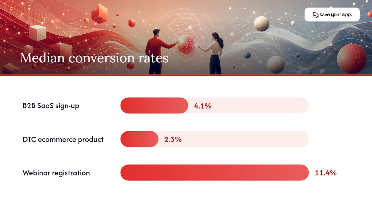
Benchmarks vary sharply by funnel, and comparing your SaaS trial page to an ecommerce checkout is a waste of time. Research from a 2,000-page study by Digital Applied puts median conversion rates at:
- B2B SaaS sign-up pages: around 4.1%
- DTC ecommerce product pages: around 2.3%
- Webinar registration pages: around 11.4%, reflecting lower commitment
Top-quartile performers in each category often run two to three times their median. If your B2B SaaS page sits at 4%, you're average. Treat 10% or higher as the real target before calling the page "done."
What Do Speed and Form Length Actually Cost You?
The gap between a fast page and a slow one isn't cosmetic. It's the single biggest lever most teams ignore because fixing it requires engineering time instead of a copy tweak.
The core numbers: Bounce probability jumps 32% as load time moves from one second to three, and pages loading under three seconds convert 32% higher than slower ones, per Kissmetrics. On mobile specifically, Shopify's research found that a 0.1-second improvement in load time can markedly lift retail conversion rates.
That second figure deserves attention. A tenth of a second is barely perceptible to a human, yet it moves revenue at that scale because mobile traffic is unforgiving and impatient in ways desktop traffic isn't.
Forms carry their own tax. Each additional field beyond the essentials cuts completion rates by roughly 3% to 5%, and Kissmetrics notes that three fields is often considered a balanced choice for lead generation, balancing lead quality against volume.
Layout patterns matter too, though less predictably than speed and fields. The Digital Applied study found:
- Single-stat heroes (one sharp number, not a paragraph) tend to perform better than generic hero copy across the sample
- Named-customer proof generally outperforms anonymous testimonials and trust badges
- Sticky CTAs typically produce a meaningful lift on their own, and stacking an above-fold CTA on top of a sticky one didn't add proportional gain
That last point matters for prioritization. If you're choosing one CTA fix to ship this week, the sticky bottom bar often outperforms polishing the hero CTA.
Landing Page Anatomy: What Each Element Must Actually Do
Every element on the page has one job. When an element tries to do two jobs, or no job, conversion suffers.
- The headline states the outcome, not the feature. "Cut onboarding drop-off in half" beats "Advanced Onboarding Analytics Platform" because it answers the visitor's actual question in under two seconds.
- The subhead removes the biggest objection or adds the specificity the headline couldn't fit. This is where you name the audience, the timeframe, or the mechanism.
- The hero visual shows the product doing the thing, not a stock photo of people pointing at a laptop. Screenshots and short product clips outperform abstract imagery almost every time.
- The primary CTA uses a single verb phrase tied to the actual next step: "Start Free Scan," not "Submit." Vague button copy is one of the most common and most fixable mistakes on the page.
- The form asks for the minimum information needed to route the lead, and nothing more, until later stages of the relationship justify asking for more.
- Social proof sits where doubt peaks, usually right before or beside the CTA, not buried in a footer nobody scrolls to.
The value-prop grid versus hero-first debate comes up constantly, and the honest answer is that it depends on visitor intent. Cold traffic from a display ad needs more context before it hits a CTA, so a value-prop grid earns its space. Warm traffic from a branded search or an email click already knows why they're here, and a hero-first layout with an immediate CTA converts better because you're not making them re-read a pitch they already believed.
One structural decision outperforms almost every visual tweak: removing site navigation entirely. HubSpot's testing found that stripping navigation from landing pages increases conversions because a single-goal page with no exit ramps keeps visitors focused on the one decision you want them to make.
Which Technical Speed Fixes Should Marketers Push First?
You don't need to become an engineer to push the right fixes. You need to know which three metrics matter and how to phrase the request so engineering prioritizes it.
Google's Core Web Vitals give you the framework:
- Largest Contentful Paint (LCP): aim under 2.5 seconds. This measures how fast the main content becomes visible, and it's usually the metric most tied to bounce rate.
- Cumulative Layout Shift (CLS): keep it under 0.1. Nothing kills trust faster than a page that jumps around while loading, especially when it moves a CTA button just as someone taps it.
- Interaction to Next Paint (INP): under 200 milliseconds. This one matters most on form-heavy pages where every click needs to feel instant.
The quick-win checklist, roughly in order of effort-to-impact ratio:
- Compress and resize hero images before upload; a 4,000-pixel-wide image displayed at 800 pixels is pure waste
- Preload the hero image and any custom fonts so the browser doesn't discover them late in the render
- Cut third-party scripts that aren't earning their weight: extra chat widgets, unused tracking pixels, and redundant analytics tags
- Lazy-load anything below the fold, especially testimonial carousels and embedded video
- Move to a CDN if your hosting doesn't already route through one
Pro Tip: Run your page through PageSpeed Insights before and after each fix, one at a time. Bundling five changes into one deploy means you'll never know which one actually moved the number.
Given that under-three-second pages convert 32% higher and a tenth-of-a-second mobile gain can lift retail conversion by 8.4%, speed fixes usually pay for themselves faster than any copy rewrite.
How Do You Fix Message Match and CTA Copy?
Message match means the landing page says the same thing the ad, email, or search result promised. Break that chain and visitors bounce within seconds because the page feels like a bait-and-switch, even when it isn't one.
Auditing message match takes ten minutes: pull up your top three traffic sources side by side with the landing page and check whether the exact phrase, offer, or number in the ad appears near the top of the page. If your ad says "50% off first order" and the landing page headline talks about "premium quality," you've found your leak.
Headline testing beats almost every other copy experiment because the headline decides whether anyone reads the rest of the page. Headline types that consistently perform well:
- Outcome-first: states the result before the mechanism ("Ship features 40% faster")
- Specific-number: a single concrete stat instead of vague superlatives
- Direct-address: names the visitor's role or situation explicitly
CTA copy rules that hold up across most tests:
- Use first person where it fits naturally: "Start My Free Scan" tends to outperform "Start Your Free Scan" in several published tests, likely because it mirrors the visitor's internal voice
- Be specific about what happens next, not generic about the action: "Get My Pricing" beats "Submit"
- Name the benefit, not the mechanism, when space allows: "See My Score" beats "Run Analysis"
How Many Form Fields Should a Landing Page Have?
Fewer than you think, and the exact number depends on what happens after the form submits.
A newsletter sign-up needs one field: email. A lead-magnet download can justify two: email and maybe company size. A demo request, where a sales rep is about to spend real time on the lead, can justify three or four: name, email, company, and maybe role. Anything beyond that should get pushed to a later stage of the relationship rather than the first landing page.
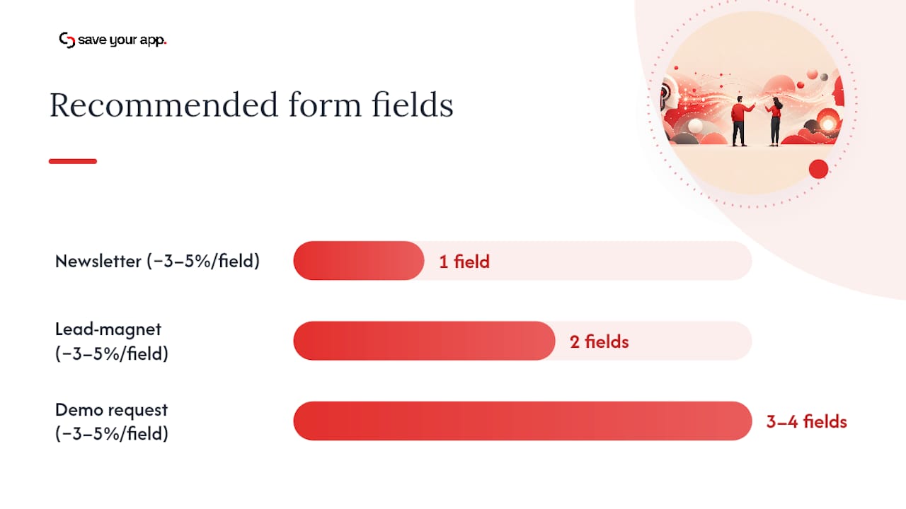
That restraint has a measurable cost if ignored. Each additional field drops completion by roughly 3% to 5%, and three fields is often the point where lead quality and volume balance out.
Progressive profiling solves the tension between short forms and sales team data needs. Ask for the minimum up front, then use server-side enrichment tools or a second-touch form (inside a welcome email or a returning-visitor prompt) to collect the rest over time. Marketing automation platforms with enrichment features can fill in company size, industry, or job title from an email domain alone, no extra field required.
Form UX details that punch above their weight:
- Inline validation that flags an error the moment someone leaves a field, not after they hit submit and lose everything
- Correct keyboard types on mobile: numeric pad for phone numbers, email keyboard with the @ symbol pre-loaded for email fields
- Autofill support through standard HTML attributes, so returning visitors and anyone using a password manager can finish in one tap
- Clear, specific error messages ("Enter a valid email address") instead of a generic "Error" that leaves the visitor guessing
Where Should Social Proof Go for Maximum Impact?
Generic trust badges and vague "Trusted by thousands" lines rarely move anyone anymore. Visitors have seen that pattern too many times to trust it on sight.
Specific, named proof works because it's checkable and concrete. A quote naming a real company, a real result, and a real name reads as evidence. A row of unnamed five-star icons reads as decoration. The Digital Applied study found named-customer claims outperformed generic hero treatments by a wide margin across the sample.
Placement matters as much as format:
- Put the strongest single proof point directly beside or just above the CTA, where doubt peaks right before someone commits
- Use a logo bar higher on the page for quick credibility, but save the detailed testimonial or case-study snippet for the moment of decision
- Test one strong, specific proof point against your current placement before adding more; stacking five testimonials rarely beats one great one
Audience sophistication changes what convinces people. Cold, unfamiliar traffic responds to logos and aggregate numbers because they need quick, low-effort trust signals. Warmer, more informed traffic responds better to a specific case study or a named result because they're already past the "is this legitimate" question and into the "will this work for me" question.
Does Mobile Design Really Change Landing Page Conversion?
Mobile traffic often makes up more than half of landing page visits, and most of the speed and form findings above hit harder on a phone than on a desktop screen.
The biggest mobile-specific mistake is a multi-column hero layout that pushes the CTA below the fold on a small screen. What looks balanced on a 27-inch monitor becomes a wall of scrolling on a phone. Keep the CTA visible within the first screen, full stop.
Practical mobile and accessibility fixes that overlap almost completely:
- Use large touch targets, at least 44 pixels tall, so a thumb doesn't miss the button or hit the wrong one
- Set correct input types so the right keyboard appears automatically for email, phone, and numeric fields
- Support autofill so returning visitors and password-manager users finish forms in seconds
- Label every form field explicitly rather than relying on placeholder text alone, since placeholder-only labels disappear the moment someone starts typing and confuse screen-reader users
- Maintain sufficient color contrast between text and background, not just for compliance but because low-contrast text is genuinely harder to read in direct sunlight on a phone
- Write error messages that state the fix, not just the failure, since vague errors frustrate everyone but hit screen-reader users hardest
What's the Right Way to Test and Prioritize Landing Page Changes?
Optimization is a math problem before it's a design problem. Leadpages makes the case plainly: prioritize fixes by measured impact and available traffic, not by which change feels the most exciting to ship.
- Write a hypothesis before building anything. "Reducing the form from six fields to three will increase completions by at least 15% based on the field-friction data above" is testable. "Let's try a different color" isn't a hypothesis, it's a guess.
- Size your sample before you start. A test needs enough traffic to reach statistical significance within a reasonable timeframe; running a test on 200 monthly visitors for two weeks and calling it conclusive is how teams fool themselves.
- Pick one primary metric and one or two secondary metrics. Conversion rate is usually primary. Time on page, scroll depth, and form abandonment rate make useful secondary signals that explain why a change worked or didn't.
- Segment results by channel before declaring a winner. A change that helps organic traffic can hurt paid traffic, and averaging the two hides the split.
- Score every proposed test with a simple formula: expected lift times monthly traffic, divided by build effort. A change with modest lift on your highest-traffic page often beats a dramatic redesign on a page nobody visits.
What Landing Page Patterns Convert Best Right Now?
A handful of repeatable patterns show up across high performers, and most can be adapted to an existing page in an afternoon.
- Single-stat hero: one sharp number as the headline visual, backed by a one-line explanation. Best for B2B SaaS with a clear quantifiable result. Test it against your current hero image first.
- Sticky bottom CTA: a persistent bar with one action, visible on scroll. Best for long-form pages and mobile-heavy traffic. Ship this before touching anything else on the CTA.
- Named-customer proof block: a specific quote with a real name, company, and result placed beside the form. Best for higher-consideration purchases. Swap your current generic testimonial for one specific one and measure the difference.
- Progressive form: one field visible, more revealed after the first is filled. Best for lead-gen pages where field count is hurting completion but sales needs more data eventually.
- Navigation-free layout: strip the header nav entirely so the CTA is the only exit. Best for paid-traffic landing pages with a single conversion goal.
- Outcome-first headline: leads with the result, not the feature list. Best for cold traffic that needs to understand value in two seconds.
- Webinar countdown pattern: urgency framed around a real date, not a fake scarcity timer. Best for registration pages, where the benchmark conversion rate already runs near 11.4%.
On mobile, collapse any multi-column pattern into a single vertical stack, and on low-traffic pages, skip statistical A/B testing in favor of directional before-and-after comparisons over a longer window.
How Does a Prioritized Audit Turn Findings Into Ranked Fixes?
A scattershot approach to conversion optimization wastes time testing low-impact changes while the real leaks stay unfixed. A structured audit inspects every layer of the page in a fixed order and ranks what it finds by how much each fix is likely to move conversion relative to how hard it is to implement.
The layers worth checking, in roughly the order they compound:
- Technical performance: load time, Core Web Vitals, script bloat
- UX and navigation: whether the page keeps visitors focused on one goal
- Conversion elements: CTA clarity, form length, message match
- Onboarding: what happens in the moments right after signup
- Accessibility: labels, contrast, keyboard navigation
- Trust and security: proof placement, security signals, guarantee visibility
- Analytics: whether the tracking setup can even tell you if a fix worked
The output of a good audit isn't a list of forty suggestions. It's a short, ordered list where fix number one is worth doing today.
A Practitioner's Take on Where Teams Actually Go Wrong
Most teams don't fail at landing page conversion because they lack ideas. They fail because they optimize the parts they can see easily (headlines, colors, hero images) while ignoring the parts that require more effort to fix (load time, form length, tracking setup). Structural changes consistently outperform purely visual ones, yet visual changes get shipped first because they're faster to design and easier to get sign-off on.
The five blind spots I see most often: nobody has actually timed the page load on a mid-range phone, nobody has counted the form fields against the funnel stage, the ad copy and the headline haven't been read side by side in months, the "social proof" is a stock badge nobody can verify, and no one segments results by traffic source before declaring a test won or lost.
Run this 60-minute check before you plan another redesign: time your page load on mobile, compare your top ad's exact wording against your headline, count your form fields against what the lead actually needs at this stage, check whether your proof names a real customer, and confirm your last "winning" test wasn't just noise from a two-week sample.
— William
Get a Ranked, Prioritized Fix List From Saveyourapp
Every tactic above works, but figuring out which one to run first on your specific page is the actual bottleneck, and most teams guess. A structured audit across multiple layers, including technical performance, UX and navigation, conversion, accessibility, trust and security, and onboarding, combined with AI-driven diagnostics and human beta tester reviews, can catch issues that automated scanners miss, such as confusing pricing pages or forms that appear fine but perform poorly in testing.
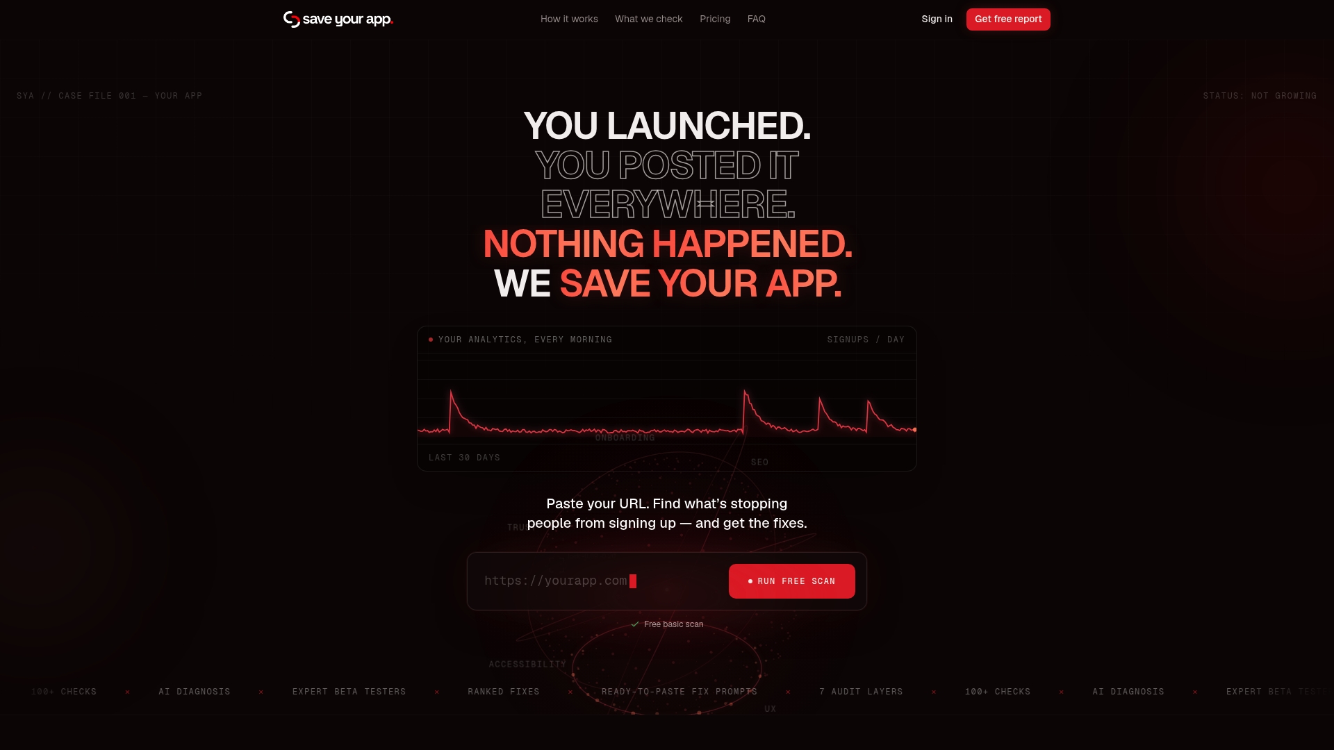
The output isn't a generic report. It's a ranked list of fixes ordered by expected impact, so instead of debating whether to fix the hero image or the form first, you get the answer. Start with the free scan on Saveyourapp to see your baseline issues at no cost. When you're ready for repeated audits and deeper human review, the Solo plan runs $49 per month and the Founder plan runs $129 per month, and a standalone 3-day test is available for $199 one-off if you just need a fast second opinion on a single page. Run your free scan today and see which fix should actually be first on your list.
Sources
The research behind this article draws primarily from Kissmetrics' landing page benchmarks, Shopify's conversion rate data, the Digital Applied 2,000-page study, and Leadpages' optimization framework.
For ongoing diagnosis, run your page through Google's PageSpeed Insights to check Core Web Vitals, use GA4 to segment conversion by traffic source, and pair both with a structured audit tool when you need ranked, prioritized fixes instead of a raw data dump.
- Landing page conversion: formula and benchmarks (Kissmetrics)
- Landing page conversion rate: Benchmarks and how to improve (Shopify)
- Landing page conversion: 2,000 pages tested (Digital Applied)
- Landing page optimization is a math problem, not a design problem (Leadpages)
FAQ
What Is a Landing Page Conversion?
A landing page conversion happens when a visitor completes the specific action the page was built for, whether that's filling out a form, starting a trial, or making a purchase. It's measured as a percentage: conversions divided by total visitors, multiplied by 100.
What Is a Good Conversion Rate for a Landing Page?
It depends entirely on your funnel type. Medians run around 4.1% for B2B SaaS sign-ups, 2.3% for DTC ecommerce, and 11.4% for webinar registrations, so compare your page against its own category rather than a single blanket number.
What Is a Typical Conversion Rate for Real Estate Landing Pages?
Real estate lead-gen pages tend to sit closer to general lead-generation benchmarks than to ecommerce or SaaS numbers, since the offer usually involves a form for a consultation, valuation, or listing alert rather than an immediate purchase. Field count matters heavily here: cutting a form from six fields to three can meaningfully lift completions given that each extra field costs roughly 3% to 5% in completion rate.
How Do You Optimize a Landing Page for Conversion?
Start with speed and form length, since pages loading under three seconds convert about 32% higher and every unnecessary form field costs completions. From there, fix message match between your ad and headline, add specific named social proof near the CTA, and test a sticky CTA before touching anything cosmetic.
How Much Does a Landing Page Audit Cost?
Saveyourapp offers a free scan to start, with paid plans at $49 per month for Solo and $129 per month for Founder for deeper, repeated audits with human review. A standalone 3-day test is also available for $199 one-off if you need a quick second opinion on a single page.