

Add a concise hero-level logo bar, a micro-testimonial next to your main call to action, and real reviewer photos in your review section. These three patterns target the exact moments where visitors hesitate: first impression, decision point, and final evaluation. Once they're live, run a quick A/B test or a conversion audit to confirm the lift before rolling proof out further.
TL;DR:
- Show testimonials and reviews with specific details like names, roles, and dates to enhance authenticity and trustworthiness.
- Place social proof strategically near decision points, especially beside CTAs, to reduce last-minute doubts and increase conversions.
- Use visual proof such as customer photos and social media embeds, as they outperform generic sliders for tangible validation.
- Verify review sources, moderate content, and optimize accessibility to maintain credibility and user trust.
- Focus on collecting genuine, detailed testimonials immediately after positive interactions to maximize authenticity and response quality.
Table of Contents
- 1. Which social proof types work on a landing page
- 2. Where to place social proof for maximum impact
- 3. Design and copy rules for high-trust social proof
- 4. Tools, widgets, and integration patterns
- 5. How to collect and curate authentic social proof
- 6. How to measure and test social proof on a landing page
- 7. Applied example: how an audit prioritizes social-proof fixes
- 8. Why authenticity beats volume in social proof
- How Save Your App finds your landing page's social-proof gaps
- FAQ
- Sources
1. Which social proof types work on a landing page
Not every proof format earns its space. Short testimonials, the one or two sentence quotes with a name and role, work best right next to a CTA because they're fast to scan under pressure. Case study snippets carry more weight earlier in the page, where a visitor is still deciding whether your product applies to them at all.
Logo bars signal credibility fast for B2B audiences who recognize the brands, but they do little for smaller companies without recognizable clients: a logo nobody knows is just decoration. Star ratings and review counts matter more as a pair than alone. A 4.8 rating from 6 reviews reads as thin; a 4.6 from hundreds reads as real, and recency matters almost as much as volume.
Visual social proof, customer photos and embedded social posts, tends to outperform generic testimonial sliders because it gives a visitor something tangible to judge against their own situation. Baymard Institute found that as of 2026, 67% of e-commerce product pages still skip social-media-sourced product images, leaving a visible gap most competitors haven't closed. Real-time notification widgets ("Someone in Austin just signed up") add urgency but wear out fast if the events look staged or repeat too often.
- Testimonials and case snippets work closest to decision points, where specificity matters most.
- Logo bars help B2B credibility but add little value without recognizable brands.
- Star ratings need both volume and recency to feel trustworthy.
- Visual proof (photos, social embeds) beats generic sliders for tangible validation.
- Real-time notifications add urgency but lose impact if they look repetitive or fake.
- Small sample sizes (a handful of reviews, one testimonial) can damage trust instead of building it.
2. Where to place social proof for maximum impact
Placement should follow the visitor's decision path, not your page's visual balance. Each zone on a landing page corresponds to a different kind of hesitation, and the proof format should match it.
- Hero section: a compact logo bar or one-line trust statement works here when brand recognition is the main barrier to continuing.
- Near the CTA: a micro-testimonial or a star rating snippet placed directly beside or under the button reduces last-second doubt, which is often where conversions are lost.
- Within the content flow: proof tied to a specific claim or feature, placed right next to that claim, validates it instead of floating as generic reassurance elsewhere on the page.
- Pricing or checkout: guarantees, security badges, and a short review excerpt address the final objections around risk and cost.
- Clustered, not scattered: grouping two or three strong proof points together keeps visual priority instead of diluting attention across a dozen small badges.
The common mistake is spreading proof thin across the whole page in the hope that more exposure means more trust. A single well-placed cluster near the CTA usually outperforms the same proof scattered across five sections.
3. Design and copy rules for high-trust social proof
Believability comes from specificity. A testimonial with a name, a role, a date, and a concrete outcome reads as real; a vague quote ("Great product!") reads as filler, even when it's genuine. Adding metadata like location, product variant, or order date gives a visitor something to anchor the claim against their own situation.

Accessibility and performance matter just as much as copy. Review widgets need alt text on images, readable star markup for screen readers, and aria labels on interactive elements. Heavy third-party review scripts can quietly wreck page speed, so measure Cumulative Layout Shift and Time to First Byte after adding any widget, not just conversion rate.
Baymard Institute's testing shows that when reviewer-submitted images are involved, users expect to open one photo and then swipe or click across every other reviewer's images in a single overlay, with visible controls on desktop and gesture support on mobile. Sites that show photos as a static, unclickable row frustrate this expectation and lose the transparency benefit the photos were supposed to provide.
- Use real names, roles, and dates instead of anonymous quotes.
- Build a single overlay for reviewer images so visitors can navigate across all of them, not just one.
- Add alt text, aria labels, and readable star markup for accessibility.
- Lazy load proof widgets so they never block the initial page render.
- Avoid anonymous quote sliders, stock photography standing in for customers, and metrics that haven't been updated in over a year.
Pro Tip: Date every testimonial you publish; a quote with no timestamp quietly reads as old or fabricated, even if it isn't.
4. Tools, widgets, and integration patterns
Most landing pages rely on one of four widget types: notification toasts for real-time activity, carousels for rotating testimonials, grids for displaying many reviews at once, and static logo bars for brand recognition. Each fits a different page zone, so pick the format to match the placement, not the other way around.
Integration varies by stack. WordPress sites usually rely on plugins that hook into existing review data, while static sites and single-page apps often need a lightweight vanilla JavaScript snippet or a server-side embed to avoid extra client-side weight. Before adopting any tool, check where its review data actually comes from, whether it moderates submissions, whether it exposes analytics hooks to tie impressions to conversions, and how it handles consent for user-generated content.
- Match widget type to placement: toasts for urgency, carousels for rotation, grids for volume, logo bars for recognition.
- Confirm data provenance and moderation before trusting any review feed.
- Look for analytics hooks that connect proof impressions to actual conversion events.
- Load widgets asynchronously with skeleton placeholders so they never delay the page's core content.
5. How to collect and curate authentic social proof
The best time to ask for a testimonial or photo is right after a clear success moment, a completed purchase, a finished onboarding flow, a milestone hit, while the experience is still fresh. Waiting weeks produces vague, generic responses.
Keep the request short: two or three fields, one of which asks for a specific result or detail, and an optional photo upload. Specificity in the prompt produces specificity in the answer. Reciprocity-based incentives, like offering a useful resource or diagnostic first, tend to work better for B2B audiences than straight payment for a review, which can taint authenticity in both B2B and consumer contexts.
Capture metadata quietly: order ID, timestamp, product variant, and show it selectively rather than dumping every field onto the page. If AI assistance is used to clean up grammar or structure in submitted testimonials, know that NN/g's 2026 guidance found that disclosing that assistance usually lowers perceived authenticity, so the safer path is restrained editing rather than visible AI polish.
- Ask for proof right after a success moment, not weeks later.
- Keep request forms short: two or three fields plus an optional photo.
- Use reciprocity (free value first) rather than paid incentives to preserve authenticity.
- Capture order metadata but display it selectively, not as a wall of data.
6. How to measure and test social proof on a landing page
Track conversion rate as the primary metric, but pair it with CTA click-through, scroll depth or micro-conversions near the proof element, and bounce rate on the specific page variant. A proof element that raises clicks but not final conversions is solving the wrong problem.
- Run a hero-proof variant against a no-proof control to isolate the logo bar or trust line's effect.
- Test testimonial copy variants (specific outcome versus generic praise) against each other, not against a blank control.
- Compare visual proof (photos, embeds) against a plain logo bar to see which format actually moves the metric you care about.
- Run tests long enough to cover a full weekly cycle and reach a sample size that avoids underpowered, noisy results.
- Watch for novelty effects in the first few days; an early spike that fades within a week is often just curiosity, not a real lift.
NN/g's research on social proof notes that social proof reduces decision uncertainty but can backfire when implemented poorly, which is exactly why testing beats assuming. A single well-designed A/B test comparing a proof-rich hero against a control is usually the fastest way to confirm whether a pattern is worth keeping, according to NN/g's guidance on testing social-proof elements. When results are inconclusive, a short round of session recordings or brief user interviews usually explains more than another week of split testing.
7. Applied example: how an audit prioritizes social-proof fixes
A conversion audit looking at social proof typically checks a handful of recurring issues: no proof near the CTA at all, reviewer images that can't be navigated as a set, and microcopy that contradicts the proof sitting next to it (a "trusted by thousands" line next to three testimonials, for instance).
A common prioritized fix looks like this: add a single micro-testimonial with a name, role, and date directly beside the CTA, then run it as an A/B variant against the current page before expanding it further. Automated heuristics catch missing elements and broken navigation reliably, but they miss subtler authenticity red flags, like a testimonial that reads as written by the marketing team rather than a customer, which is where human review earns its place.
- Check for proof gaps near CTAs and other key decision points.
- Check whether reviewer images can be navigated as a set, not just viewed one at a time.
- Flag microcopy that contradicts or exaggerates the actual proof shown.
- Prepare screenshots, your conversion goal, and analytics access before requesting a review.
8. Why authenticity beats volume in social proof
A handful of specific, verifiable testimonials will consistently outperform a wall of generic five-star ratings. Visitors have learned to skim past "amazing service!" quotes, but they stop on a testimonial that names a real outcome, a specific role, or a timeframe.
The instinct to pile on more proof, more logos, more notifications, more stars, usually backfires. NN/g's research points to a halo effect where overused or implausible proof starts to read as manipulation rather than reassurance. For higher-trust purchases, offering something useful before asking for anything, a free reciprocity-driven resource or diagnostic, tends to build more goodwill than another badge ever will.
The practical habit worth adopting is testing assumptions instead of copying whatever pattern a competitor uses. What reads as trustworthy in one industry can read as noise in another.
— William
How Save Your App finds your landing page's social-proof gaps
We built our conversion audit to catch exactly the kind of social-proof problems covered above: missing proof near your CTA, reviewer images with no navigation, or trust signals that contradict your own copy. Our Prism Engine™ combines AI-driven diagnostics with human beta tester review across seven audit layers, including Conversion and Trust & Security, so a flagged issue comes with a ranked fix, not just a score.
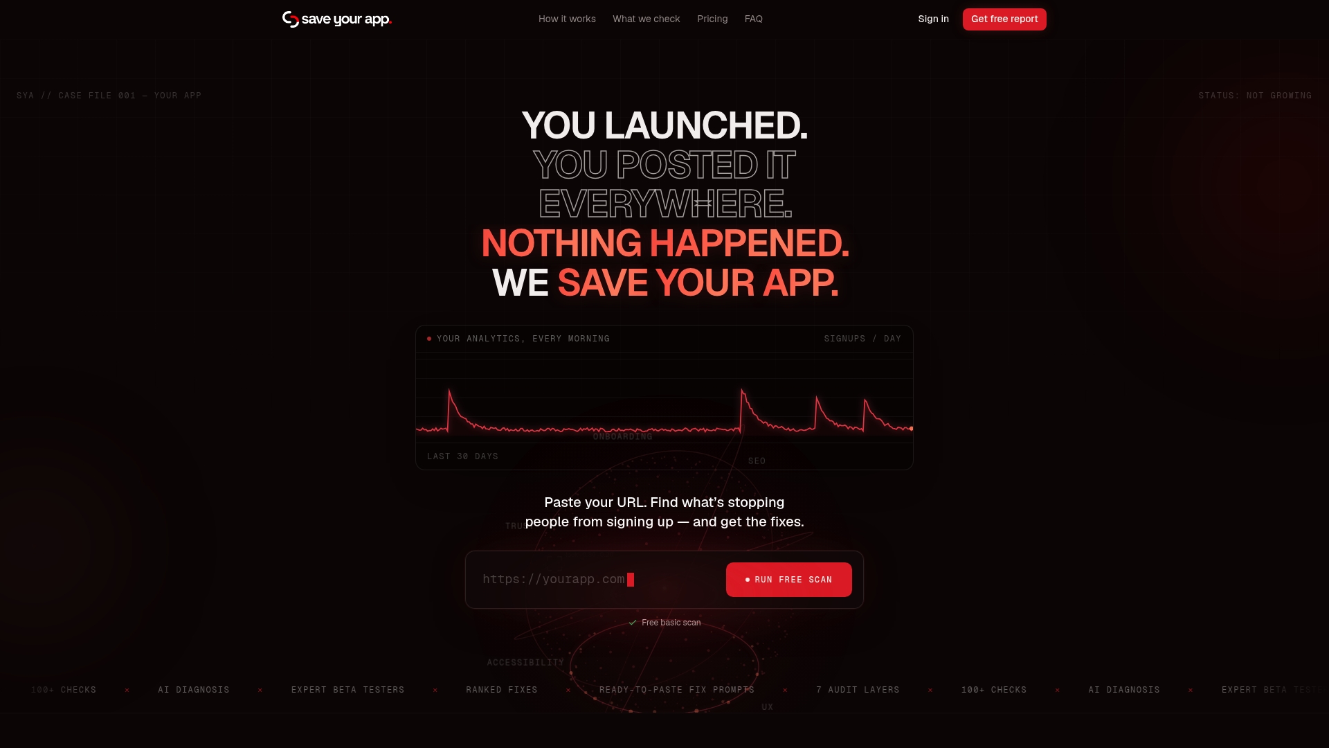
- Our first scan is free and flags conversion barriers, including social-proof placement.
- Paid plans add repeated audits and human-reviewed feedback; current prices are available on our pricing page.
- Need a deeper look at a specific flow? Extra 3-day tests are available; for current pricing, see our pricing page.
Start with a free scan on our pricing page and see which social-proof fixes rank highest for your page.
FAQ
What is a good example of a landing page?
A strong landing page pairs a clear value statement with proof placed exactly where hesitation happens: a logo bar in the hero, a micro-testimonial beside the CTA, and reviewer photos in the evaluation section. JobOS Pro's customer results pages show this pattern applied to service businesses, pairing specific outcomes with named customers rather than generic praise.
What are some examples of social proof?
Common formats include customer testimonials, case study snippets, logo bars, star ratings and review counts, user-submitted photos, and real-time activity notifications. Each format fits a different moment in the decision process, so the best pages mix two or three rather than relying on just one.
Can ChatGPT build a landing page?
ChatGPT can help draft landing page copy, including testimonial structure and section outlines, but it can't replace real customer proof or a structural conversion review. Disclosing AI involvement in testimonial text specifically tends to lower perceived authenticity, according to NN/g's 2026 guidance, so AI is better used for drafting structure than for writing proof itself.
How do I get social proof?
Ask customers for feedback right after a clear success moment, using a short form with two or three specific questions and an optional photo upload. Offering something of value first, a useful resource or a free diagnostic, tends to produce better response rates than asking cold, based on NN/g's research on reciprocity.
Sources
Research on reviewer images, social proof mechanics, and reciprocity comes from Baymard Institute, Nielsen Norman Group, and implementation docs below.