
Show representative total costs, meaning the base price plus any mandatory fees and the billing cadence, early on your pricing and product pages. This single change tends to cut surprise-fee drop-offs and builds trust faster than any transparent pricing example redesign. Treat it as a hypothesis, not a certainty: run an A/B test and a short usability check before you roll it out everywhere.
TL;DR:
- Display the total price, including mandatory fees, directly next to the primary call to action to reduce checkout surprises and increase trust.
- Use representative scenarios and clear fee callouts to help visitors understand costs without creating friction, especially on mobile devices.
- Conduct usability testing with small groups and analyze analytics to identify points of confusion or drop-off related to pricing clarity.
- Pair visible total prices with explanations of the value and tier differences to prevent visitors from balking at hidden or poorly explained fees.
- Start with quick copy improvements like showing total prices and fee blurbs, then consider more extensive testing or redesigns based on impact.
Table of Contents
- What good on-site pricing transparency looks like
- Practical display patterns and UX patterns to implement
- How to test and measure whether your pricing is understood
- Behavioral effects and common pitfalls (what research shows)
- Prioritized checklist and quick fixes (what to change this week)
- How Save Your App finds pricing friction
- Run a pricing clarity scan with Save Your App
- Sources
- FAQ
What good on-site pricing transparency looks like
Clear pricing has a short list of required parts: the base price, any mandatory fees, whether billing is monthly or annual, what's actually included at that price, and a plain note on cancellation or refunds. Miss any one of these and visitors fill the gap with worst-case assumptions.

When your pricing depends on usage, seats, or configuration, exact numbers up front are not realistic. In that case, NN/g's guidance on B2B pricing is to show something rather than nothing: a starting price, a typical range, or a representative scenario. Hiding the number behind "contact sales" reads as evasive even when the reason is legitimate complexity.
Resist the urge to solve this with a configurator on the first page a visitor sees. Detailed calculators belong later in the funnel, once someone is comparing options seriously. NN/g's research on representative pricing found that sample cases work better than precise tools at the discovery stage, because a calculator with a dozen fields asks for effort before trust exists. Give the casual visitor a number they can hold onto, then give the serious buyer a tool once they've decided to dig in.
Practical display patterns and UX patterns to implement
A few layout choices do most of the work. Start with a plan comparison built as cards or a simple table: each plan gets a name, a one-line differentiator, a starting price or range, and one primary call to action. Keep the visual weight even across plans, so none looks like an afterthought.
Fee disclosure works best as short, plain-language callouts rather than legal copy buried in a tooltip. "Includes a mandatory processing fee of $5" reads faster than a footnote with an asterisk. Representative scenarios help too: a line like "A typical team of 10 pays around $90 per month" turns an abstract price list into something a visitor can map onto their own situation.
A few patterns to build into this sprint:
- Put the representative total, not just the base price, right next to the primary CTA.
- Add a one-line fee callout wherever a mandatory charge applies, written in plain words, not legal phrasing.
- Include at least one sample scenario per plan tier so visitors can self-identify.
- On mobile, keep the total price visible without requiring a horizontal scroll or an extra tap.
Keep the total visible as someone scrolls, especially near any CTA. Surprise arrives when the number a visitor remembers from the top of the page is different from the one they hit at checkout.
How to test and measure whether your pricing is understood
You don't need a large research budget to find out whether your pricing page actually communicates. A handful of usability sessions and a couple of analytics events will tell you most of what you need.
- Run 5 to 8 think-aloud sessions and ask participants to answer: "What will I pay right now?", "What will I pay later?", "What's included?", and "How do I cancel?"
- Instrument your pricing and checkout pages to track page-to-page drop-off, time spent on the pricing page, clicks on each CTA, and checkout abandonment events.
- Run an A/B test comparing a total-price display against a base-price-only display, and a second test comparing a page with sample scenarios against one without.
- Watch for reduced checkout abandonment, higher click-through from pricing to signup, and better task success in your usability sessions.
NN/g's usability testing framework recommends exactly this mix: small qualitative sessions paired with analytics, because analytics show you where people drop off and think-aloud testing tells you why. A drop-off at the checkout step means something is wrong; only a moderated session reveals whether the problem is the fee, the wording, or the layout.
Pro Tip: Ask usability participants to say the total price out loud before they click "continue." If they hesitate or guess low, your total isn't visible enough.
Behavioral effects and common pitfalls (what research shows)
Showing costs upfront is not automatically good for every metric. A randomized field experiment on StubHub found that making mandatory fees salient reduced the quantity and total value of what people bought, even though it made prices easier to compare across listings. Transparency helped people shop more accurately, but it also made some of them buy less or trade down.
That trade-off matters for signup flows too. If you surface a total price without also making the value clear, some visitors will simply balk rather than convert. The fix isn't to hide the fee again, it's to pair the visible total with stronger value framing and clearer differences between tiers, so the number lands next to a reason to pay it.
On the ecommerce side, the incentive to disclose early is strong: eMarketer reports that 48% of US adults have abandoned an online cart because extra costs like shipping, tax, or fees were higher than expected. Cross-border shoppers face a related problem with surprise customs and duty charges, according to an Avalara survey on hidden fees. The lesson carries over directly to signup pages: a fee that shows up at the last step reads as a broken promise, even when it was always going to apply.

Prioritized checklist and quick fixes (what to change this week)
Not every fix needs a redesign. Order your work by effort against impact.
- High impact, low effort: show the representative total near your CTA, add a one-line fee blurb, and state billing cadence clearly.
- Medium effort: add sample scenarios to your pricing page and a short line explaining the billing timeline.
- Higher effort: run structured usability testing and use the findings to guide a full checkout redesign.
Start with the first tier this week. It requires copy changes more than engineering, and it addresses the exact friction point that costs teams signups.
How Save Your App finds pricing friction
Pricing confusion rarely shows up as a single obvious bug. It hides across onboarding copy, a tooltip nobody reads, or a billing cadence mentioned once and then never again. The platform runs its analysis engine alongside expert reviews across several audit layers, including Conversion, UX & Navigation, Onboarding, and Trust & Security, specifically to surface this kind of friction.
The recurring findings look familiar: a mandatory fee mentioned only in a tooltip, a billing cadence that's ambiguous until checkout, or a pricing page missing any representative scenario. Audits return ranked fixes, allowing teams to act on the highest-impact issue first instead of guessing where to start.
— William
Run a pricing clarity scan with Save Your App
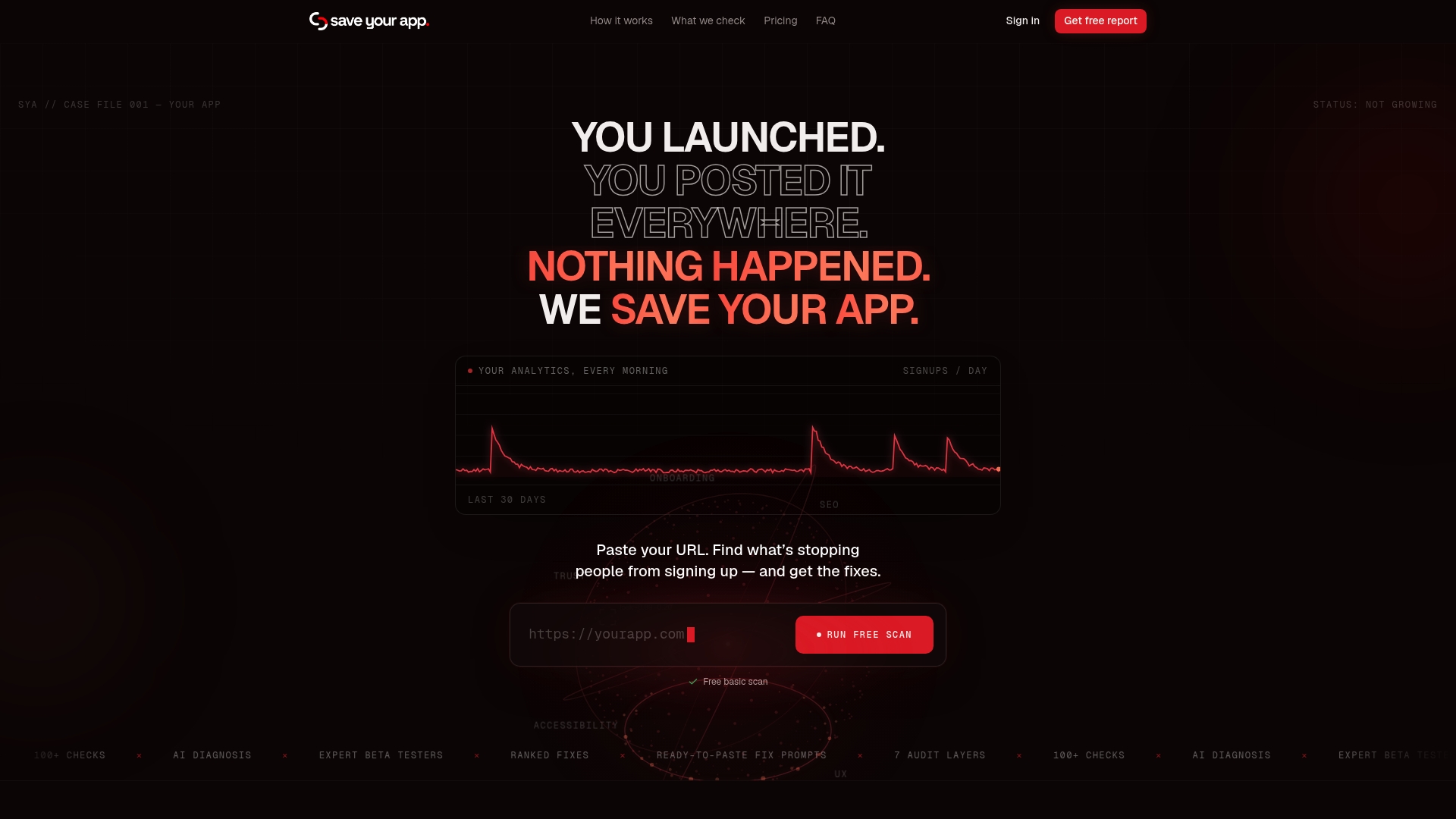
If you'd rather see your own pricing page's friction points than guess at them, a free scan tool can give you a ranked list of issues in minutes, with paid tiers unlocking deeper, expert-reviewed audits.
| Plan | Price | What it unlocks |
|---|---|---|
| Free | Not published | Initial scan and basic findings |
| Solo | $49 per month | Full automated audits |
| Founder | $129 per month | Automated plus human expert review |
| Extra 3-day tests | $199 one-off per test | Additional focused testing round |
Start with the free scan on the Save Your App pricing page and see where your own pricing clarity stands today.
Sources
- Pricing information gives B2B sites a competitive advantage — Nielsen Norman Group
- Price salience and product choice — Stadelis et al.
- Extra costs are the top reason consumers abandon online carts — eMarketer
FAQ
How often should we test pricing page comprehension?
Retest whenever you change pricing, plan structure, or checkout flow, and otherwise run a quick usability check once or twice a year. NN/g's usability testing approach shows that small, frequent sessions catch comprehension problems faster than a single large study.
Should we show a calculator or a representative scenario first?
Lead with a representative scenario or starting price, and save the detailed calculator for later in the funnel. NN/g's research on representative pricing found that sample cases reduce friction for visitors who are still comparing options.
Does showing fees upfront always increase conversions?
Not always. A field experiment on StubHub found that making fees salient can reduce purchase quantity even as it improves price comparability, so upfront totals work best paired with clear value framing.
What's the biggest mobile-specific pricing mistake?
Burying the total price below the fold or behind a horizontal scroll on small screens. Keep the representative total and primary CTA visible together without extra taps, since mobile visitors have even less patience for hunting down the real cost.
Can Save Your App show us exactly where our pricing page loses visitors?
Yes, Save Your App's audits cover Conversion and UX & Navigation layers specifically to flag unclear fees, ambiguous billing cadence, and missing scenarios, then rank the fixes by likely impact.