
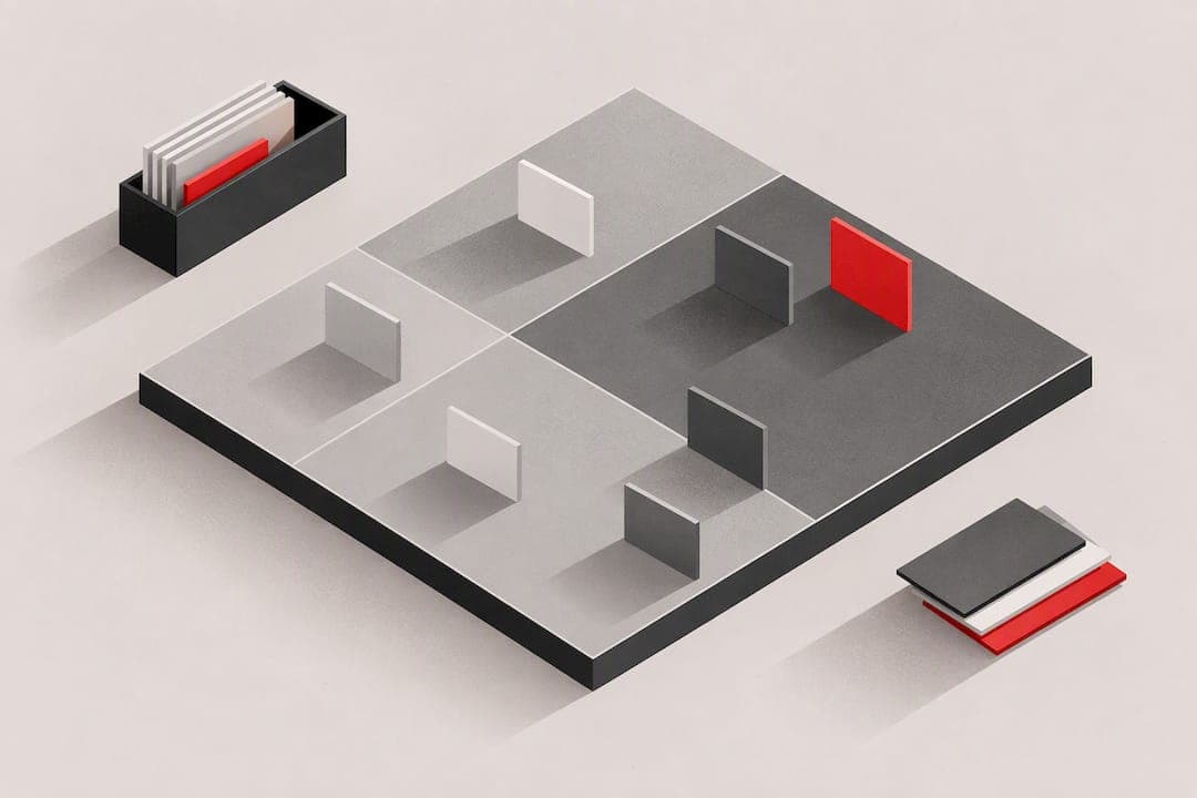
An impact effort matrix is a 2x2 grid that plots how much value a task delivers against how much work it takes, so you can see instantly what to tackle first. Build one now: list your top 10 to 30 items, plot each by impact and effort, then start with whatever lands in the quick wins corner. Scoring methods, facilitation tips, and ready-to-use templates follow below.
TL;DR:
- The impact effort matrix helps prioritize tasks by plotting their value against required effort to focus on quick wins and strategic projects effectively.
- For optimal results, score items independently, keep the list between 10-30, and review regularly every two to four weeks to maintain relevance.
- Use numeric scales for precise ranking and T-shirt sizes for simplicity, ensuring consistent impact and effort assessment across team members.
- Avoid relying on the matrix for urgent, deadline-driven triage, as it emphasizes value over immediacy and should be treated as a dynamic, living document.
- Automating diagnostics can generate ranked fix lists, streamlining the transition from prioritization to actionable results in website or product audits.
Table of Contents
- What is an impact effort matrix and when should you use it?
- The four quadrants and what to do with each one
- Step-by-step: run a matrix session solo or with a team
- Scoring options and when to upgrade to RICE
- Facilitation best practices and common pitfalls
- Examples and templates you can reuse right away
- How prioritizing by impact speeds outcomes
- When the matrix helps and when it misleads
- Another option: turning matrix items into ranked fixes
- Primary sources and templates referenced in this guide
- Sources
- FAQ
What is an impact effort matrix and when should you use it?
An impact effort matrix is a decision-making tool that sorts ideas or tasks by two questions: how much value will this create, and how much work will it take. The vertical axis measures impact, which can mean revenue, customer satisfaction, or efficiency gains. The horizontal axis measures effort, meaning cost, time, or complexity. This is the same core logic behind the impact/feasibility matrix used in government process improvement work, where feasibility stands in for effort.
Teams reach for this grid most often when:
- Trimming a bloated product backlog down to what actually matters
- Choosing which features to build next on a roadmap
- Deciding which process improvements are worth the disruption
It differs from the Eisenhower matrix, which sorts by urgency and importance for daily triage rather than initiative selection, and from RICE, which adds reach and confidence scoring for when a simple 2x2 does not offer enough rigor, a distinction covered in more detail in the comparison between Eisenhower and impact/effort frameworks.
The four quadrants and what to do with each one
Once items are plotted, the grid splits into four zones, and each one implies a default action rather than a judgment call, a structure laid out clearly in Monday.
- Quick wins sit in high impact, low effort. Do these first. Example: fixing a broken signup button that takes an afternoon but stops lost customers.
- Major projects sit in high impact, high effort. Plan and resource these properly rather than squeezing them into a spare afternoon. Example: rebuilding an onboarding flow across three product surfaces.
- Fill-ins sit in low impact, low effort. Do these when the team has spare capacity, never at the expense of a quick win. Example: updating a footer link or cleaning up unused copy.
- Thankless tasks sit in low impact, high effort. Deprioritize or stop doing these outright. Example: rebuilding a legacy reporting tool that three people still use.
The value of the grid is that it forces a decision instead of a debate. An item's quadrant tells you what to do next without another meeting.
Step-by-step: run a matrix session solo or with a team
Running the exercise well matters more than the grid itself. The CFPB's facilitation guide for prioritization exercises outlines a version of this process for team workshops.
- Collect 10 to 30 candidate items on sticky notes or in a shared doc, then merge any duplicates.
- Agree on one primary impact metric (revenue, retention, satisfaction) and a clear definition of effort before anyone scores anything.
- Pick a scoring method, whether numeric (1 to 5 or 1 to 10) or T-shirt sizing, and have each participant score independently before discussing.
- Plot every item, then flag outliers where scores disagree sharply and discuss those specifically rather than re-litigating every item.
- Assign an owner and a rough timeline to each selected item, and cap how many major projects run at once.
- Set a review cadence, typically every two to four weeks or quarterly, so the matrix stays current instead of going stale.
Pro Tip: Score independently first and reveal results together. Groupthink kills the honest disagreement that makes this exercise useful.
Scoring options and when to upgrade to RICE
A basic 1 to 5 or 1 to 10 scale works well for fast sessions, while T-shirt sizing (small, medium, large) suits teams that resist forcing false precision onto fuzzy estimates. Both work, as long as everyone uses the same scale consistently.
- Use numeric scales when you want to rank items tightly against each other.
- Use T-shirt sizing when the group is new to scoring and needs an easier on-ramp.
- Have commercial roles score impact and delivery roles score effort separately, a split recommended in the Eisenhower vs impact/effort comparison to surface honest disagreement instead of averaging it away.
A practical calibration: teams often underestimate how long work takes, so a conservative "2x effort" adjustment before plotting is a documented fix for optimism bias in effort scoring.
When a decision needs to survive a budget review or a skeptical stakeholder, RICE (Reach times Impact times Confidence, divided by Effort) adds the rigor a simple grid lacks, at the cost of more time spent scoring.
Facilitation best practices and common pitfalls
Good sessions share a few habits. Weak ones share the same mistakes.
- Score independently before any group discussion, then reveal and debate the outliers.
- Merge near-duplicate ideas early and keep the working list in the 10 to 30 item range.
- Assign an owner and clear acceptance criteria to every item that makes the cut.
- Say out loud what got deprioritized and why, so nobody quietly restarts a dead idea next month.
The most common failure is vague axis definitions: if "impact" means revenue to one person and satisfaction to another, the grid produces noise instead of a decision. A related failure is confusing urgency with impact, a distinction the comparison of Eisenhower and impact/effort matrices flags directly. Treating the matrix as a one-time artifact rather than a living document is the third common trap.
Pro Tip: Cap the list at four to six items selected for immediate action per session. A longer shortlist just becomes next quarter's backlog again.

Examples and templates you can reuse right away
The simplest version needs nothing more than a whiteboard: draw two crossing axes, label the four quadrants, and plot items on sticky notes so people can move them as the conversation shifts. For distributed teams, digital boards work better, and Miro's collection of impact-effort templates covers most common formats.
- A five-item backlog might plot a checkout bug fix and a pricing page rewrite as quick wins, a mobile app redesign as a major project, a blog format update as a fill-in, and a legacy integration rebuild as a thankless task.
- When two items land close to a boundary, discuss them directly rather than letting placement alone decide, since a borderline quick win might actually be a small major project in disguise.
- Solo founders can run the whole exercise in twenty minutes with a notebook; cross-functional teams benefit from a shared digital board and a dedicated facilitator to manage the discussion.
How prioritizing by impact speeds outcomes
Fixing high-impact, low-effort issues first raises conversion fastest, and reserving major projects for genuine strategic bets keeps a team from getting stuck rebuilding things that barely move the needle.
Ranked, actionable fixes that map directly onto a quick wins to major projects sequence turn a prioritization exercise into a punch list instead of a debate.
A combination of automated diagnostics and human reviewer input can produce that kind of ranked list, which is useful for validating impact estimates before committing to a bigger investment.
When the matrix helps and when it misleads
The impact effort matrix is strong for picking which initiatives deserve a roadmap slot, weak as a stand-in for deadline-driven triage where urgency, not value, decides what happens today. Treat it as a living document, not a poster on the wall.
— William
Another option: turning matrix items into ranked fixes
A DIY matrix tells you where to start, but turning that into a specific list of fixes on your own website still takes guesswork. Some services run automated diagnostics alongside human reviewer checks across multiple audit layers and return ranked lists of fixes, so the quick wins your matrix surfaced arrive already scoped and ready to act on.

- Explore the Save Your App overview to see how the audit works before committing to a plan.
- Compare the Free, Solo, and Founder plans to find the tier that matches your team's audit needs.
Start with a free scan, then decide if a ranked, execution-ready fix list is worth the upgrade.
Primary sources and templates referenced in this guide
- Your Washington's impact/feasibility matrix guide for definitions and procedure.
- CFPB's facilitation tool for workshop steps.
- ASQ's quality-improvement framing of the same tool.
Sources
- Impact/Feasibility Matrix – Your Washington
- Effort and impact matrix — CFPB facilitation tool (PDF)
- Eisenhower Matrix vs Impact/Effort Matrix — Frameworklist
- Monday
FAQ
What are the four quadrants of an impact effort matrix?
The four quadrants are quick wins (high impact, low effort), major projects (high impact, high effort), fill-ins (low impact, low effort), and thankless tasks (low impact, high effort), a structure detailed in monday.com's guide to the framework. Each quadrant implies a default action, from doing quick wins immediately to deprioritizing thankless tasks entirely.
What is the difference between the impact-effort matrix and the effort-impact matrix?
These are the same tool with the axes swapped in name only, since both plot value against work required. Some guides, including Your Washington's impact/feasibility resource, use "feasibility" instead of "effort" but follow the identical logic.
What is an impact effort diagram?
An impact effort diagram is another name for the same 2x2 grid, plotting impact on one axis and effort on the other to sort ideas into actionable groups. It is commonly used in root cause analysis and quality improvement, a use case the ASQ resource on the topic describes directly.
How is the impact effort matrix different from RICE scoring?
The impact effort matrix sorts items quickly using two simple axes, while RICE (Reach times Impact times Confidence, divided by Effort) adds more variables for a more defensible ranking. Teams typically start with the simpler grid and move to RICE when a decision needs to hold up under closer scrutiny.
How often should a team revisit its impact effort matrix?
Most teams review the matrix every two to four weeks or on a quarterly cadence, since priorities and effort estimates shift as work progresses. Treating it as a one-time exercise rather than a living document is one of the more common mistakes teams make with the framework.