
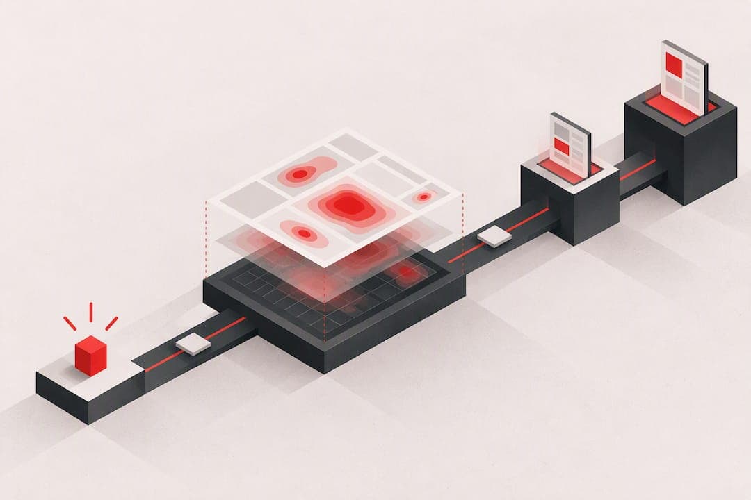
Heatmap analysis quickly shows where visitors click, scroll, or hesitate on a page, and the first move is always to form a testable hypothesis and turn on consent-compliant tracking before collecting any data. Research from NN/g on scroll attention and tools like Audit workflows both point to the same lesson: a map only matters once you know what question it answers.
TL;DR:
- Heatmaps must be paired with analytics data to accurately identify actionable issues, such as dead clicks, scroll depth, or navigation patterns.
- Low-sample or short-term maps are unreliable and should be confirmed with stable data over multiple days before implementation.
- Cursor movement maps are only directional indicators and should never be treated as reliable eye gaze proxies.
- Choosing the right heatmap tool depends on your traffic volume, privacy needs, and whether you require session recordings or funnel integration.
- Writing a hypothesis before analyzing heatmaps helps teams prioritize tests effectively and avoid unfocused or impulsive changes.
Table of Contents
- What Heatmaps Show: The Four Core Types and When to Use Each
- How to Read a Heatmap: Five Diagnostic Questions
- Common Mistakes and Misreads to Avoid
- Choosing a Heatmap Approach: A Tool-Agnostic Selection Framework
- Implementing Heatmaps: Instrumentation, Sampling, and Consent Best Practices
- Interpreting Heatmaps With Analytics and Experiments
- A Prioritized Action Plan: Three Experiments to Run From Heatmap Findings
- Our perspective: how a tool can turn signals into ranked fixes
- The One Habit That Separates Teams That Get Results
- Try a Free Scan: What It Delivers and Who It's For
- FAQ
- Sources
What Heatmaps Show: The Four Core Types and When to Use Each
Most heatmap platforms generate four distinct map types, and each one answers a different question about visitor behavior. Confusing them is the fastest way to draw the wrong conclusion from a page audit.
Click and tap maps record where visitors actually click or tap, including on elements that are not interactive. They are the right tool for testing whether a call-to-action gets noticed and whether visitors are clicking on things that look clickable but are not, a pattern known as a dead click.
Scroll maps show how far down a page visitors travel before leaving, displayed as a gradient from hot at the top to cold near the bottom. They are built for long-form pages, pricing tables, and any layout where you need to know if content below the first screen gets seen at all.
Move or hover maps track cursor movement across a page. They work best as a rough proxy for browsing patterns on desktop, though the correlation to actual eye gaze is weak, a point confirmed by research on mouse versus gaze reliability, which found cursor position is not a dependable stand-in for where someone is actually looking.
Attention or predictive maps use algorithmic models to estimate where a design is likely to draw eyes before any real traffic has visited it. They are useful early in a redesign, but they are a forecast, not a measurement, and should be replaced with real data as soon as traffic allows.
Each map type needs enough sessions to be stable. A click map on a low-traffic page can look convincing with a handful of visits and still be noise.
- Click/tap maps: best for CTA testing and spotting dead clicks on non-interactive elements.
- Scroll maps: best for long-form content, pricing pages, and measuring how far engagement carries.
- Move/hover maps: best for rough desktop browsing patterns, weak as a gaze proxy.
- Attention/predictive maps: best for pre-launch forecasts before real traffic exists.
How to Read a Heatmap: Five Diagnostic Questions
A heatmap is a picture, not a conclusion. Turning color into a decision takes a consistent set of questions, applied the same way every time.
- What is hot, and does it match the page's goal? A hot zone on your primary CTA is good news. A hot zone on a logo or a static image usually signals confusion, not interest.
- Are the clicks expected, or are they dead clicks? Visitors clicking on text that is not a link or an image that does not expand is a strong signal that your layout is sending the wrong visual cues.
- Does scroll depth meet the page's goals? If your pricing table sits at 80% depth and your scroll map shows most visitors drop off at 50%, that pricing table is effectively invisible to most of your traffic.
- Is movement a reliable proxy here? Move maps are directional at best. Cross-check any hover pattern against session replays or analytics before treating it as a finding.
- Is the sample size stable? A map built from 40 sessions can shift completely with the next 40. Wait for a sample that holds its shape across a few days before acting on it.
Cross-checking against analytics turns a visual hunch into a real signal. Pair click maps with click-through rate on the same element, scroll maps with your analytics platform's scroll-depth or exit-rate reports, and hover patterns with funnel drop-off at the matching step.
The analytics funnel confirms a steep drop-off at that same point. That combination is enough to justify an A/B test moving the form higher, with signup rate as the success metric.
Pro Tip: Never act on a single map. Confirm the pattern in at least one analytics report before writing a test brief.
Common Mistakes and Misreads to Avoid
Heatmaps are easy to misread, and a misread almost always leads to a wasted test cycle. A few errors show up repeatedly.
Treating move maps as gaze maps is the most common one. Cursor movement correlates loosely with attention at best, according to research comparing mouse tracking to actual eye gaze, so a hover hotspot is a cue to investigate, never proof that visitors looked there.
Acting on low-sample maps is a close second. A map generated from a short traffic window can look decisive and still be statistical noise once more sessions arrive.
Task mismatch distorts results too. NN/g's research on eyetracking tasks found that poorly designed test scenarios produce misleading scanning patterns, the same risk applies to heatmaps collected during an unusual traffic event, like a sale or a press mention, when behavior does not reflect normal visits.
Third-party scripts, personalization layers, and bot traffic also skew results, inflating click counts or scroll depth in ways that have nothing to do with real visitors.
Before acting on any map, run it through a short checklist:
- Confirm the sample size held steady over at least a few days of normal traffic.
- Rule out bot traffic or a traffic spike tied to a single campaign.
- Cross-check the finding against analytics, not just the visual.
- Check whether the task or page goal matches what the map was collecting for.
Choosing a Heatmap Approach: A Tool-Agnostic Selection Framework
Picking the right heatmap setup starts with matching features to the question you are actually trying to answer, not with picking the platform with the most dashboards.
Start with feature scope. Do you need session recordings alongside heatmaps, or just the aggregate visual? Do you need funnel-level reporting built in, or will that live in your existing analytics tool? Predictive attention maps matter if you are testing layouts before launch, less so once you have real traffic.
Privacy and consent posture should weigh as heavily as features. Any tool that records sessions or tracks individual behavior needs a clear consent mechanism, a stated data-retention policy, and a way to exclude personal information before it is captured. Government guidance on analytics setup treats cookie consent and a visible privacy notice as a prerequisite step, not an afterthought, before any recording or heatmap script goes live.
Sampling and scale needs matter next. A site with a few thousand monthly visitors needs a tool that can generate a usable map from a modest sample. A high-traffic site can afford stricter sampling rates and still get stable results quickly.
Pricing shape is the last filter, and it is where many teams get surprised. Free tiers typically cap session volume or limit history, while paid tiers unlock longer retention, more concurrent tests, or deeper integrations. Decide what you actually need before comparing sticker prices.
- Feature scope: does it include recordings, funnels, and integrations with your existing analytics stack?
- Data volume and sampling: does the sampling rate produce stable maps at your traffic level?
- Privacy and consent: does it support consent gating, anonymization, and a defined retention window?
- Pricing shape: does the free tier cover a real use case, or is it a trial designed to expire?
Implementing Heatmaps: Instrumentation, Sampling, and Consent Best Practices
Getting clean heatmap data depends on how the tracking script is installed, not just which tool you pick.
- Choose one script placement method. Install the tracking snippet directly in your page template or through a tag manager like Google Tag Manager, never both, since double-tagging inflates session counts and skews every map built on top of it.
- Set a sampling strategy before launch. Decide what percentage of sessions to capture based on your traffic volume, and wait for a few hundred sessions minimum before trusting a pattern as stable.
- Build a consent-first checklist. Confirm your cookie banner covers heatmap and recording scripts specifically, that visitors have a working opt-out path, and that no personally identifiable information gets captured in the recording layer. Government guidance on campaign site analytics frames this consent and privacy-notice setup as a precondition, not a step you can add later. Our own cookie policy covers how we handle this on our side.
- Verify anonymization before going live. Run a test session yourself and check the recording or heatmap output to confirm no form fields, emails, or payment details were captured.
- Confirm the data after launch. Check that session counts in the heatmap tool roughly match your analytics platform's traffic numbers for the same period, a mismatch usually means a tagging error.
Pro Tip: Run your consent checklist and a test session on staging before the tracking script ever touches live traffic.
Interpreting Heatmaps With Analytics and Experiments
A heatmap finding becomes useful the moment you pair it with a metric that measures outcomes, not just attention. Scroll percentage, exit rate at a given section, and funnel drop-off at the matching step all turn a visual pattern into something you can test against.
NN/g's eye-tracking analysis found that users spend a majority of their page-viewing time above the fold and within the first two screenfuls, which means content placed higher on a page gets a disproportionate share of attention by default. That finding should shape how you prioritize fixes: a cold CTA sitting above the fold is a bigger red flag than a cold CTA three screens down, because the first one is fighting against the natural attention curve, while the second one may simply be out of sight for most visitors regardless of design.
Not every heatmap finding needs a full experiment. A broken dead-click on a static image is a bug, fix it immediately. A cold CTA that could be a wording problem, a placement problem, or a visibility problem needs a hypothesis and an A/B test before you touch it, since guessing which cause is correct wastes a development cycle if you are wrong.
Encyclopedic guidance on conversion rate optimization frames heatmaps as one diagnostic input among several, meant to feed into funnel analysis and tested changes rather than stand alone as proof of what to build.
- Pair click maps with click-through rate on the exact element in question.
- Pair scroll maps with your analytics platform's scroll-depth and exit-rate reports.
- Pair funnel-adjacent findings with the matching step's drop-off rate before scoping a test.
A Prioritized Action Plan: Three Experiments to Run From Heatmap Findings
Once a heatmap finding is confirmed against analytics, the next step is turning it into a scoped experiment with a clear metric and a sample-size target.
- Fix dead clicks and improve affordances. If a click map shows visitors tapping on non-interactive text or images, redesign that element to either become clickable or look clearly static. Track click-through rate on the corrected element and aim for a sample large enough to hold steady over at least a week of normal traffic.
- Restyle or move cold CTAs above the fold. When a call-to-action sits in a cold zone, test a version with stronger contrast or a higher position on the page. Measure click-through rate and downstream conversion rate, and give the test enough volume to reach a stable result before concluding. Clear CTA design practices can help shape what the revised version should look like.
- Restructure long content where scroll maps show early drop-off. If a scroll map shows most visitors leaving before a key section, test a shorter version or move that section higher. Measure scroll depth and final conversion rate on the page.
Score each experiment on expected impact against effort to build, and log the outcome whether the test wins, loses, or comes back inconclusive, so the next audit starts from a record instead of a guess.
| Experiment | Primary metric | Relative effort |
|---|---|---|
| Fix dead clicks | Click-through rate on corrected element | Low |
| Move cold CTA above the fold | Click-through and conversion rate | Medium |
| Restructure long content | Scroll depth and conversion rate | Medium to high |
Our perspective: how a tool can turn signals into ranked fixes
Reading heatmaps and analytics side by side takes time most teams do not have every week, which is the gap our Prism Engine™ is built to close. Some platforms run a web page through multiple audit layers, combining AI-driven diagnostics with human expert reviews in paid plans.
Instead of handing back a raw map and leaving the interpretation to you, some platforms return a ranked list of issues ordered by impact, paired with suggested fixes you can hand straight to a developer or designer. Many paid plans include a PDF report, so the findings travel beyond a dashboard and into whatever planning tool your team already uses. For a product manager or founder juggling a dozen other priorities, that ranked structure replaces hours of manual cross-checking between a heatmap tool and an analytics platform with one prioritized document.
The One Habit That Separates Teams That Get Results
The teams that consistently improve their conversion rates share one habit: they write down a hypothesis before they ever open a heatmap. "I think visitors are missing the pricing link because it's below the fold" is a testable claim. "Let's see what the heatmap shows" is not a plan, it is a fishing trip, and fishing trips rarely produce a prioritized backlog.

A simple weekly rhythm works better than sporadic deep dives: a short micro-audit of one page, one hypothesis written down first, and one test queued for the next sprint. That pace keeps findings small enough to act on and large enough to matter.
None of this works without trust. Visitors who know their data is handled with clear consent and no unnecessary collection are the visitors who stick around long enough to generate the sessions your next heatmap depends on.
— William
Try a Free Scan: What It Delivers and Who It's For
Reading your own heatmaps takes a framework and a chunk of your week. We built a faster path: run your page through our free scan and get quick diagnostics across seven audit layers without touching a single tracking script yourself.
A free test returns a prioritized list of issues ranked by impact, along with suggested fixes you can act on the same day. It is built for product managers, marketers, and founders who need to know what is actually blocking signups, not a general health score with no next step attached.
- Quick diagnostics: a ranked issue list across technical, UX, conversion, and onboarding layers.
- Suggested fixes: actionable prompts tied to each issue, not just a score.
- A clear upgrade path: our Solo and Founder plans add ongoing human beta tester reviews for teams that want repeated audits as the page evolves.
If your pricing page or signup flow has felt like a guessing game, starting with a free scan and a ranked list can help you decide where to focus your attention first.
FAQ
What is the best heatmap tool for a website?
The right choice depends on your traffic volume, whether you need session recordings alongside heatmaps, and how strict your consent requirements are. Match features to your use case first, then compare pricing shape and sampling controls rather than picking by brand name alone.
Can ChatGPT create heatmaps?
A general-purpose AI assistant cannot generate a heatmap from live website traffic, since that requires a tracking script installed on your page to capture real clicks, scrolls, and movement. It can help you interpret a heatmap you already have or draft a hypothesis to test next.
What is the best software for heatmap analysis?
There is no single best option for every site. A tool-agnostic framework focused on feature scope, privacy and consent posture, sampling needs, and pricing shape will point you to the right category faster than a fixed recommendation would.
Is there a free heatmap tool?
Many platforms offer a free tier with capped session volume or limited history, which works fine for smaller sites or early testing. Our own free scan takes a related but different approach, running a full conversion audit rather than generating a standalone heatmap.