

A customer journey map is a visual record of the steps, thoughts, and emotions a specific person goes through while trying to reach a goal with your product. Its real value isn't the diagram itself; it's what the diagram exposes: the exact moments where people get stuck, frustrated, or lost, so teams can rank fixes by impact instead of guessing. Product managers, CX leads, UX researchers, and marketers all use it for the same reason: to turn scattered opinions about "the user experience" into a shared, evidence-backed priority list.
TL;DR:
- Automated diagnostics paired with human reviews can rapidly identify key friction points, saving weeks of manual research.
- Focusing on one persona and scenario at a time ensures the journey map is actionable and directly tied to specific business goals.
- Quantitative data like drop-off rates and sessions replays, combined with qualitative interviews, improve the accuracy and reliability of insights.
- Prioritized fixes should be impact-driven, with clear owners and measurable KPIs, to ensure they translate into measurable improvements.
- Regular updates and a dedicated owner are essential to keep the journey map relevant as product and market conditions evolve.
Table of Contents
- What Goes Into an Effective Customer Journey Map?
- Which Type of Journey Map Should You Build?
- How Do You Actually Build a Customer Journey Map?
- What Evidence Should You Use to Populate the Map?
- Templates You Can Copy and Adapt Right Now
- Turning Map Findings Into Prioritized Fixes
- Keeping the Map Alive Instead of Letting It Go Stale
- How Diagnostics and Human Review Speed Up Evidence Collection
- What Journey Mapping Actually Delivers (and What It Doesn't)
- Get Evidence and Ranked Fixes Without Building a Research Team
- Where to Go Deeper on Customer Journey Mapping
- Sources
- FAQ
What Goes Into an Effective Customer Journey Map?
A journey map that actually gets used shares a specific anatomy, regardless of industry. It centers on one actor and one scenario. A map covering "small business owners" trying to "manage everything" is too broad to act on. A map covering "Maria, a solo bookkeeper, trying to reconcile her first month of transactions" is specific enough to build fixes around. NN/g's foundational research on journey mapping makes this point directly: a map is a visualization of the process one person goes through to accomplish one goal, and it works best scoped that tightly.
Beneath that scenario, the map runs through stages left to right, and each stage carries the same set of lanes, so you can compare apples to apples across the whole journey. The standard lane structure, drawn from patterns used across Shopify's customer journey mapping guidance, typically includes:
- Actions: what the person actually does at this stage (searches, clicks, calls support, abandons a form).
- Touchpoints: the specific channels or surfaces involved (a landing page, an email, a mobile app screen, a phone call).
- Thoughts: what the person is thinking or asking themselves in that moment.
- Emotions: a rated or plotted line showing confidence, confusion, frustration, or delight.
- Pain points: the specific friction that blocks or slows progress.
- Owners: the internal team or role responsible for that touchpoint.
- Opportunities: the fix or experiment that would remove the friction.
The lanes matter more than the visual style. Keeping the same lane structure across every persona map you build lets you stack maps side by side and spot which pain points repeat across segments, which is exactly the kind of pattern that turns a pretty diagram into a prioritization tool.
Which Type of Journey Map Should You Build?
Not every mapping project needs the same scope. The right format depends on what decision the map needs to support.
- Current-state maps document the journey as it exists today, including the friction. Use these when you're auditing an existing product or funnel and need a baseline before changing anything.
- Future-state maps sketch the journey you want to exist after changes ship. Use these to align stakeholders on a redesign before committing engineering time.
- Service blueprints add a backstage lane showing the internal systems, staff actions, and handoffs behind each customer-facing step. Use these when the friction seems to originate from operations, not interface design, like a support ticket bouncing between three teams.
- Single-stage deep dives zoom into one phase, like checkout or onboarding, with far more granular detail than a full-journey map would allow. Use these when you already know where the pain lives and need forensic detail to fix it.
A team launching a new feature might build a future-state map to rally internal agreement. A team fighting high churn in week one might skip the full journey entirely and go straight to a single-stage deep dive on onboarding.
How Do You Actually Build a Customer Journey Map?
Building a map that changes anything follows a specific sequence. Skipping steps, especially the research and validation steps, is the single biggest reason maps end up ignored in a shared drive.
- Define scope and a measurable business goal. Decide what the map is supposed to influence, whether that's trial-to-paid conversion, cart abandonment, or support ticket volume. Atlassian's guidance on journey mapping is blunt about this: maps not tied to a specific business goal rarely produce insight anyone acts on.
- Select one persona and one scenario. Resist the urge to map "all users." Pick the segment tied most directly to your goal, like new free-trial signups if activation is the problem.
- Collect evidence before you draw anything. Pull from interviews, support transcripts, analytics, and session recordings. This step is where most maps go wrong, because teams fill cells with internal assumptions instead of what customers actually said or did.
- Populate the lanes stage by stage. Work through actions, touchpoints, thoughts, and emotions for each stage, plotting an emotional high or low point at each one.
- Flag moments of truth. Mark the two or three interactions that disproportionately shape how the person feels about the whole experience, a concept Qualtrics describes as "moments that matter" in customer experience work.
- Prioritize opportunities and assign owners. Every pain point on the map should end with a named owner and a proposed fix, not just a red sticky note.
- Validate with real customers, then revise. Show the draft map to a handful of people who match the persona and check whether it matches their actual experience.
Pro Tip: Draft the map fast in a single working session with sticky notes or a shared doc, then spend the next week validating it against real transcripts and analytics. A map built slowly in isolation almost always drifts from reality before it's finished.
The order matters because each step constrains the next. You can't validate a map you built purely from internal opinion, and you can't prioritize opportunities you haven't yet mapped to a business goal. Teams that jump straight to step four, drawing lanes before doing any research, end up with a map that looks thorough but reflects internal assumptions rather than customer reality.
What Evidence Should You Use to Populate the Map?
Journey maps built on assumptions look confident and mean nothing. The lanes that matter most, emotions and pain points, need qualitative evidence, while quantitative data tells you where to look and how big the problem is.
On the qualitative side, structured interviews work best when you script five or six open questions tied to the scenario and let follow-up questions branch naturally. Diary studies, where participants log their experience over several days, catch friction that a one-time interview misses entirely. Support transcripts are an underused goldmine here too: customers describe pain points in their own words, unprompted, which is exactly the raw material emotion and pain-point lanes need.
On the quantitative side, funnel reports and drop-off rates tell you where people are leaving, session replay tools show you what they were doing right before they left, and NPS or CES (Customer Effort Score) surveys quantify how a stage felt in aggregate.
- Structured interviews (five to eight participants matching the persona) for depth on emotions and reasoning.
- Support transcripts and chat logs for unfiltered, in-the-moment language.
- Funnel and drop-off analytics to find where volume falls off.
- Session replay to see the literal clicks and hesitation before abandonment.
- NPS or CES scores at key stages to quantify how painful a moment feels in aggregate.
Global online shopping cart abandonment rates hover in a well-documented range that Statista tracks over time, and that figure is a useful baseline if you're mapping a checkout flow: if your own abandonment rate sits well above the benchmark, that's your signal the map's checkout stage deserves the first deep dive. NN/g's research on journey mapping practice backs the same conclusion from the qualitative side: maps built on interviews and diary studies, then checked against analytics, hold up far better than maps built on either source alone. Quantitative data alone tells you where people drop off, but not why, which is why the two methods have to run together, not as a substitute for each other.
Templates You Can Copy and Adapt Right Now
You don't need custom software to start. A master grid, one row per lane and one column per stage, works in a spreadsheet, a whiteboard tool, or plain paper. A lighter single-stage template strips that down to just the stage you're deep-diving, with more room for granular detail in each lane.
Three quick examples show how the same grid flexes across business types:
- SaaS onboarding: prioritize the emotion and pain-point lanes during the first-login and setup stages, since research on early-stage friction consistently finds this is where trial users silently disengage.
- Ecommerce checkout: prioritize touchpoints and actions across cart, shipping details, and payment, cross-referenced against your cart abandonment rate as the validating metric.
- Services onboarding (agencies, consultancies, professional services): prioritize the owner lane heavily, since handoffs between sales, onboarding, and delivery teams are usually where the client's confidence drops.
Adapt the timeline, not the structure. A SaaS product might map a 14-day trial in daily increments; a services business might map a 90-day onboarding in weekly increments. The lanes stay identical, which is what lets you compare maps later even when the timeframes don't match. Practical journey map templates built around this same master grid approach exist specifically to help teams start faster instead of designing a format from scratch.
Turning Map Findings Into Prioritized Fixes
A finished map is worthless if it just sits in a folder. The step that actually moves metrics is converting each pain point into a scoped experiment with an owner and a number attached to it.
A simple impact-times-effort framework works for most teams: score each opportunity on how many customers it affects and how disruptive the current pain point is, then weigh that against how much work the fix requires. Weight anything tagged as a "moment that matters" higher than a low-stakes annoyance, even if the effort score looks similar.
- Rank opportunities by impact times effort, with moments-of-truth weighted higher.
- Assign one named owner per opportunity, not a team or department.
- Tie every fix to a single measurable KPI before work begins, whether that's activation rate, cart completion, or ticket resolution time.
- Report results back against that KPI, and feed what you learned into the next version of the map.
A checkout pain point around unclear shipping costs might become an experiment showing total cost earlier in the flow, measured against cart completion rate. An onboarding pain point around a confusing first setup screen might become a redesigned empty state, measured against day-one activation.
Pro Tip: Cap your first round of experiments at three to five. A map with twenty flagged opportunities and no ranking is just a longer to-do list, not a strategy.
Keeping the Map Alive Instead of Letting It Go Stale
A journey map is a living document, not a one-time deliverable, and it needs an owner just as much as any opportunity on it does. Without a name attached, maps quietly go stale the moment the product or the market shifts.
- Assign a single owner, usually a CX lead, product manager, or UX researcher, responsible for scheduling reviews and keeping the map current.
- Set a standing review cadence, quarterly for most products, alongside ad hoc reviews after major redesigns, pricing changes, or a support ticket spike.
- Connect the map to real workflows: link opportunities to tickets in your project tracker and reference the map directly in roadmap planning, so it informs decisions instead of describing them after the fact.
NN/g's practitioner research is direct on this point: teams that assign clear ownership and a review rhythm are the ones whose maps keep producing value instead of becoming shelf-ware.
How Diagnostics and Human Review Speed Up Evidence Collection
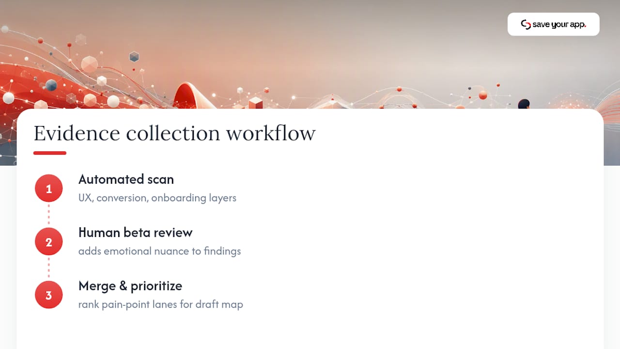
Manually gathering interview transcripts, session replays, and funnel data for every stage takes real time, which is exactly where an automated first pass earns its place. Automated diagnostics can scan a page or flow and flag likely friction points, like a confusing pricing table or a stalled onboarding step, in minutes rather than the days a full research cycle usually takes.
An automated scan runs across multiple audit layers, including UX and navigation, conversion, and onboarding, and pairs the automated findings with human beta tester reviews to catch the emotional nuance a script alone misses. That combination gives you a ranked, prioritized starting list for pain-point lanes before you've booked a single customer interview. Running a free scan is a fast way to seed a draft map with real signal instead of a blank grid.
What Journey Mapping Actually Delivers (and What It Doesn't)
Journey mapping earns its budget through alignment, not artwork. The real output is a room full of product, marketing, and support people agreeing on where the friction actually lives, which happens far less often than most teams assume before they sit down together.
Expect three to five prioritized experiments out of a good mapping exercise, not a sprawling backlog. If a team hands you fifteen "opportunities" with no ranking, push back and ask for the evidence behind each one before committing resources. A map is only as credible as the interviews and data behind it.
— William
Get Evidence and Ranked Fixes Without Building a Research Team
Mapping the journey tells you where the friction probably lives. Confirming it, and ranking which fix to build first, is the part that eats weeks if you're relying on manual interviews and spreadsheets alone. This kind of tool runs a page through multiple audit layers, including Technical SEO, Performance, UX & Navigation, Conversion, Accessibility, Trust & Security, and Onboarding, then pairs AI diagnostics with human beta tester reviews so the pain points in your map come with real nuance, not just a flagged metric.
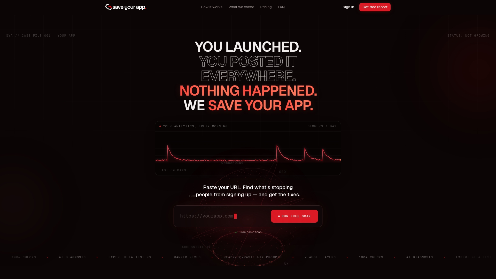
You get a ranked list of fixes by impact, not a wall of unranked observations, which is the exact prioritization step most mapping exercises struggle to finish on their own. The free scan is the fastest way to test fit, and if the onboarding or conversion lanes on your map need deeper, ongoing evidence, the Solo plan runs $49 per month and the Founder plan runs $129 per month, with an optional extra 3-day test for $199 one-off when you need a focused second look. Start with a free scan, then check the pricing page to see which tier matches how often your team plans to revisit the map.
Where to Go Deeper on Customer Journey Mapping
For further reading beyond this guide, NN/g's journey mapping research covers the foundational single-persona methodology, Atlassian's team playbook offers a workshop-style facilitation approach, Shopify's guide breaks down ecommerce-specific stages, and Qualtrics covers moments-that-matter prioritization. Statista provides current cart abandonment benchmarks for checkout-focused maps.
Sources
- Journey Mapping 101 - NN/g
- A Complete Guide to Customer Journey Mapping - Atlassian
- Customer Journey Map: How to Create One - Shopify
- Online shopping cart abandonment rate worldwide - Statista
- Customer journey mapping for better experiences - Qualtrics
FAQ
What Are the 7 Steps to Map the Customer Journey?
The core sequence is: define scope and a measurable goal, select one persona and scenario, collect qualitative and quantitative evidence, populate the map's lanes stage by stage, flag moments of truth, prioritize opportunities with named owners, and validate the draft with real customers before finalizing it.
What Is Customer Journey Mapping?
Customer journey mapping is the process of visualizing the steps, touchpoints, thoughts, and emotions a specific persona experiences while trying to reach a goal with your product or service. NN/g's definition emphasizes that it works best scoped to one person and one scenario, not an entire user base at once.
What Are the Main Lanes in a Customer Journey Map?
Most maps include actions, touchpoints, thoughts, emotions, pain points, owners, and opportunities, laid out stage by stage. Shopify's guide to building journey maps uses this same lane structure across awareness, consideration, decision, and loyalty stages.
What Are the Common Stages in Customer Journey Mapping?
Most journey maps run through awareness, consideration, decision or acquisition, onboarding or retention, and advocacy. Not every map needs all five: a single-stage deep dive might focus entirely on onboarding if that's where the business goal points.
Can a Tool Speed Up Journey Map Research?
Yes. A tool like Saveyourapp can scan a page across multiple audit layers and pair automated findings with human beta tester reviews, giving you a ranked starting list of likely friction points before you run a single customer interview. Current plan pricing is listed on the Saveyourapp pricing page.